The Hole That Refused to Quit 250 metres underground — past where these gold systems are supposed to die — a byEquediaJune 23, 2026
A Trillion-Dollar Trade Hiding in Plain Sight While the basic investors argue about chatbots, chips, and trillion-dollar byEquediaJune 7, 2026
By the Time You Read This, They’ve Already Bought More The most powerful institutions are buying it at a pace we haven't seen in over byEquediaApril 27, 2026
They Left a Fortune in the Desert. Now One Small Company Could Use It to Save America’s Military. This obscure material is now in the crosshairs of every nation, and there's only byEquediaApril 5, 2026
Instructional Metals and Mining Silver Stock Charts Technical AnalysisJune 14, 2022 Silver Price Analysis: Hanging On by a Fibonacci Thread The weekly chart for silver is accumulating a series of negative technical
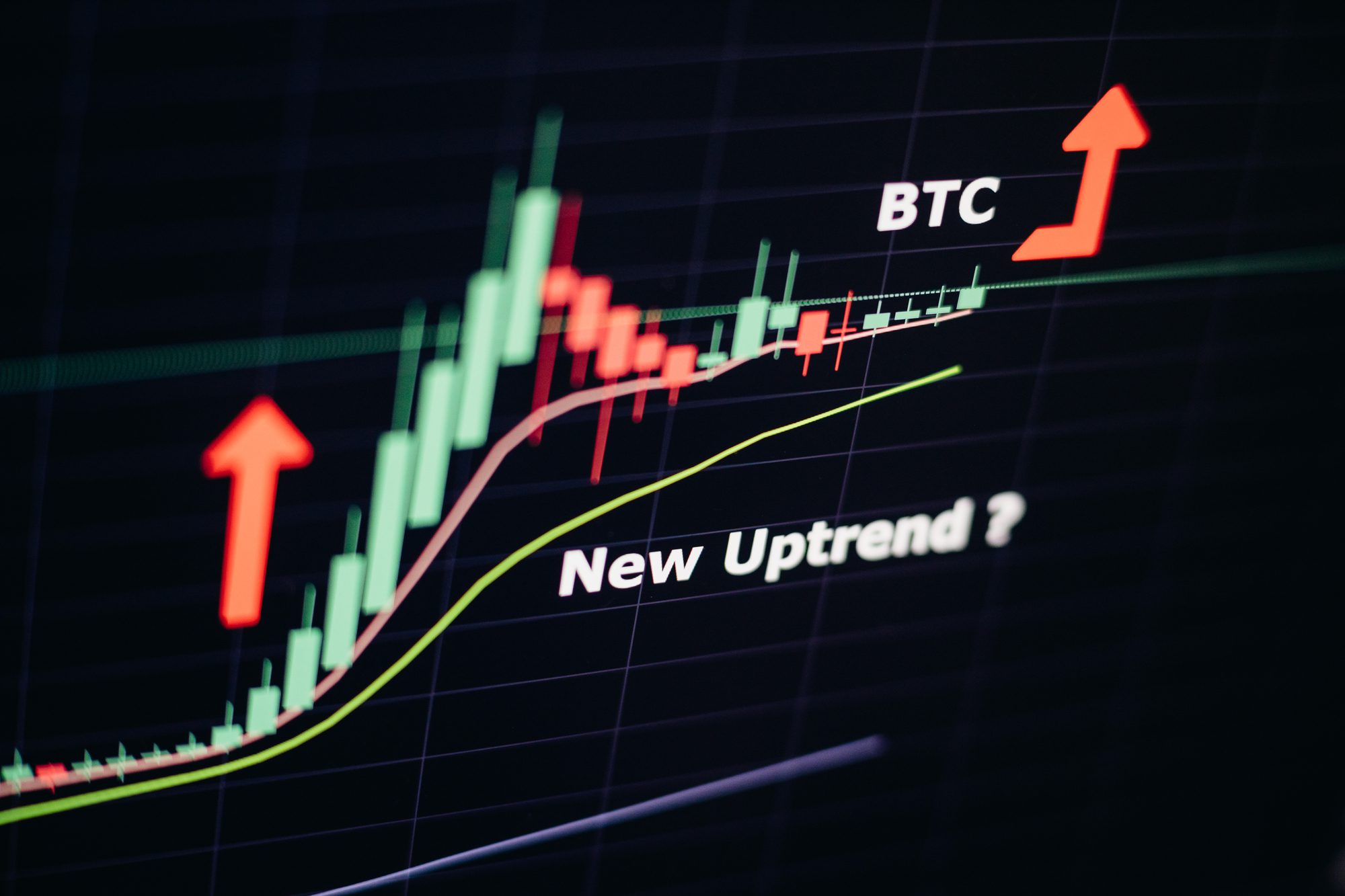
Blockchain and Cryptocurrencies Instructional Stock Charts Technical AnalysisJune 14, 2022 Bitcoin Trend Analysis We were concerned that Bitcoin had dipped below the base of its Ichimoku Cloud
Instructional Market Outlook Stock Charts Technical Analysis United StatesJune 4, 2022 US Dollar Chart Analysis: Triple Top Reversal A look at what's in store for the US dollar using chart analysis
Instructional Market Outlook Stock Charts Technical Analysis US Stock ExchangesMay 25, 2022 Analysis: The DOW and the Ichimoku Cloud Charts filter out the noise
Blockchain and Cryptocurrencies Instructional Stock Charts Technical AnalysisMay 16, 2022 Bitcoin Candlestick Chart Analysis A look at the bitcoin candlestick chart using our familiar weekly chart to see
Financial Instructional Market Outlook Stock Charts Technical AnalysisMay 14, 2022 Is the US Dollar Bullish? We look at the US dollar chart to answer the question: is the US dollar bullish?
Gold Instructional Metals and Mining Stock Charts Technical AnalysisMay 10, 2022 Gold Price Forecast: What’s Next? Gold has declined as the Fed raises rates
ETF Gold Instructional Metals and Mining Stock Charts Technical AnalysisApril 27, 2022 Rising Dollar, Rising Rates Slowly Eroding Confidence in Gold The GDX has gone from strong technical momentum, to one showing weakness and
Gold Instructional Stock Charts Technical AnalysisApril 19, 2022 GDX Stock Forecast: Breaking Out? We have been following the GDX stock chart with great anticipation
Instructional Market Outlook Stock Charts Technical Analysis US Stock ExchangesApril 12, 2022 Dow Chart Analysis: Searching for Support While In Decline We look at the 16-year weekly DOW chart to get perspective on the "raggedy"
Gold Instructional Metals and Mining Stock Charts Technical AnalysisMarch 9, 2022 $SPTGD Chart Analysis: Gold Stocks Complete Year-Long Consolidation Gold stocks have been consolidating within defined Fibonacci Retracement Levels
Gold Instructional Investment Ideas Metals and Mining Stock Charts Technical AnalysisMarch 7, 2022 Calibre Mining Chart Looking Good The chart for Calibre Mining Corp