
Overhead Resistance for DOW: Ichimoku Cloud Provides Guidance
Six weeks ago, we presented readers with a daily chart for the DOW that had a “Worrisome ORTHODOX BROADENING TOP.”
This pattern appears after a long, steady gain. As the name suggests, it defines a “top.”
We also highlighted a weekly chart for the Dow in which we could see that MACD (trend settings) had its signal line below the trigger line. This was negative. Balancing this negative outlook was the fact that the Dow had yet to enter its Ichimoku Cloud and, as we noted, weekly volume was “muted.”
That was then; this is now:
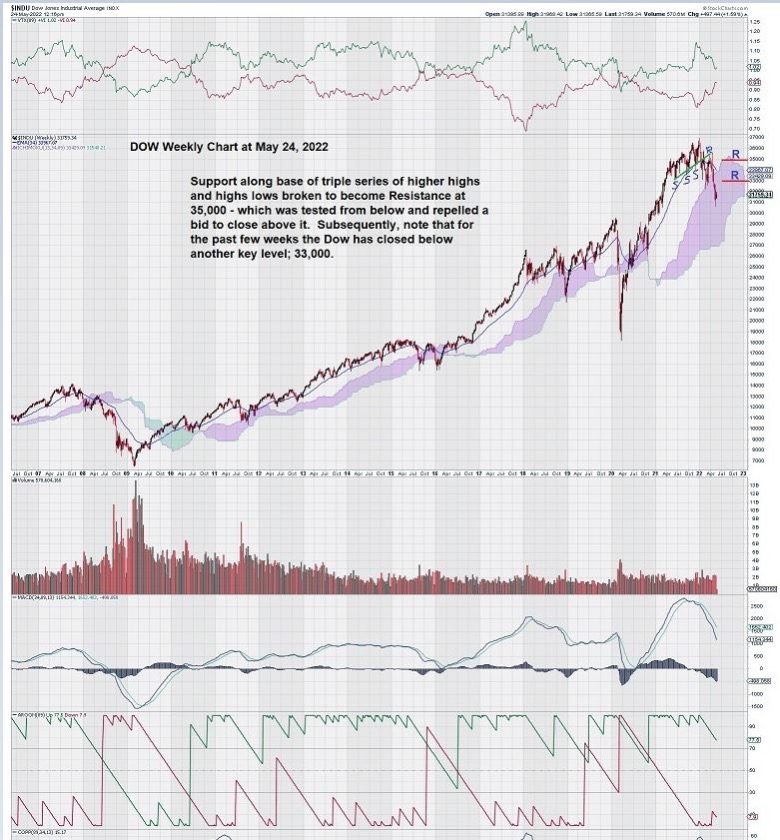
MACD is in a strong decline, but it remains above the zero line. Now take a look at the far left-hand side of the chart, and you will see that MACD fell below the zero line sometime in mid-2008, accompanied by an avalanche of selling. The large red volume bars are a visual reminder that market conditions in 2008 produced “fear.” In 2022, there is a level of growing concern, but not at the fear level yet.
There are two levels of overhead resistance that have been established for the Dow weekly chart: one is at 35,000 and the other at 33,000.
We have all heard and seen the non-stop chatter on the future of world markets on financial news networks and through the internet. However, through charts that take enough time into account to give valid signals, technical analysis filters much of the noise that typically surrounds markets.
Charts leave the reader with conclusions free of bias. This is how we come to view our MACD indicator set to define the trend – rather than on very short-term settings that can identify the “trade” within the trend.
So with that in mind, let’s take another look at our weekly chart for the Dow and focus on MACD and the zero line.
We start with mid-2008 when MACD crossed below the zero line, and the Dow continued to decline. Then, in early 2016, after a favorable double bottom pattern completed, MACD fell to the zero line but did not cross it. The Dow rose steadily for almost three years after MACD flattened and the signal line rose above the trigger line. Then, at the start of Q2 in 2020, news of the COVID pandemic put fear into markets. They dropped so fast that a large increase in volumes was not observed. MACD did drop slightly below the zero line on the signal line, but not the trigger line. A quick recovery of the DOW followed for the balance of 2020 and all of 2021.
This re-cap of MACD takes us to today.
MACD is sharply negative, with a steep downward slope for both the signal line and the trigger line. Both lines remain above the zero line.
Each day for the Dow is turning out to be an “adventure .”We have seen strong and weak opens, lots of inter-day movement, and strong and weak closes.
The weekly chart considers this when it posts the Friday close.
In the past many weeks, the Friday close continues to weigh on the Dow and pull it down.
Today, April 24th, was another wide-ranging day. The Dow chart had a more than 400 point interday move.
Summary and Wrap-Up
The Dow has entered its Ichimoku Cloud.
Since falling below it in 2008, the Dow has consistently been repelled upwards from the base of its Ichimoku Cloud except for when COVID pulled it lower and when the favorable double bottom chart pattern formed just beneath the Ichimoku Cloud base.
We will continue to keep our eye on both MACD and the Ichimoku Cloud for further clues.
There is just one more thing….
As September/October start to roll around, we sure would not want to see MACD break the zero line, the price chart close below the Ichimoku Cloud, and a big spike up in volume on down days.
– John Top, the technical trader