BITCOIN Trend Analysis – Selling Takes Price Below Ichimoku Cloud
Last month, around the middle of May, we looked closely at the weekly chart for Bitcoin. We were concerned that the level of Bitcoin had dipped below the base of its Ichimoku Cloud. A clear sign of weakness.
Here is how we characterized the trading in Bitcoin a month ago:
“As for Bitcoin, it is currently below the Ichimoku Cloud. This puts it in a weakened state. It is vulnerable to future declines in price. This we can say with certainty.”
Now we have some more data points to consider and an updated chart to present to our readers:
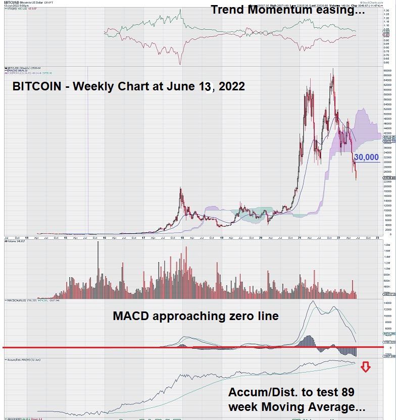
The current weekly chart for Bitcoin shows that our chart analysis was correct – Bitcoin looked weak and has fallen further.
Today (June 13), Bitcoin has declined by over 10% at the time of writing.
As we look at the current weekly chart for Bitcoin, another obvious caution is worth noting. MACD is getting closer and closer to the zero line. What does this mean?
In our experience in analyzing weekly charts that have MACD settings reflect the “trend,” once the zero line is crossed, further price deterioration often occurs, and declines can be accelerated. It seems very likely that Bitcoin is destined to at least test the zero line. We will revisit the chart in another month or two.
Notice also that the Accumulation/Distribution line has not yet crossed over an 89-week moving average trigger line…yet. This would represent another negative technical attribute.
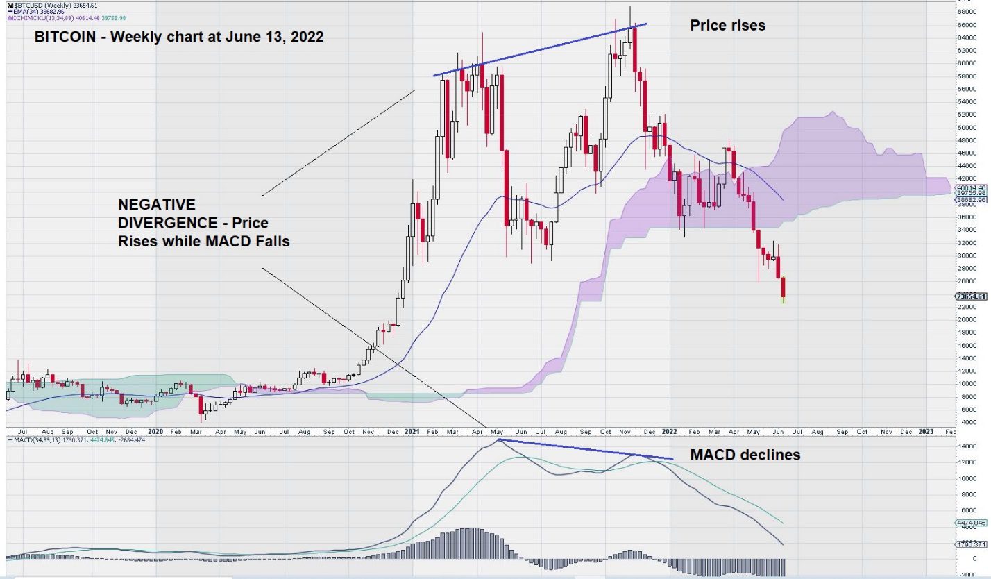
A closer look at the price chart for Bitcoin coupled with its corresponding MACD indicator shows “negative divergence.”
Bitcoin Trend Analysis Summary and Wrap-Up
Technical indicators work best when they support each other. This was the case when analyzing the weekly chart for Bitcoin. At the $34,000 level, there were lots of warning signs:
- $34,000 was an area of support/resistance
- Ichimoku Cloud base
- TRIX crossover (see May 15 weekly chart)
- MACD crossover.
What does the Bitcoin weekly chart tell us now through our Bitcoin Trend Analysis?
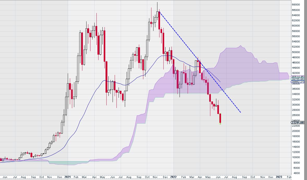
Future trade guidance for Bitcoin is provided by its weekly chart. More specifically, the downtrend line that is clearly defined by the all-time high of over $65,000 and the recent interim high of about $46,000 will provide enough of a clue as to when it might be time to consider Bitcoin for a trade.
So long as Bitcoin continues to have a weekly close below this simple trend line, perhaps the best “trade” is no trade at all if one is playing from the long side.
– John Top, the technical trader