
Gold Stocks Continue to Consolidate as Inflation Awakens from a Long Slumber
We once referred to time as the “thief that we all come to know.” That is how some gold investors are viewing gold stocks right now.
It’s time for gold stocks to go back up, they say.
Bitcoin has seen strong price advances, and yet gold is seemingly just lingering around, not doing too much.
Sure, it is holding onto a higher price than before, but how come it is not moving up faster? How come gold stocks aren’t moving up as well? We seem to have inflation pressure that is building, even if it is taking much longer for there to be a broader recognition of it.
Lumber prices have skyrocketed upwards; copper is on a steady climb, and food prices are not what they used to be.
It’s not hard to see why gold investors have become a wee bit impatient. They believe that their “time” is now. But Mr. Market is holding them back.
For chart followers, though, the view is quite different. In fact, the view is very bland and ordinary — nothing too unusual to report.
Let’s take a look back at some of our previous charts for gold and the S & P TSX Global Gold Index to review our expectations and see if the passage of time makes us ready to change our views or stand pat.
Let’s begin.
First, we’ll use our most extended telescope – a 50-year chart that takes us back to 1970.
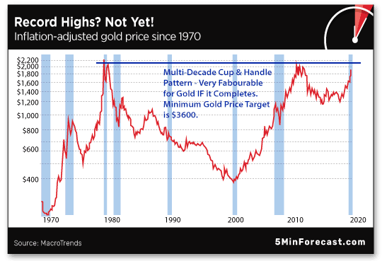
Here we can see an impressive technical trading pattern – the “tea-cup with handle” pattern. It is obviously visible, even to those who place no value in accepting the application of technical analysis to charts and the patterns they sometimes form.
As measured on this chart, “time” takes on a completely different meaning than that given to it by the growing chorus of impatient gold investors who have taken a “fast-food approach” to investing. Strictly speaking, this gold chart, as far as time is concerned, appears to be “right on schedule.”
We first commented on this chart at the end of July 2020. Now, about nine months later, we look back on our concluding paragraphs:
“The good news for readers of this letter is that both of these questions are addressed in the 40-year chart. Next, we simply wait on a clear break out of the cup and handle chart pattern. It seems we don’t have long to wait, even if the wait is within the next two years. A break out above the top of the cup and handle pattern has a measured minimum price target of $3600.
One final comment: time – that is, enough time – puts many things in perspective.
This is important because, as the chart clearly demonstrates, a “once in 40 years break out” on this chart is quite literally a “once in a lifetime opportunity.” Don’t squander it.”
Today, we are about to see some acceleration in this chart.
Inflation, which has been “whimpering just loud enough to be heard,” is getting ready to “roar.”
More recently, some of the larger investment banks have set out gold price targets in excess of $2000 per ounce. While this is encouraging in the short term, the focus of our chart is what happens to gold once these levels are reached.
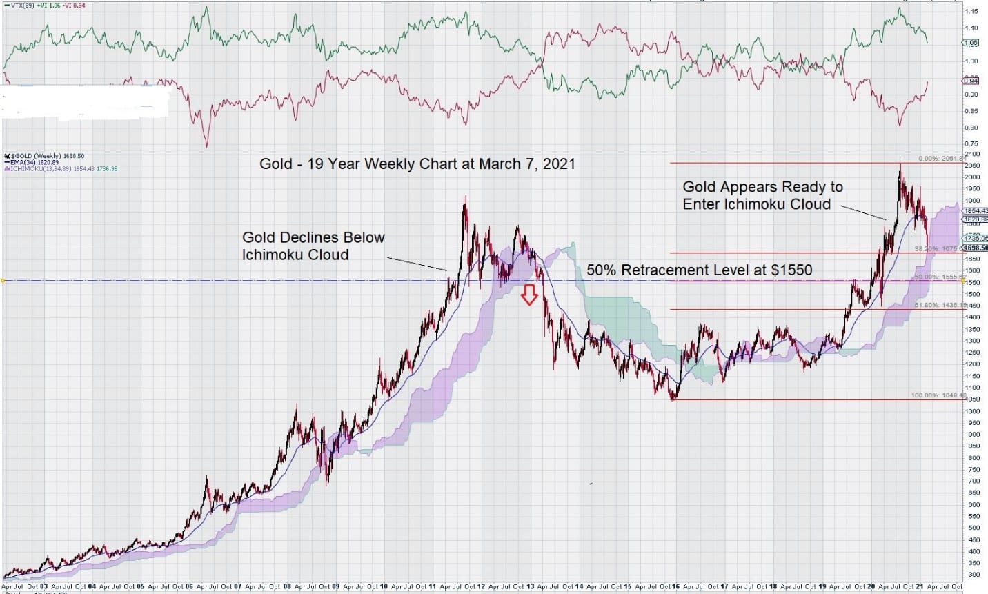
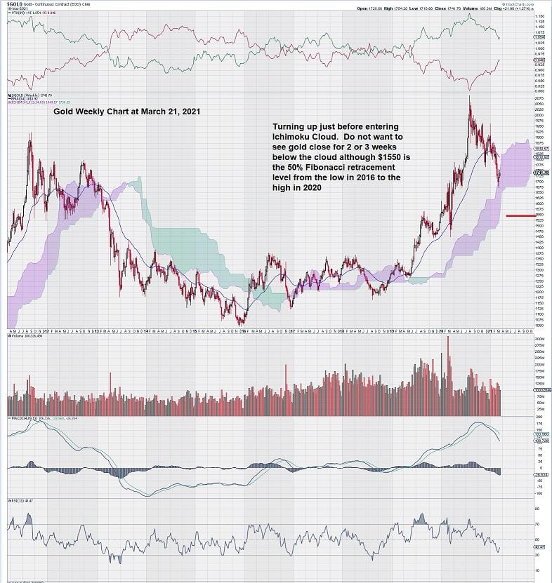
Last month our focus was on this chart. It showed gold entering the Ichimoku Cloud. This was an obvious source of concern because of the visual comparison to the 2011- 2013 period. Once gold entered and then exited the Ichimoku Cloud, it retraced 50% of its gain. Gold then established and traded within a defined range of $1100 to $1350 for 7 years. So, it was completely understandable that gold investors would become nervous that a similar decline was about to occur for gold.
Our view is that although there seemed to be a strong visual comparison on the chart, there were a few differences that needed to be considered.
First and foremost, there is a growing recognition that inflation has arrived, even as the various methods of its calculation continue to be manipulated to show that it is still not of great concern. Chairman Powell of the US central bank has gone so far as to say that any inflationary pressures are expected to be “transitory.” Perhaps the soaring price of commodities (lumber and copper are two examples), rising home prices, and increasing food prices may alter this opinion in the future. It isn’t easy to see how inputs for manufacturing can increase in price without seeing a complimentary rise in price for finished goods.
Additionally, there has been much discussion about the dramatic increase in the money supply. There are worries that the current US administration has only started to spend as they implement a new vision for America.
Ivan recently wrote about how China, Russia, and other nations intend to conduct trade between themselves, bypassing the use of the $USD. Over time, this will result in $USD weakness as much of the global trade is settled using the greenback.
In the past, the USA has relied on other nations to help finance their ever-growing debt through the bond market. The world is saturated with US-denominated debt. What does this mean for gold? The $USD loss will become Gold’s gain.
As Ivan points out in his article, as China starts to exert its global dominance through the use of the yuan and now the “digital yuan,” the $USD will weaken further. China’s gain will be at the expense of the $USD.
The US central bank is still holding on to positive rates despite rates becoming negative in other countries, most notably in Japan and the EU.
Chairman Powell and the FED governors must believe that a zero or negative interest rate policy would be a signal for US administrations, especially the current one, to engage in unlimited spending – although when you start talking in “trillions,” it may be one and the same. Perhaps there should be a rallying cry for conservative lawmakers: “Zeros Matter.”
Now, let’s turn our attention to gold stocks by taking a look at the S & P TSX Global Gold Index weekly chart. We have been following this chart since its inception, and it feels like an old friend who has been with us every step of the way through the many ups and downs.
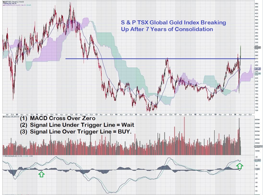
The TSX Gold Index showed all the correct technical signals for a break out after a lengthy consolidation. As we know, it did break out, and gold stocks large and small were favoured by investors.
The TSX Gold Index subsequently climbed from the multi-year support/resistance level of 280 up to 400. Then, as you can see in the chart below, it retraced all of its gains and re-tested this important technical level from ABOVE. Accordingly, what was an established resistance level became support.
This is also plainly noted on the chart.
What happens next?
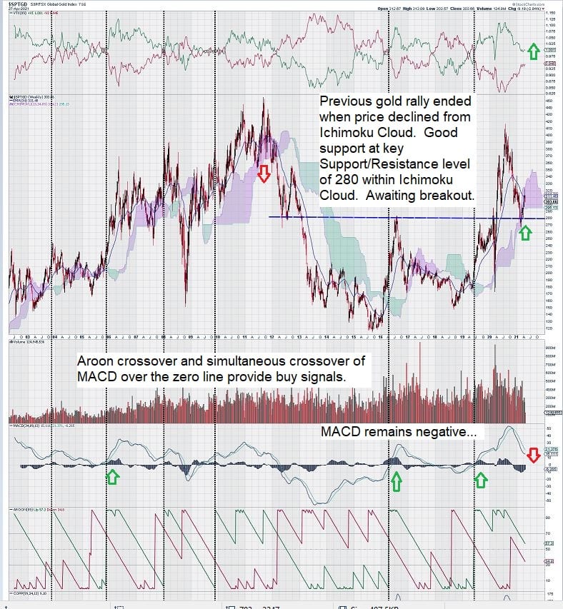
In the weeks and months ahead, what we are watching very closely is MACD.
Our MACD settings are unconventional and are best to measure when there is a sentiment change in a market. By using MACD with long-dated variables, we ensure that we will never get a signal at the “absolute bottom” or the “absolute top.”
But, in exchange, we have a strong sense of trade direction and are almost always on the “right side” of the trade.
In the chart above, we examined how Aroon is related to MACD. We note that there were three instances where Aroon crossover coincided with MACD crossing over the zero line. Recall that Aroon is derived from a Sanskrit word that translates to “early dawn.” In the context of technical analysis, this means a “change in sentiment.”
Currently, MACD remains negative, as noted in our recent article:
https://www.equedia.com/gold-chart-analysis-whats-up-with-gold-going-down/
A good trading outcome for gold during the next 3 – 4 months would be to find a trading range that results in a flattening of MACD, thus providing a trade set up for a positive crossover. A good trading outcome for gold stocks would be a continued sideways drift that results in an exchange of shares from weak to stronger hands.
Trend momentum remains positive, even as MACD becomes negative while remaining above the zero line.
Weekly trade volumes are declining – a good sign after such an important re-test of a key support level.
Summary and Wrap-up
As we move into the summer months and later into the fall, gold and gold stocks simply need to establish a trading range and trade within it.
Trade direction will become more evident with time.
Our 50-year chart puts many things in perspective. We can’t even begin to assess trade direction by analyzing daily charts. Our “trusty telescope” is to look at markets through the lens of a long-term weekly chart.
Charting knowledge, gained only through experience, tells us that change happens but not fast enough for most market participants.
We are reminded of the words of Jesse Livermore: “A time to buy, a time to sell, and a time to go fishing,” He went on to point out that his best gains in the market came when he was neither buying nor selling.
Some of the gold investors who are growing impatient need to learn how to fish…
– John Top, the technical trader