Gold investors are a strange lot. They have 100% conviction in their belief that gold will continue to rise when it is going up, but they are quick to bathe in self-doubt when it corrects.
With gold’s recent correction, let’s look at gold from many different perspectives to see if we can identify some key technical levels of the weekly gold chart.
In astronomy, the names Galileo/Copernicus/Hubble are synonymous with stargazers. Each one developed their perspective about the universe. Likewise, each of the chart views that we will present gives a different perspective due to the different time periods used in their construction. Thus, any conclusions that we might draw from examining them will, by necessity, reflect the investor sentiment for gold at different times. We will see how this sentiment gets reflected in the gold price.
Let’s begin.
Some of us were around to personally see this in the last gold cycle, back in the mid-1970s. Gold traded up from $35 to $200 – then declined to $100 before eventually staging a dramatic run-up to over $850. Are we seeing the same type of trading action today, or is it something different?
Again, in the two-decade-long “golden decline” from the $850 level, gold seemed magnetically “stuck” to the 50% retracement level of plus/minus $350. Finally, in 2001, gold started to move back up.
Gold obeyed a simple technical charting observation – the longer the “base,” the higher the potential upside. Indeed, gold removed a lot of doubt from the minds of its investors when it commenced a decade-long ascent to just below $2000.
Gold broke down through some key technical levels established by the low in 2008 and the high in 2011. Despite declining from 2011 to 2016, gold once again found good support at its longer-term 50% Fibonacci retracement level of $1050, as noted on the chart below.
From the low in 2016, gold recovered and traded to a weekly high closing level of around $2080. Now, another decline is underway.
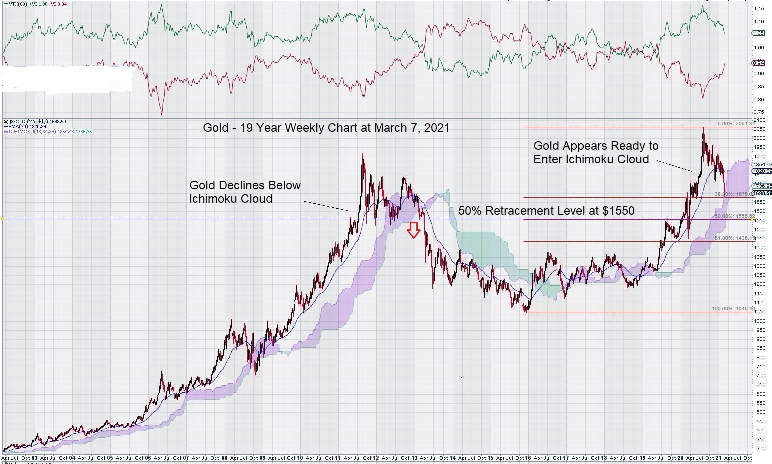
We have recently posted a weekly chart for gold that is a bit unusual in that it uses $1350 as an interim low and $2080 as an interim high. Based on these two chart points, the 50% retracement level is around $1700.
This level is expected to provide some support.
However, we are not particularly too fussed if lower prices for gold emerge in the coming weeks.
Our analysis was based on solid ground. The $1350/$1375 is a clearly identified key level on the weekly chart. It acted as strong resistance for about a 6-year period. That is why we were able to set it as a zero point – even though this is an unconventional way to establish a 50% Fibonacci retracement level.
Even though gold is closing below $1700, remember that we tend to follow our own 3% “buffer rule” due to the volatility displayed by today’s markets. So, at $1700, we have about a $50 plus/minus range to consider.
Lastly, the key technical level of a 50% retracement that gold has followed on all of its previous chart gains since 1972 is $1550. We would expect our initial analysis using the $1350 as a “low” to result in some chart support at $1700 and $1610. Now that gold is re-testing the $1700 level, trading over the next month or so may give a little more clarity as to direction.
Here is a 50-year weekly chart for gold:
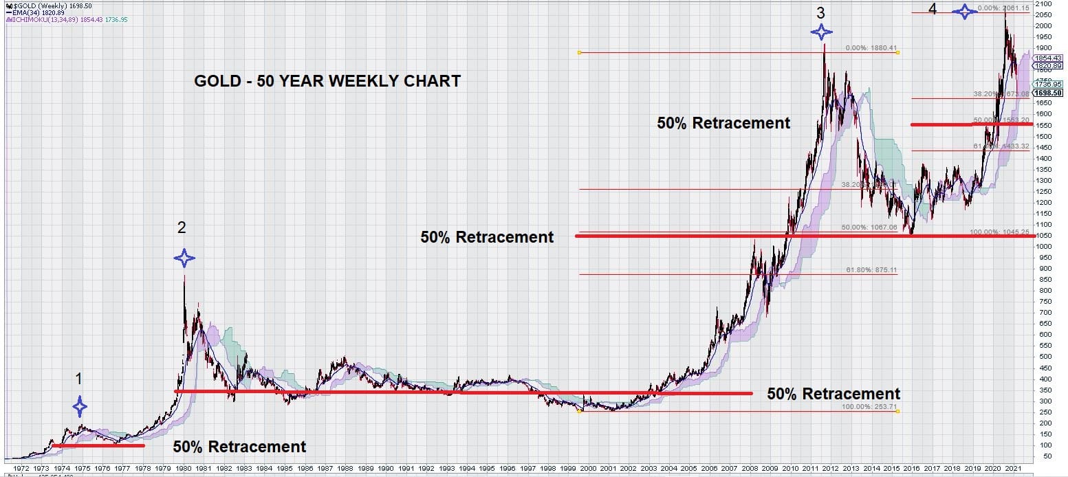
- Gold – initial move up from $35 to $200. 50% Retracement to $100.
- Gold –interim move up from $35 to $850. 50% Retracement to $350.
- Gold – interim move up from $250 to $1875. 50% Retracement to $1050.
- Gold – interim move up from $1050 to $2050. 50% Retracement to $1550 (target).
Note: 50% Retracement values are “round dollar estimates” and are used to identify and illustrate general trends in the way that gold trades.
Does this chart make you feel a bit better now?
So far, gold has been a “model of consistency” when it comes to obeying the Fibonacci Retracement of 50% of each of its prior gains – so why would time be different?
With that in mind, we are not inclined to get caught up in the tide of the common opinion that has pronounced that rising bond yields are set to “end” the gold market. Something about the gold market just doesn’t have the feel of being a “top.” Our trading instincts are telling us this, and the above chart goes a long way to convince us of that.
We have shown a complete history of gold with a very strong case for following Fibonacci retracement levels. This is all positive. Now, what is it about the chart that could give us any pause for concern?
Three chart observations that we are monitoring with special interest are:
- Trend Momentum – falling but still positive
- EMA – price is below the exponential moving average (89), and this of some concern because it has remained above it (previous dips below it for a week at a time are not considered) since the end of 2018 – near the start of the current gold price rally.
- MACD – The signal line has been under the trigger line since mid-November of 2020. Obviously, this weighs on the gold price and sets up a technical trading condition that attracts traders who are emboldened to short gold. These same traders will reverse their short positions and go long gold when the technical picture changes.
Finally, as a separate observation, we also note how the gold price will react to the Ichimoku Cloud.
Recall that Ichimoku Clouds are simply a visual representation of exponential moving averages plotted forward in time. The previous 10-year long rally in the gold price confirmed that it had already reached its recent high once the Ichimoku Cloud was broken to the downside. You will not see that the 2008 Financial Crisis resulted in a temporary breakdown below the Ichimoku Cloud. The announcement of the global economic shutdown in March 2020 spiked gold lower, along with stocks, but it did not enter the Ichimoku Cloud at that time.
Summary: Gold’s 50 Year Trading History Favors Consolidation Over Collapse
There are other technical indicators that we could discuss, but they do not change the way that we have seen gold trade for the past 50 years.
Our first chart shows that gold has a well-established history of somewhat easily giving up 50% of its gains in each up-leg in price. However, it has shown that declines much below the 50% Fibonacci retracement level have not been observed. Even the long 20-year decline in gold from its peak in the 1980s stopped and consolidated around the 50% Fibonacci retracement level.
This is why we expect to see interim support around the current level of $1700 based on our earlier identification of the $1350 level as a key support/resistance level.
Declines below $1700 may eventually take gold to $1550 but, based on historical trading patterns, there is good reason to believe that further significant declines would be inconsistent with the way that gold has traded for the past 50 years.
–John Top, the technical trader