How to Identify Buy Signals: the Rising Tide That Lifts All Boats
Educational Segment (018)
Do you remember the first time you heard the expression, “a rising tide lifts all boats?” I do. It was at a small cafe more than 40 years ago. Some local market players had just returned from “watching the tape” – back then, this is what people did. Actively traded stocks were the ones appearing time and time again on the ticker tape.
One of the players ceremoniously pronounced that it was a great time to be in the market. That is when he said it: “A rising tide lifts all boats.”
I was in my early twenties, so it felt as if some wise oracle had decided to sprinkle some gold-laden knowledge for those present. Years later, having watched several commodity-driven cycles, this simple market adage proved itself to be true on several occasions. We can all remember when China decided it was time to start stocking up on resources. Natural resource stocks across the board developed deep liquidity. This resulted in record fundraising for the resource industry.
Resource companies, large and small, had access to risk capital that seemed “endless” at the time. It quickly became an issue: there was more money than there were projects to invest in.
This week we decided to take a closer look at the TSX Composite Index because of its heavy influence from the natural resource sector; oil and gas, mining, and forestry continue to play a significant role in Canada’s economy.
Near the end of 2020, we made an observation concerning the application of Ichimoku Clouds in technical analysis.
Specifically, we showed how the stock chart of a small medical research company, Sernova, had a series of rising Ichimoku Clouds prior to a strong move in its share price. We also pinpointed some excellent trade entry points.
In our Summary & Wrap Up section, we made these comments:
“We are confident that we will identify this specific chart pattern again, maybe not just in the pharmaceutical industry but also in other sectors.”
Sure enough, we have come across another example of “Rising Ichimoku Clouds.” They are present in the TSX Composite Index Weekly Chart.
Take a look for yourself:
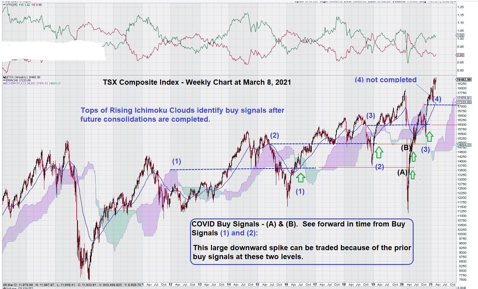
Here we can see that the top of the previous Ichimoku Cloud, plotted forward in time, passed the completion of the next up-leg and subsequent consolidation, thus giving a great place to enter trades.
In the case of Example (1), there is even a very rare “2nd buy signal” at point (“A”) due to the unusual drop in most markets as a result of COVID-19 grinding the global economy to a halt.
This was a “true” black swan event that resulted in some excellent opportunities to “buy at the right time.”
The same thing happened in Example (2), where a “2nd buy signal” was seen at point (“B”).
Should markets continue to correct (and they may not), then we have set in place with (3) and (4), two additional levels to watch. These become buy signals when the index first trades below these levels and then recovers to trade above them.
Summary and Wrap Up
This weekly chart for the TSX Composite Index is quite instructive as it is a graphic illustration of the “ebb and flow” of the market. It clearly shows that, given enough time, some trustworthy signals emerge.
It does not go unnoticed that the first part of (1) occurs at the start of 2012. The second part, the buy signal, occurs 4 ½ years later, in mid-2016.
In (2), the same thing occurs about 4 years from the initial part of the signal to the second part, the buy signal.
We recognize that this form of trend analysis is not for everyone. This type of chart is probably best for hedge funds, pension managers, and other investors who always want to be on the “right side” of the “rising tide.”
Do you have the patience to wait 4 ½ years for the “rising tide that lifts all boats?” We hope so.
The financial rewards can be well worth the wait.
-John Top, the technical trader