
We told you this would happen.
And many thought we were nuts.
Yet, things are playing out as predicted – or, rather, planned.
If you want to know what’s coming next, read on.
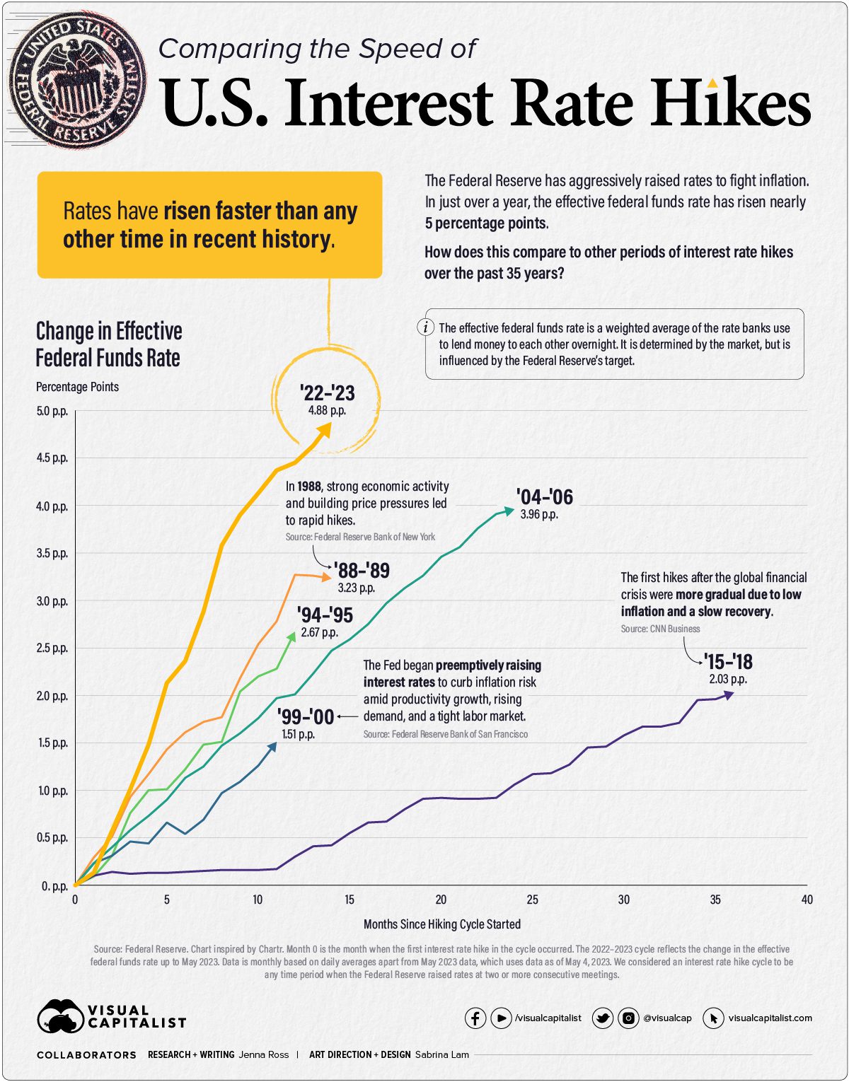
The Fastest in Modern History
The U.S. Federal Reserve just unleashed the fastest and most aggressive series of rate hikes in modern history.
U.S. interest rates have reached levels not seen since 2007 – yes, right before the Great Recession of 2008.
Take a look:
Unprecedented Territory
What does this mean?
Over the last decade, the world has printed more money – i.e., borrowed more money – than ever before.
But you don’t need to look at the world to see how bad our debt levels have become.
You just need to look at the United States.
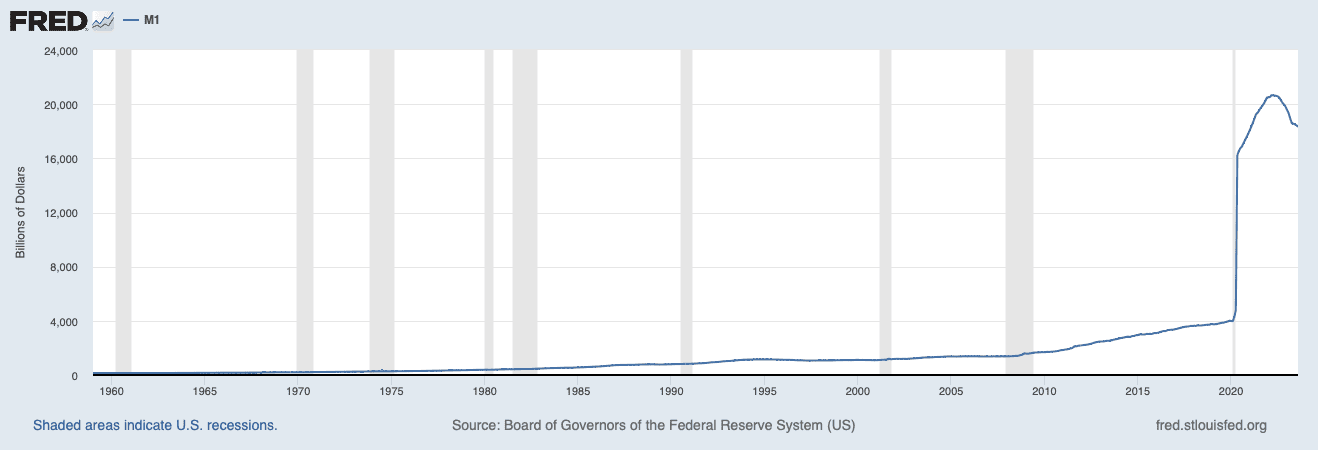
This is a chart of the M1 money supply.
M1 money supply, in its simplest terms, refers to the total amount of the most liquid forms of money within an economy. It includes:
- Physical currency (coins and paper money) that is in circulation.
- Demand deposits are funds in checking accounts and other similar accounts that can be readily accessed without delay.
M1 does not include less liquid forms of money like savings accounts (more in this in just a bit), time deposits, or investments. It’s a measure of money that is immediately available for spending and transactions in the economy.
In 2020, M1 money supply was around $4 trillion.
Last year, it quintupled to over $20 trillion.
This massive increase in M1 money supply is due to many factors, including record government spending, borrowing, and financial deregulation.
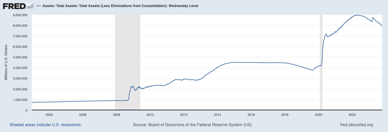
For example, in just a couple of years, the Fed more than doubled its balance sheet from around $4 trillion in 2020 to nearly $9 trillion last year.
Adding more fuel to the fire, deregulation by the Fed – both through the removal of the fractional reserve ratio (see our Letter The Banking Failures Were Planned) and Regulation D – caused the M1 money supply to grow even more.
Via our Letter The Banking Failures Were Planned:
“…the Fed reduced reserve requirement ratios to zero percent in March 2020. This action eliminated reserve requirements for ALL depository institutions.
The reserve requirement ratio is the percentage of deposits that banks are legally required to hold as reserves, which cannot be lent out. It is set by the Fed to ensure that banks maintain a certain level of liquidity and stability.
So, obviously, removing the reserve requirement means banks no longer need to have any level of liquidity or stability. It could have none.”
What about the changes to Regulation D?
Via the Fed:
“…In late February and early March of 2020, the Fed cut its policy interest rate dramatically to help ease credit conditions during the COVID-19 crisis.
The resulting acceleration in the supply of M1 can be understood largely as banks accommodating an increase in people’s demand for money.
However, the opportunity cost of money has remained more or less constant throughout 2020, over which time M1 growth has accelerated. What might account for this behavior?
To help answer this question, we’ll need to talk a bit about banking regulations…
On April 24, 2020, the Federal Reserve Board announced that Regulation D would no longer impose limits on the number of transactions or withdrawals permitted on savings deposit accounts. According to this ruling, if a bank suspends enforcement of the six-transfer limit on a savings deposit, the bank may report that account as a “transaction account” on its FR 2900 reports.
However, the bank may instead, if it chooses, continue to report the account as a “savings deposit” (See Board of Governors FAQ #6). Since banks have been flush with excess reserves since 2008, reporting savings deposits as transaction balances incurs no cost.
On the other hand, it’s not immediately clear what advantage there is from the bank’s perspective in relabeling savings accounts as transactions balances. In any case, it seems that the modification of Regulation D in late April has effectively rendered savings accounts almost indistinguishable from checking accounts from the perspective of depositors and banks…”
In addition to deregulation, the U.S. government went on a borrowing spree, and significantly expanded its debt, going from $20 trillion at the beginning of 2020 to over $32.3 trillion today – a whopping increase of more than 60%.
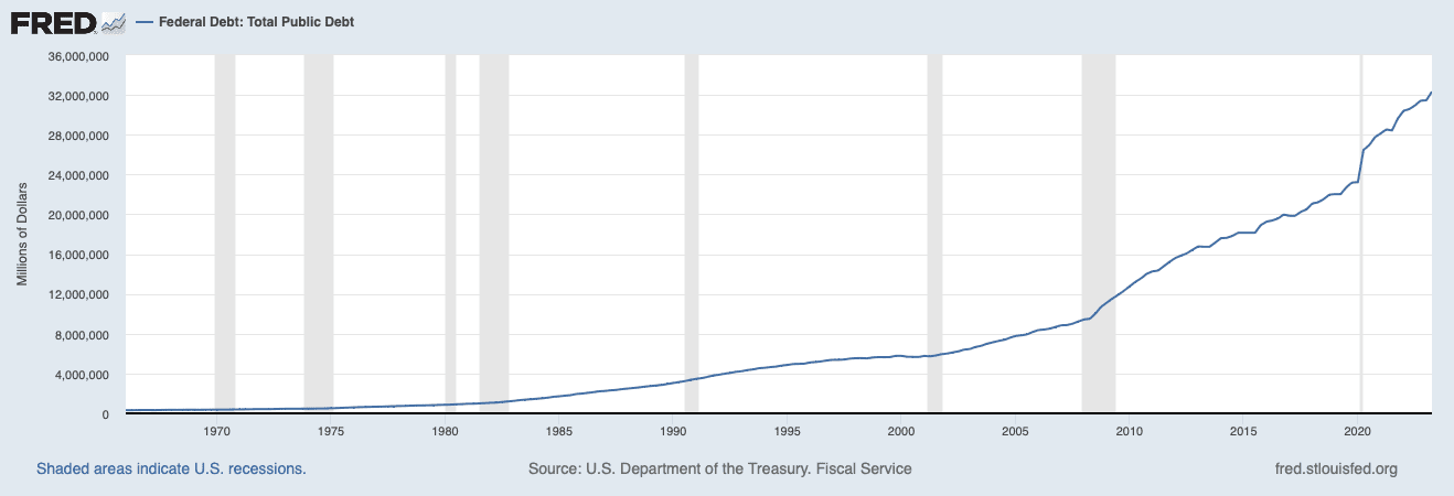
To put that in perspective, the U.S. borrowed more in two years than it did in over a combined decade between 2008 and 2020.
When you add it all up, you might wonder how this could have happened so quickly.
How do we have so much liquidity while borrowing so much money so fast?
Simply put, all of the above monetary scenarios, including deregulation, are governed by the Fed.
So don’t be fooled into thinking that the Fed is a reactionary entity that never gets it right.
It knows exactly what it is doing.
That is precisely why we have told our readers to always follow the Fed.
Where did the money go?
Think about how much money our governments have borrowed. Where did that money go?
Sure, they’re sending billions overseas to fuel wars and other things like climate change and “vaccine equity” – but they’ve printed trillions.
Did it go to infrastructure? Do you see many new bridges, roads, airports, and refineries?
Do you see many major infrastructure projects being built?
Sure, there might be a few things, but the math should be simple.
If you spend $1 on infrastructure, you should get at least $1 back in GDP.
Whatever projects are being built with this massive spending, it’s certainly not showing up in GDP.
But just how big is this discrepancy?
Take a look at this chart:
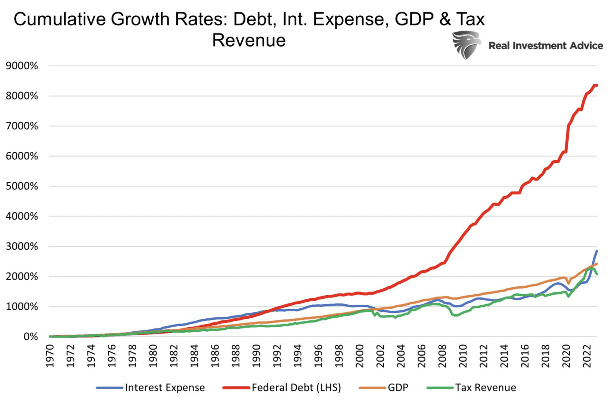
This chart shows that U.S. federal debt grew four times faster than interest expenses, GDP, and tax revenues.
At that rate, we should be seeing dramatic increases in infrastructure builds throughout the nation – as we did in China over the past 20 years.
But tell me, what have you seen in your city or state?
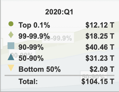
Now take a look at this chart:
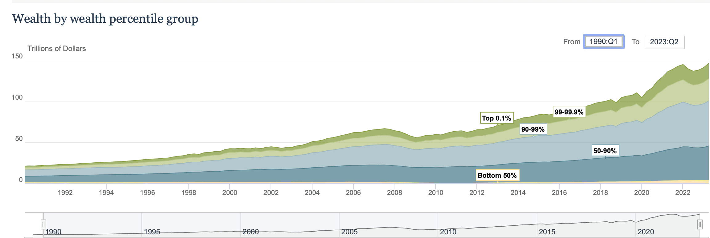
This is a chart of wealth by wealth percentile group.
Wealth percentile groups are categories that divide a population into different segments based on their wealth or net worth. Each group represents a specific percentage of the population, arranged from lowest to highest wealth.
When record amounts of money are printed, i.e., borrowed, it must go somewhere, right?
That somewhere is the distribution of wealth. But to whom?
Let’s break this down a bit further.
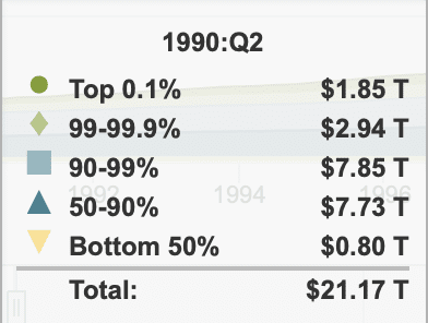
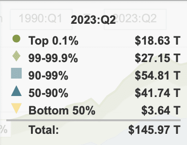
Source: Fed
Since Q2 1990:
- the bottom 50% have increased their wealth by 355%,
- the top 90-99% have increased their wealth by 598%
- the top 99-99.9% have increased their wealth by over 823%
And the top 0.1%? A whopping 907%, representing nearly $19 trillion.
Meanwhile, the bottom 50% has just $3.64 trillion.
Putting that into further perspective…
In 1990, the top 0.1% were just 131% richer than the bottom 50%.
Today, the top 0.1% are now 411% richer than the bottom 50%.
And if you think all of the COVID money spending went to helping out those in need – you know, the bottom 50% – just take a look at this:
In two years, from 2020 to 2022:
- the top 0.1% gained $6 trillion;
- the top 99-99.9% gained $8.9 trillion;
- the top 90-99% gained $14.35 trillion;
- the top 50-90 gained $10.51 trillion.
The bottom 50%? A measly $1.55 trillion.
This is by far the biggest wealth gap in US history.
Want even more perspective?
Take a look at this chart from 2022:
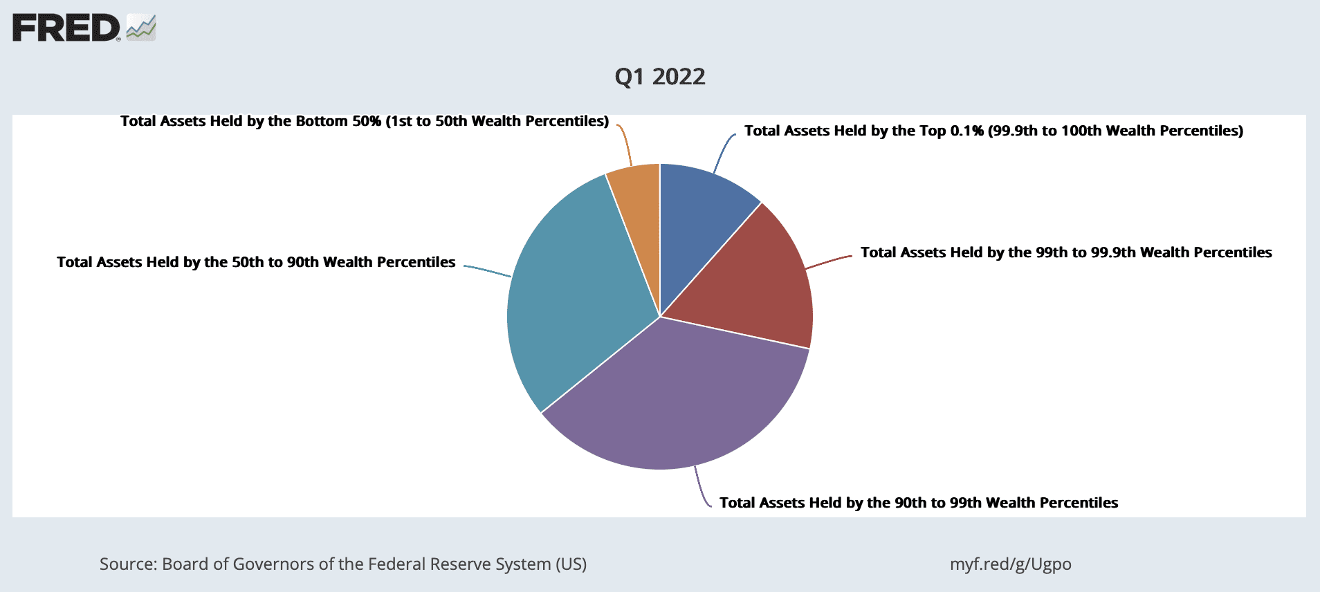
The bottom 50% represented by orange is equal to 65 million households.
The top 0.1% represented by blue is equal to 130,757 households but holds almost twice as much wealth as the 65 million households in the bottom 50%.
If we take the 130,757 households in the top 0.1% and average their wealth using today’s numbers, each household in the top 0.1% would have assets worth $142,295,625.
If we take the 65 million households in the bottom 50% and average their wealth using today’s numbers, each household in the bottom 50% would have assets worth $56,000.
That means the wealth of the top 0.1%, on average, is 253,184% more than the bottom 50%.
It doesn’t take a rocket scientist to know where most of the money went: the elites.
If you are wondering why we have so much division amongst our own people, recall our past letters, including THIS one, where we said:
“Racial inequality pits one group against another, whereas economic inequality pits citizens against the rulers of an empire.”
And as we have just shown you, economic inequality is at a modern-day high. No wonder the media is working so hard to divide us.
Conclusion
When the government spends money recklessly, it leads to inflation. This is a fact.
It’s also a fact that the more our governments spend, the more debt WE owe.
In Canada, we each owe C$42,915-$64,579.
In the U.S., you each owe more than US$100,000.
This means many years of higher taxes and infrastructure cuts.
Now, tell me, who audits the money our governments sends to Ukraine or Israel? Or what about the $90 million Canada’s PM Justin Trudeau just sent to the Caribbeans?
The only way out of this debt is a reset.
Or, as we told you before, war.
Seek the truth and be prepared,
Carlisle Kane