

Several years ago, I was introduced to Sernova Corp. (TSX-V:SVA) (OTCQB:SEOVF) (FSE:PSH), a small diabetes research company that is developing a safe, implantable “pouch” to store and release implanted cells (think stem cells) to eliminate the use of insulin in people that have diabetes.
The company has received sizeable research grants from various sources to help advance its research into helping diabetes patients have a higher quality of life – sans the ever-present needle.
Some very notable funding sources have vetted what doctors and scientific researchers are doing at Sernova and have supported the company through research grants. One example is JDRF (Juvenile Diabetes Research Foundation), a global non-profit organization focused on providing funding to advance diabetes research.
Here is how JDRF describe themselves:
“JDRF is the world’s largest non-profit funder of type 1 diabetes research. Our in-house scientists oversee a diverse portfolio of research tracks, leaving no stone unturned in our search for a cure.”
Let’s take a closer look at the 5-year weekly chart to see if we can “read anything” into the recent trading activity.
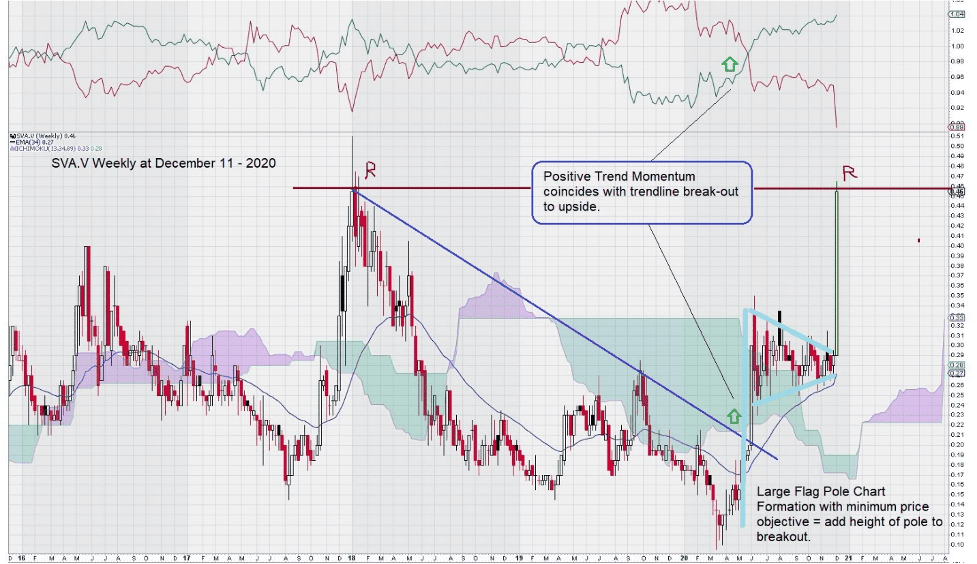
As you can see, the chart is a challenge to interpret. This may be changing.
We note that a positive shift in trend momentum took place in May of this year when the downtrend line was penetrated to the upside and when the price crossed over the EMA (89) line; this exponential moving average line is shown as the blue line under the price chart in mid-2020.
Our second observation is to note the Pennant chart pattern representing a continuation pattern of the trend in place. In this example, the trend in place was up, and once the pattern was completed, it continued.
Technical charting patterns have associated “price objectives” attached to them. For example, in a simple rectangular “box range pattern,” the minimum expected price objective is the height of the box added to its top if the price break-out is positive and subtracted from its base if the price falls below the base level. In this case, in the pattern noted for Sernova, the minimum price object has almost been met in just two weeks of trading.
Adding the height of the “flagpole” to the pennant’s break-out level places the minimum price objective at the current level of around $0.40/$0.45. This puts the price at a level reached before, at the start of 2018, which became resistance.
The current market is very receptive to the “next new medical advance” due to the global focus on the creation of vaccines and treatments for the COVID virus. SVA recently made a “speeding ticket” disclosure when it announced that the company was:
“unaware of any material or undisclosed information or change in the Company’s operations that would account for the recent increase in price and market activity.”
In any case, our model for investing – from a technical perspective – is based on 2 or 3 consecutive closes above the break-out level, and we rely on a volume increase for the 2nd candle to provide an additional layer of confirmation.
Separately and by observation only, we note some interesting aspects of the price chart that seem to be related to the Ichimoku Clouds that are forming over the years as SVA continues to advance in a step-like fashion.
Here is a longer 12-year chart showing a very “choppy” chart with Ichimoku Clouds showing increasing tops. Remember that Ichimoku Clouds are simply a visual representation of Exponential Moving Averages (EMA’s) plotted forward in time.
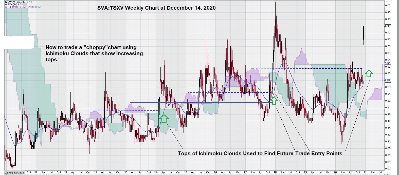
A much closer examination of the Ichimoku Clouds reveals an interesting way to possibly trade a very choppy chart pattern, as is noted here.
We simply draw a horizontal line from the top of the Red Ichimoku Cloud passed the next one, and we can see that when price rises above this line, there is enough price momentum to move higher.
This trade entry point seems to capture the short-term price rise that follows. The trading method is best for swing traders who have a trade duration of 2 – 3 weeks.
This is generally not how we look at charts, but the pattern was so obvious that it was worth a mention. (Swing Traders can work out their own trade exit strategy.)
Summary & Wrap Up
The past year’s events have re-shaped investors’ appetite for companies that rely on scientific research to develop a new drug or treatment method. Sernova is a beneficiary of this revived investor interest.
We will keep Sernova under watch to see if they report any material developments in their on-going quest to develop a new method to deliver insulin, stem cells, and other regenerative medicines to the body.
-John Top, educational segment 014