Today, we work our way through several weekly charts – gold/silver/$USD.
The purpose is two-fold.
The first is to compare current weekly charts with those over a month ago for gold and silver (a year ago for the $USD).
The second is to see if the current weekly charts offer any insights into the future as we rapidly approach the end of another year.
Let’s begin with the weekly chart for gold.
Gold Chart Analysis
In early October, we penned an article entitled: “Weekly Gold Chart – Warning Signs are Everywhere.” The article was focused on the interpretation of the gold price as it relates to a long-term Ichimoku Cloud.
Here is the chart:
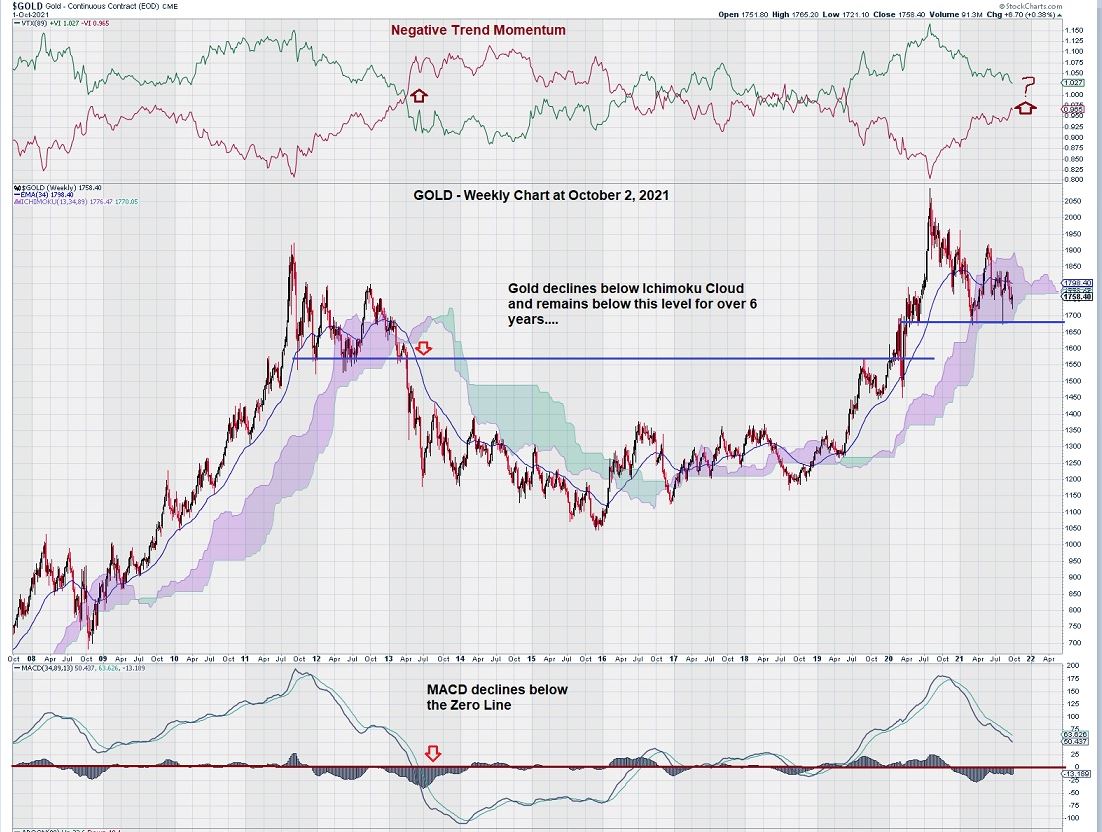
It is pretty obvious that gold was “in the danger zone,” – meaning that the price was well within its Ichimoku Cloud. Our concern was simply founded on what happened back in 2013 when gold dipped below the Ichimoku Cloud base and subsequently began a multi-year decline, followed by a multi-year consolidation.
Here is the weekly chart for gold today:
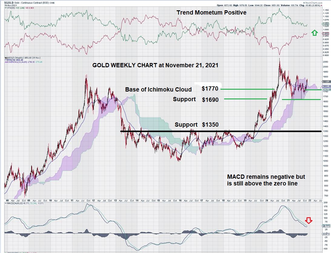
The current price of gold is $1805. However, we remain vigilant and have our eye on the $1770 level, mindful that gold may close below that level. Consecutive weekly closes below $1770 would then shift our attention to the Fibonacci Retracement levels defined in this next chart:
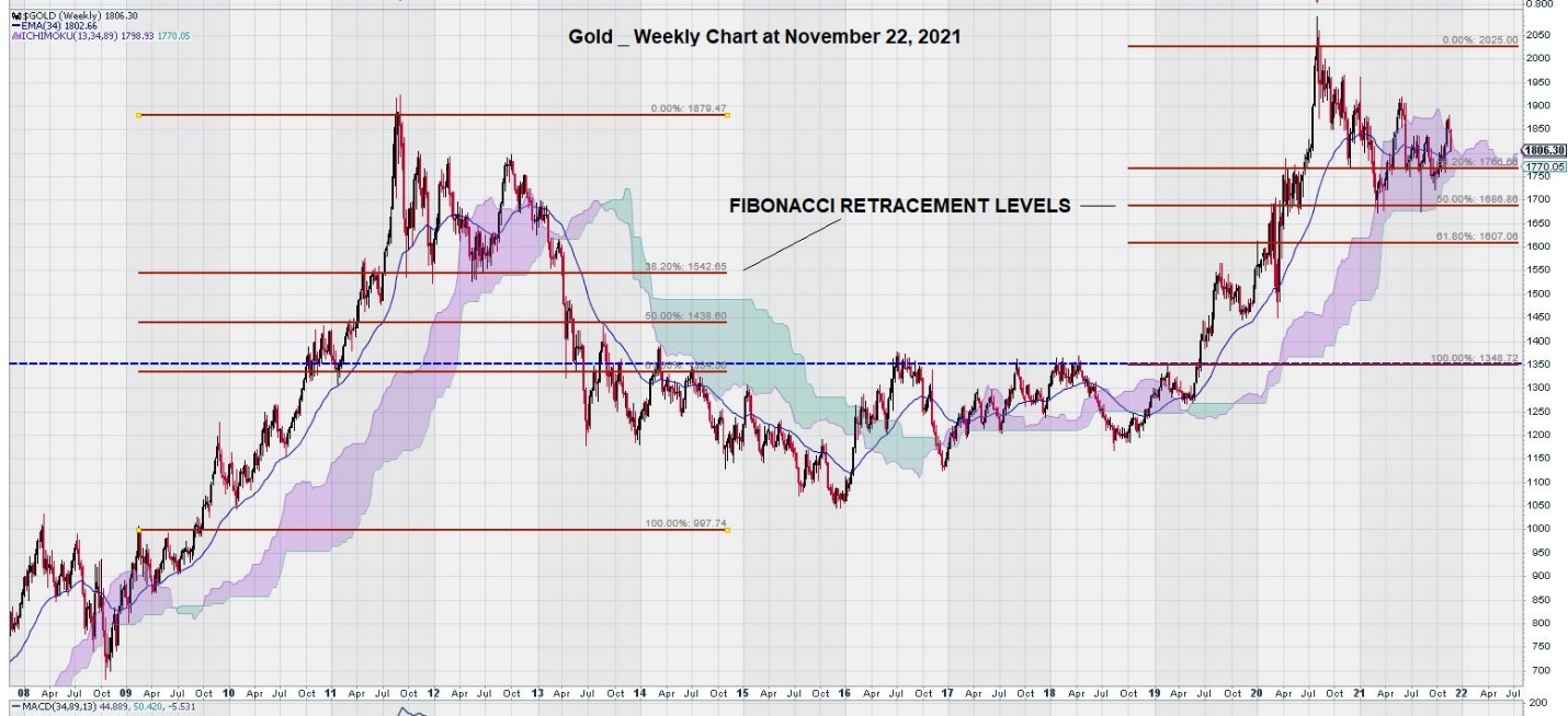
In the previous run-up of the gold price weekly chart, we see that the first Fibonacci level provided good support – until it failed at the $1550 level.
The current weekly chart shows that the first Fibonacci level provided support at $1770, which gave way on the second re-test, dropping to the second Fibonacci level at $1690. Thus, the $1770 level is again coming into play as it also marks the base of the Ichimoku Cloud.
Gold Chart Analysis Summary
What have we learned by reviewing these charts?
There are “two conditions” that must be met to believe that the gold price is set to continue its decline: several weekly closes below the Ichimoku Cloud and closes below the established Fibonacci Retracement levels.
In the 2011 rise in gold, this level was at $1550, as shown. Today, we would say that $1690 is a key level to continue to monitor. So far, two previous declines in the gold price have been repelled when this level was reached.
Now we turn our attention to the weekly silver chart.
Silver Chart Analysis
The previous weekly chart for gold highlighted an ascending triangle pattern that had broken to the downside:
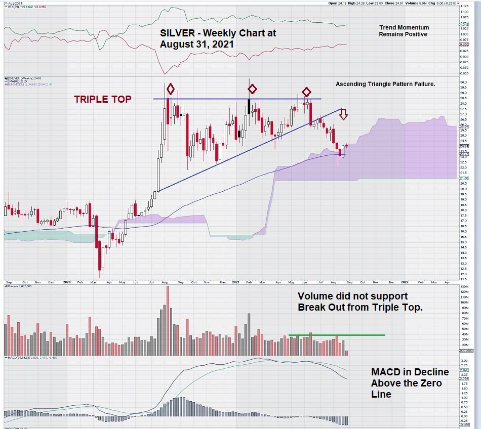
A few months later, this is what we are now looking at when it comes to the weekly silver chart:
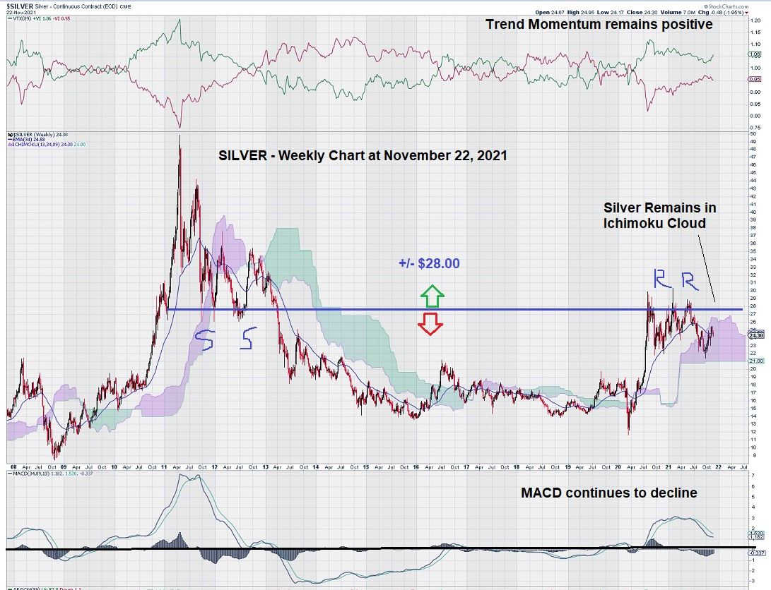
For silver, we can see that it is a stronger chart than for gold when comparing the weekly price chart to the Ichimoku Cloud. For gold trading at just over $1800, the base of the Ichimoku Cloud is at $1770. For silver, trading at $24.25, the base of the Ichimoku Cloud is at $21.00. Thus, silver has “more room” within the Ichimoku Cloud to consolidate and perhaps break above it.
Long-term MACD for silver is declining; as with gold, it would be chart positive for there to be a positive crossover of the signal line over the trigger line before MACD declines below the zero line.
Silver Chart Analysis Summary
The best summary for silver is to simply remark that it is trading constructively within a defined range: $28.00 – $28.00. Future trade direction is likely going to be determined once this trading range resolves.
US Dollar Analysis
Finally, a look at a weekly chart for the US Dollar ($USD) from one year ago:
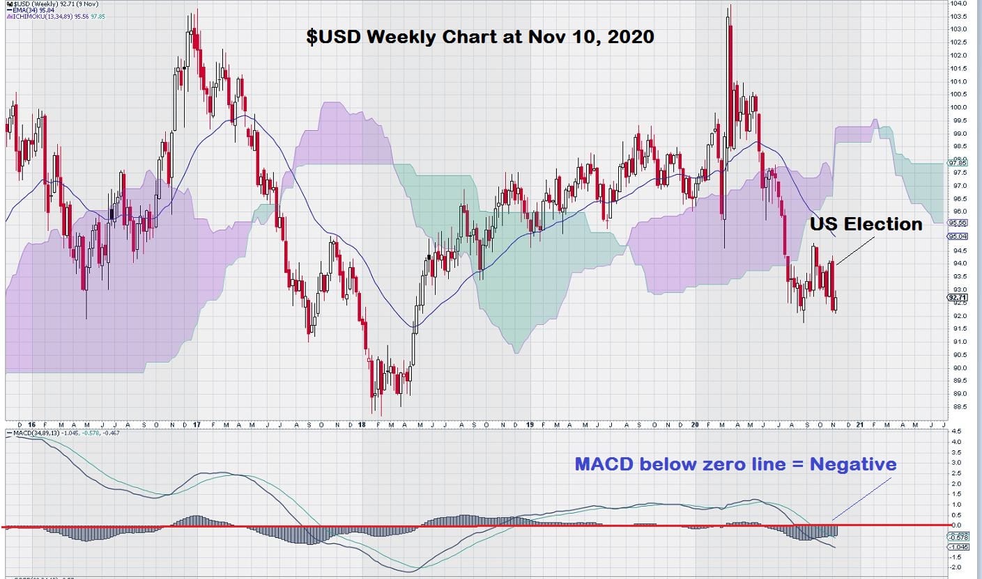
There is a lot more movement of the Ichimoku Cloud in the weekly chart for the $USD. We notice that the Cloud color is changing more frequently than the gold chart and the silver chart. This is caused by changes in price within a fairly narrow range. The Ichimoku Cloud highlights the changing exponential moving averages plotted forward in time. So, the up and down moves within a narrow range result in this pattern.
Let’s now take a look at the weekly chart for the $USD today:
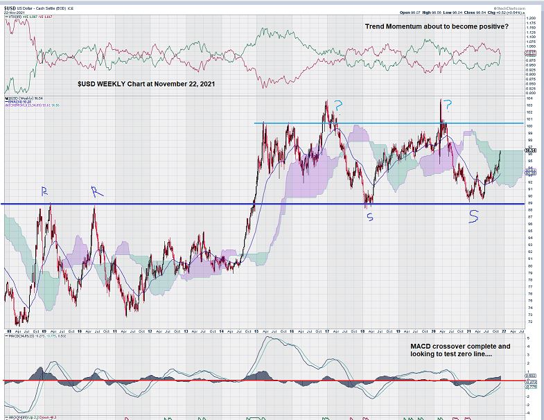
The weekly chart for the $USD shows that MACD is improving. The signal line crossed over the trigger line, and both appear ready to test the zero line. The chart tells us that significant improvement in the chart only comes when MACD is positive and above the zero line.
In some ways, the $USD weekly chart is similar to the silver weekly chart; both the $USD and Silver appear range-bound.
Silver has defined a trading range between $22 – $28, and the $USD trades between $0.89 and $1.01, although it has had two unsuccessful break-outs above the top of its range.
US Dollar Chart Analysis Summary
Despite all the noise, such as the FED Chairman re-appointment, political driven budget debates, and other such “distractions,” the $USD remains range-bound.
We have made the “tap-tap-tap” – break-out – case for several equities in our educational segment. Did the $USD “fail” to break out at the start of 2020? This question remains unanswered. The current condition of the chart makes one think that another test of the overhead resistance at the $1.01 level could happen next year.
The other possibility is that MACD will “roll over,” become negative, fall below the zero line, and re-test support at $0.89.
In summary, the $USD chart is not giving up any hints as to what is in store for 2022. Currently, the $USD is trading in the “middle” of its range. Bulls and Bears are at a temporary standstill.
– John Top, the technical trader
Disclosure: We are long gold and silver, including some stocks.