


Today, we undertake a multi-decade review of the NASDAQ Composite Index through our NASDAQ chart analysis. So much has been made of technology that we thought it would be helpful to present an overview.
Here is a 25-year weekly chart for the “tech-heavy” NASDAQ Composite Index:
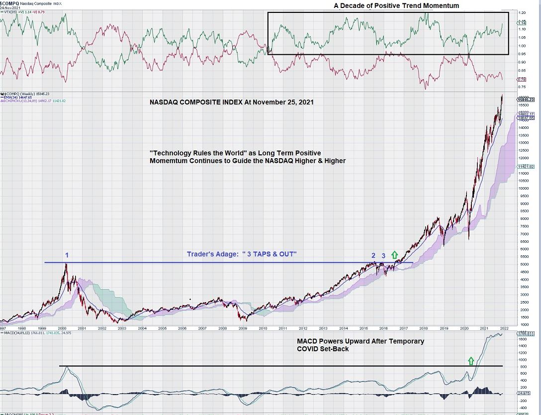
This chart illustrates two trader’s adages:
(1) “3 Taps & Out” and…
(2) “A Trend in Place Tends to Stay in Place Until It Ends.”
NASDAQ Chart Analysis
It is very clear that the NASDAQ needed to test the 5,000 level 3 times before finally breaking through in 2016. A long period of sustained positive momentum (with a small, temporary set-back due to the global economic impact of COVID) then powered the NASDAQ to new all-time highs over 15,000.
During the past 5 or 6 years, technology has become “the only game in town.” Surging positive momentum and a widely held belief that “buying the dips” would continue to be a winning strategy kept the NASDAQ well supported, especially after any brief relapses.
In the future, a series of successive weekly closes below the Ichimoku Cloud could provide a lethal blow to the NASDAQ. However, this remains a very remote possibility in the near term.
Will Eventual Rising Interest Rates De-Rail Technology Sector?
The well-worn phrases of “quantitative easing” and “COVID relief package” have given way to a term that the older generation knows very well: “inflation.” Former FED Chairman, Paul Volker, is credited with finally taming the “uncontrollable financial beast” with interest rates that peaked at 20% in the 1980s. The economic landscape became littered with the corpses of institutional and private debtors who were crushed by what became known as “stagflation” – strong inflation coupled with a slowing economy.
The question weighing on the minds of tech investors is one that has been asked many times before: “Is this time different?”
Perhaps the old rules of financial assessment leading to share purchases, earnings increases or debt reduction, etc., don’t apply.
And in our NASDAQ chart analysis, the weekly chart shows us what happens when companies can embark on long-term share buy-backs using their own cash or cash borrowed at historically low rates. Ever-shrinking public floats push the share price in only one direction.
In the past, market capitalization expansion was a reflection of investors rewarding companies that are expanding their businesses through innovation coupled with sound management practices. This idea has given way to “financial engineering” by concerted efforts to diminish the number of shares available to buy.
In our view, momentum alone cannot continue to sustain investor appetite for technology companies. Although the sector has completed a robust and 10-year advance, much of this advance was “helped along” by a lack of alternative investment opportunities in fixed income assets. Recall this chart from a few weeks ago:
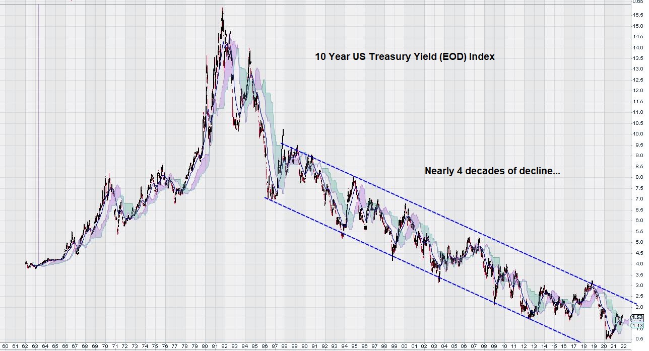
When one looks at the long-term weekly charts for both the NASDAQ and the 10 Year US Treasury Yield, the question,“Is this time different?” may become of high importance, especially if there is a reversal of the long-term downward trend in the 10 Year US Treasury Yield.
2022 has the potential to be a year of many changes…
– John Top, the technical trader