
Back in January, we could see that the Bitcoin weekly chart was starting to show signs of weakness. Bitcoin had made a new high in November 2021, closing for the week above $65,000. Then it began what looked like another correction back down to the $48,000 – $50,000 level, where it traded for about a month.
Bitcoin then proceeded to drop, and within three weeks, it had entered its Ichimoku Cloud and was testing support near the lower Ichimoku Cloud limits at the $38,000 level.
Last week’s trading lifted Bitcoin above its Ichimoku Cloud once again:
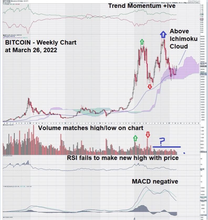
Let’s take a closer look at the weekly chart for Bitcoin.
In the first part of the chart, we see what we have seen many times before on our charts. Volume increases, price rises, MACD peaks and starts to weaken, and then volume increases once again as a new level of support defines a “low.” All of this chart action is typical of the ebb and flow of a market.
In the second part of the chart, we see something much different. Price rises sharply without any volume confirmation. MACD does cross over but remains somewhat weak and fails to re-establish itself, as it did in the previous rise in price.
Perhaps due to these factors, Bitcoin declined sharply to enter into its Ichimoku Cloud, where it found support at around $38,000.
Trend Momentum has remained positive throughout.
The weekly chart for Bitcoin does not have the same negative tone to it as it did over this past month; instead, price has risen to close the week above its Ichimoku Cloud.
MACD remains negative, and so does RSI when using “trend settings” to define time. MACD lags, but for there to be a cross-over, we need to see a “flattening” first.
Near term, this seems unlikely.
Something has really caught our eye on the weekly chart for Bitcoin. Do you see it too?
It is the curious lack of volume that accompanies both the rise and fall of Bitcoin since the middle of 2021. We follow Bitcoin more from a distance, and perhaps it is with that perspective that we can make these observations about the weekly chart that otherwise may be “hiding in plain sight.”
The way volume reacts to the move up and then down in the first part of the chart versus the second part is sharp and clear.
One might make the case that the Bitcoin market is highly controlled and that the move back up and then down again almost seems “manufactured.” Hopefully, this is not the case.
Summary and Wrap-up
Bitcoin has gained an advantage by now trading above its Ichimoku Cloud. We will continue to monitor this chart with great interest and provide observations, like the one that details our concerns related to “lack of volume” so that investors who are trading Bitcoin can gain additional trading insights.
Over time, charts create their own “personality,” reflecting the views and opinions of the shareholder base as a whole. The Bitcoin chart tells us that we may be dealing with a “split-personality.” Volume seems to matter until it doesn’t…
– John Top, the technical trader