
A Dishonest Dollar Continues Its Downward Slide
In 2014 Equedia readers responded to an article entitled “Forget Ebola, Worry About the Coconut Virus.” The article described many of the concerns of investors that were prevalent then and which have become even greater concerns today.
These include the actions of the Federal Reserve regarding interest rates, money creation, and inflation.
The discussion of inflation made the important distinction between monetary inflation versus true price inflation that results from an increase in aggregate demand.
To illustrate the detrimental impact of monetary inflation, the following table highlighted the comparison of the cost of goods against wages over time:
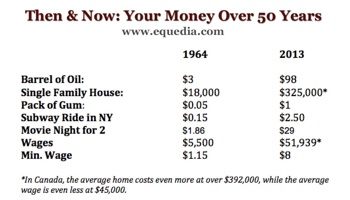
And the rising average cost of goods against wages in US dollars, in nominal terms?
In the last 50 years, oil prices have gone up 32x; housing 18x; pack of gum 20x; subway ride 16x; and movie night for two 15x.
The average annual and minimum wage increase? Eight times.
Welcome to modern slavery.
The latest US Census Bureau and US Department of Housing and Urban Development jointly announced that the average sales price for a new home was $443,200 in August 2021 and $405,400 in September 2021 – a substantial increase over the 2013 price of $325,000.
The price of oil is now over $80 per barrel, an NYC subway ride costs $2.75, and the Federal Minimum Wage is $7.25. It should be noted that a majority of the US States have a State Minimum Wage that is higher, with 17 US States paying over $10.00.
“Welcome To Modern Slavery.”
Here is a precise summary from the above note link:
“According to the Bureau of Labor Statistics, 247,000 workers were paid only $7.25 per hour in 2020. With an increase in the cost of goods and living expenses, living on $7.25 per hour can be challenging. Some workers must work multiple jobs to be able to afford rent and pay their bills.”
Low minimum wages, even the States with a Minimum Wage over $10.00, put the wage earner in an “economic limbo.” They are hampered on two levels. First, they can not save enough to establish a reasonable down payment for a home. Second, they would need the Minimum Wage to be in the range of 3 – 4 X the current rate just to qualify for a mortgage according to a common measure that requires the limits of debt to a formula based on 30% of income required for debt service.
The table that shows wages compared to the rising price of goods, including recent updates, clearly shows that wages are falling further and further behind the price of goods. Over the past few months, we have seen a greater public awareness of this condition brought about by media reports. The focus is on inflation.
Inflation today is a direct result of monetary policy.
The ever-expanding FED balance sheet continues to reflect the “Dishonest Dollar.”
Let’s see what a long-term monthly chart of the $USD has to reveal:
The monthly chart for the $USD shows a steady decline since inception, with a subsequent rise to 160 in 1985. Recall that the 30-year fixed rate for mortgages peaked at over 18% in 1981, and it remained at over 12% for most of 1985. This was the primary source of $USD strength during that period.
Now we see the monthly chart for the $USD expressing weakness. Trend momentum is negative and rising; MACD on “trend settings” shows the signal line below the trigger line and both lines falling towards the zero line. A simple trend line from the low in mid-2011 has been broken. The $USD is within its Ichimoku Cloud; so far, it has not broken below it. We continue to monitor this chart condition. Look at what happened to the $USD when it broke down below its Ichimoku Cloud twice in the past.
So how are some investors finding opportunity to take advantage of the expected “next wave of inflation?
One noted hedge fund manager, David Einhorn of Greenlight Capital, is focused on a US home building and land-development company while also preferring gold to cryptocurrencies as an inflation hedge.
Here is a summary of a recent CNBC interview that was reviewed by Seeking Alpha:
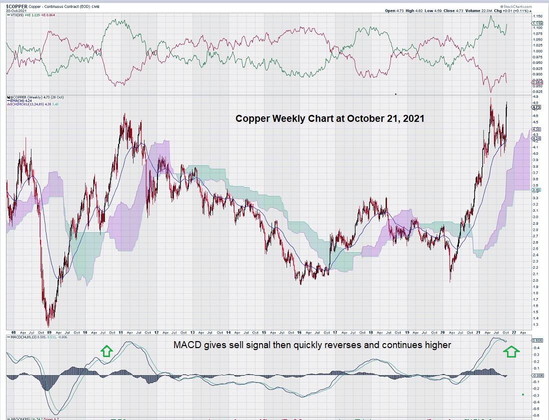
In addition to US homebuilders and gold, we continue to like the way copper is trading. On the monthly chart, it is making new, all-time highs. Here are some of our past articles and charts:
https://www.equedia.com/weekly-chart-for-copper-highlights-this-as-a-key-resistance-level/
https://www.equedia.com/copper-and-copper-stocks-chart-analysis-looking-for-a-breakout/
Our most recent interpretation of the weekly chart for copper a month ago, in September, was overly cautious. We saw that copper had risen strongly, without consolidating its gains, and was ready for a “rest.” However, this turned out not to be the case as copper made an abrupt turn-around and is heading higher into a new price range.
Here is an updated weekly copper chart showing a previous “head fake” on the chart and a subsequent rise:
Summary and Wrap-Up
A declining $USD does not mean a declining investment opportunity.
There is a strong case to be made for homebuilders, gold, copper, and the commodity sector in general. For example, copper is making new all-time highs on its monthly chart.
This is exciting and should help expose copper stocks to a wider range of investors.
Gold and gold stocks have weekly charts that still show a bias to the downside. We see good trading opportunities once MACD is in a more favorable position on the weekly chart. In the meantime, some of our past picks continue to improve their balance sheets after eliminating their debt.
The long-term monthly chart for the $USD seems to show an “interruption” due to COVID. The pandemic may have created a short-term “flight to safety,” which slowed the fall of the $USD for the past few years. As the global economy starts to re-establish itself, the monthly chart for the $USD appears ready to resume its decline toward the zero line. MACD now has a steeper decline for 2021 after remaining mostly flat for 2018 – 2020.
It follows that a declining $USD will help $GOLD breakthrough what some market followers have referred to as a “wall of resistance” at the $1800 level.
– John Top, the technical trader
Disclosure: We own gold, copper, and other resource stocks.