


Copper Continues to Reflect A “Back to Work World”
A couple of months ago, the longer-term chart for copper was highlighted in Educational Segment 010. We noted with great interest the similarity of the copper chart to that of the S & P TSX Global Gold Index.
https://www.equedia.com/weekly-chart-for-copper-highlights-this-as-a-key-resistance-level/
Let’s zero in on the period from 2008 onwards to see if we are any closer to becoming more bullish on copper and copper stocks.
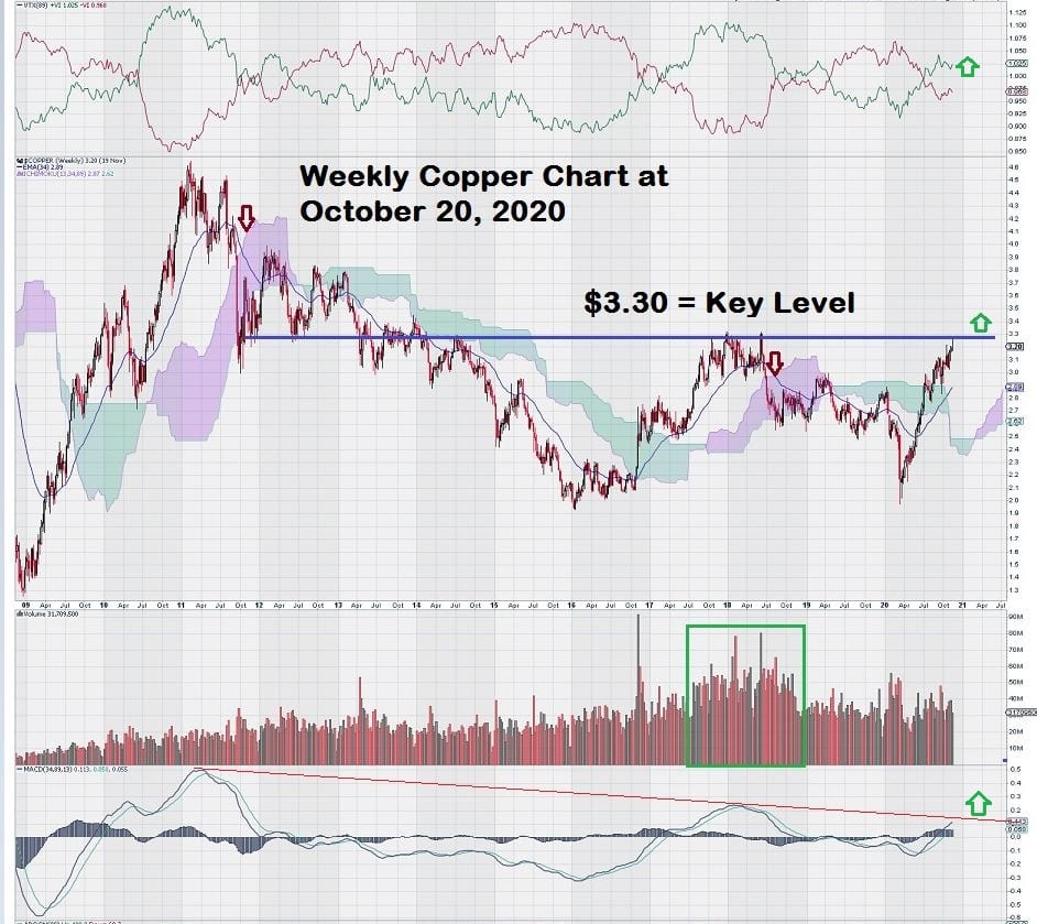
The weekly chart for copper shows consolidation for the past eight years below the well-defined chart resistance level of $3.30. Longer-term resistance levels that define key levels on charts need to be monitored.
As the saying goes: “Timing is Everything.” Paying attention to charts makes sense, especially if you can match the technical aspects of them to fundamental analysis.
Our view is that, despite all the “noise” generated by the global media, one thing is ringing loud and clear: The world wants to, actually, needs to get back to work. That is what the weekly copper chart is indicating.
So how will we know when it is “safe” to getting investment exposure to copper-related equities?
The way we look at charts gives us the best solution to that question.
For example, one of our charting “rules” is to define key levels – for copper, it’s $3.30 – and then wait for breakouts to be confirmed by 2 or 3 consecutive closes above it, preferably with the second or third weekly candlestick stronger than the first.
A little bit of basic candlestick charting knowledge can only help most investors.
It is not necessary to become immersed in the technical aspects of understanding charts, but an overview can be useful.
For those who want to have an informative read over Christmas, we recommend that Santa bring you a book entitled: “Japanese Candlestick Charting Techniques” by Steve Nison.
Let’s go back and closely study this week’s copper chart in more detail.
Two aspects of the chart immediately catch our eye.
First, Trend Momentum is positive and trending higher.
Second, MACD is positive and has crossed the zero-line. These two chart indicators, when combined, are enough on their own to make a bullish case.
But wait, it gets even better.
The long-term downtrend line drawn on the MACD indicator shows that it has almost broken to the upside. It is positive that we can be at this particular point on the chart because a breakout to the upside would take into account the past eight years of weekly data.
Another key feature of this chart is the volume of copper contracts that are traded.
So far, we have not seen volume increase to levels that were seen back in the period from mid-2017 to mid-2018. We sense that further increases in volume could be price positive for copper moving forward.
Now, betting on copper alone isn’t too exciting. The real upside for copper, as always, remain in copper stocks.
So how has the rise in the price of copper translated into share performance for copper stocks?
Let’s take a look at a few copper companies and see what their charts tell us.
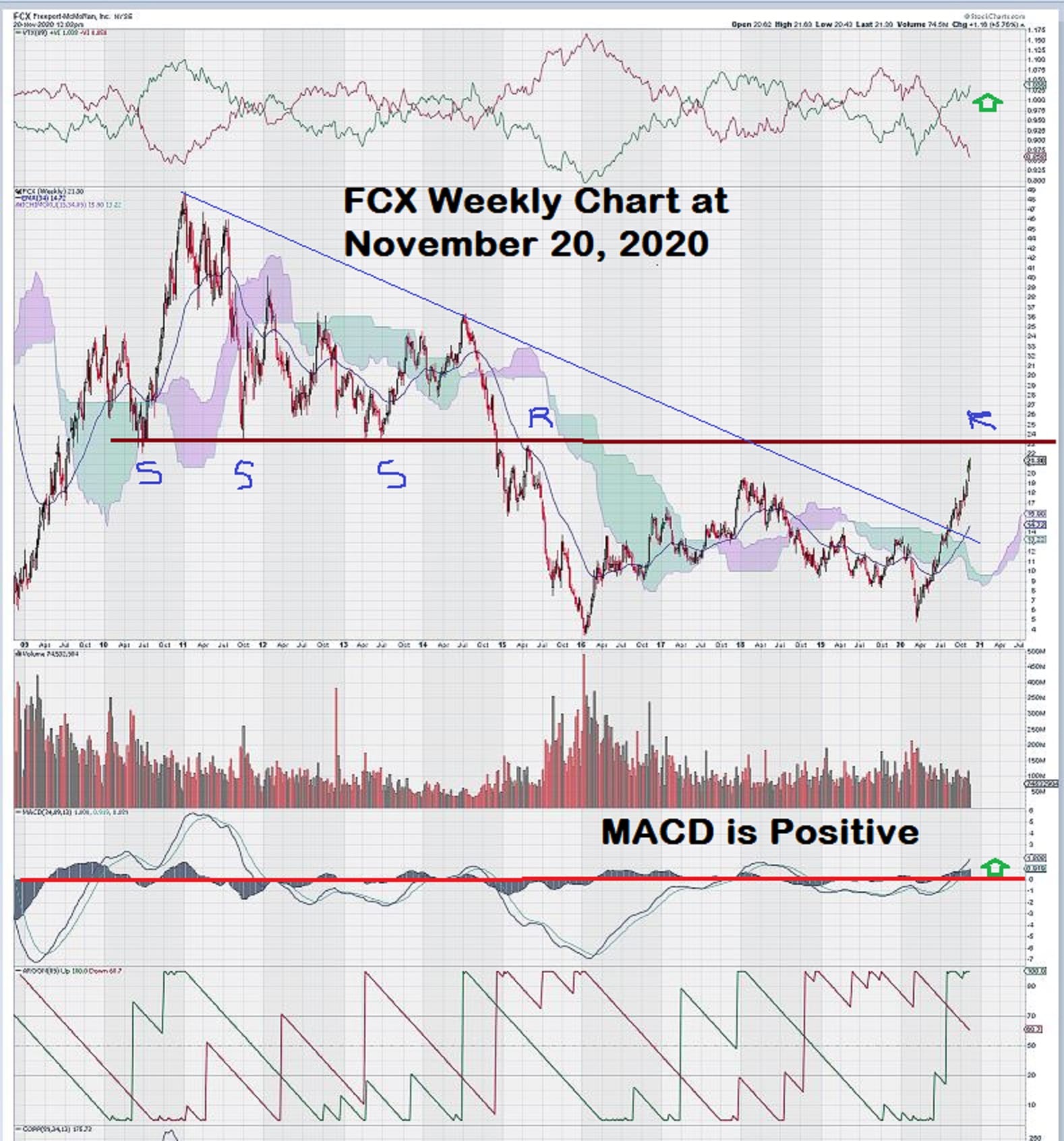
FCX.N (Freeport McMoran Inc.) is a global leader in copper production with operations in North and South America and Indonesia. The company is transitioning from open-pit to underground operations at its spectacular Grasberg copper/gold mine. Grasberg is the largest gold mine in the world and, simultaneously, the second-largest copper mine.
FCX.N is widely followed and is a good proxy for investor interest in copper-related stocks.
The weekly chart starts out the same as what we have seen for the S & P TSX Global Gold Index and the weekly Copper chart, but then it changes.
Note that the support level of $23 during mid-2011 to mid-2013 becomes future resistance as shown. However, the stock failed to reach this level in 2018, recovering to $19 before once again retreating lower.
The power downtrend line broke to the upside in August 2020, and, predictably, after such a long decline, the shares made a nice move up from $14 to $21. At the time of this writing, FCX.N trades at $21.30.
There is no doubt that the $23 level for FCX.N is resistance. Two or three weekly closes above this level with stronger candlesticks and/or increasing volume are needed to confirm the breakout.
In summary, FCX.N will offer good exposure to a rising price of copper and to expected increases in mine production. Copper and FCX.N will be excellent leading indicators to determine how the world views its industrial future from a post-pandemic viewpoint.
Next, we review the chart for Southern Copper (SCCO.N).
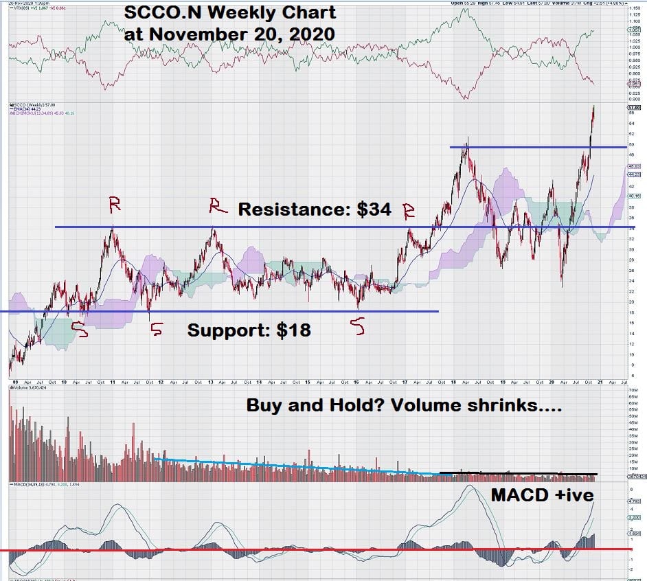
Well, this is a surprise. This chart looks nothing like the ones we have been looking at and comparing to each other. Why is the stock performance so different?
A quick search provides the answer….Southern Copper is a “captive” subsidiary of Mexican mining giant Grupo Mexico. Grupo Mexico holds almost 90% of the shares, thus muting the volatility resulting from movements in the commodity markets that took place from 2011 to 2017. And, we have looked at countless charts, the volume bars on this one are truly outstanding.
Our chart comment about “Buy and Hold?” was made before discovering such strong share ownership concentrated in a single shareholder.
Charts really do tell their own story….interpreting that story is what technical analysis is all about.
Now we will take a look at a chart for a well-known name in the copper space, First Quantum Minerals (FM.TO).
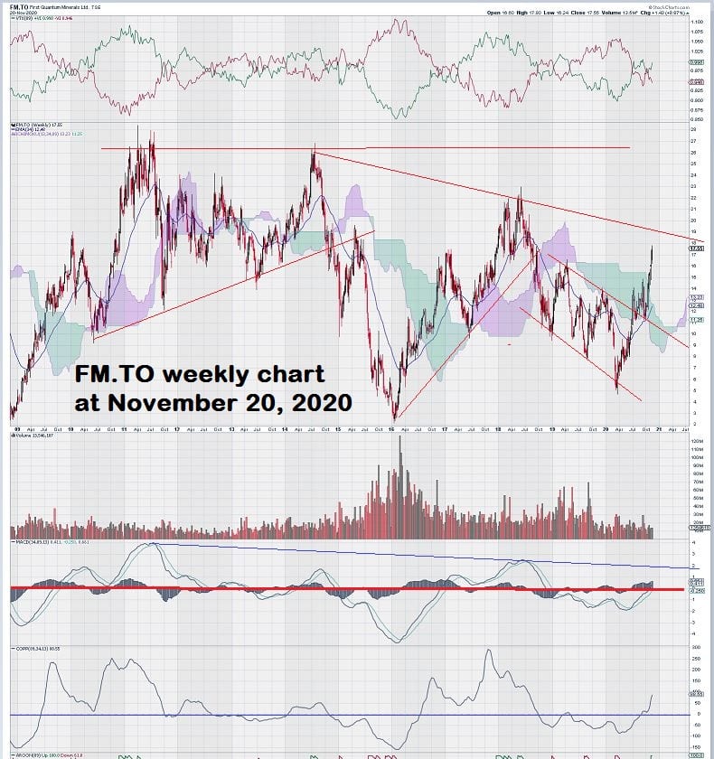
The weekly chart for FM.TO is a “trader’s dream”— lots of action, big price swings, and high volatility. So, where to start our analysis?
First, we note that FM.TO and FCX.N both “re-set” their respective lows of 2008 at the end of 2015/start of 2016. Do you remember how “short-lived” the small rally was at that time? 2016 began with the “flipping of a switch” compared to 2015. Commodity markets made sudden and sharp turnarounds, and commodity-related equities made stellar gains in Q1/Q2 of 2016.
By mid-2018, resource markets were starting to feel heavy again and turned back down.
What is worth taking note of for the weekly chart of FM.TO is that MACD is just about to cross the zero-line. This is positive when combined with the trend-momentum indicator above the price chart, which is also positive.
For active traders, as opposed to patient investors who may want to “scale” into copper stocks as the market starts to look forward to renewed “synchronous global growth” – FM.TO is an ideal candidate.
A suggestion worth strong consideration is to find settings on daily charts for Williams %R and Slow Stochastics that will help provide trade signals. These indicators are ideal to use in “choppy” markets.
Let’s move away from the large-cap copper stocks and see how the mid-caps are looking now that the copper price is bumping up against our breakout threshold of $3.30.
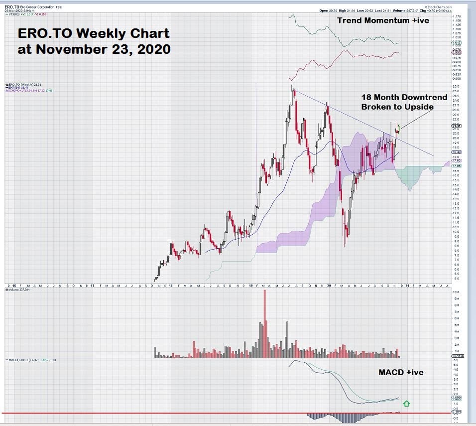
Here’s a look at ERO.T (Ero Copper Corp.), a mid-tier copper producer with operations in Brazil. The company has implemented a strategy that readers of EQUEDIA are familiar with and have seen before with Ivan’s pick of Calibre Mining (TSX:CXB), which has performed very well over the past year. Both companies recognized the value of “slack capacity” in an under-utilized mill.
Here is a direct summary from the ERO.T website:
“Ero’s business strategy is centered upon aggressively increasing the high-grade mineral reserves, extending mine life and maximizing mill throughput of the operations, leveraging the excess capacity of the installed infrastructure.”
This chart for ERO.T shows that the shares are held in strong hands. How do we know this?
Take a look at the most recent steep decline in price brought about by overall market concerns about the COVID virus. There was concentrated selling (the small clump of red volume bars in Feb/Mar of this year) that impacted the price. The strong recovery in price with very little volume to accompany it shows that the stock is in firm hands.
Now let’s take a look at another chart for mid-cap miner Lundin Mining Corp. (LUN.TO).
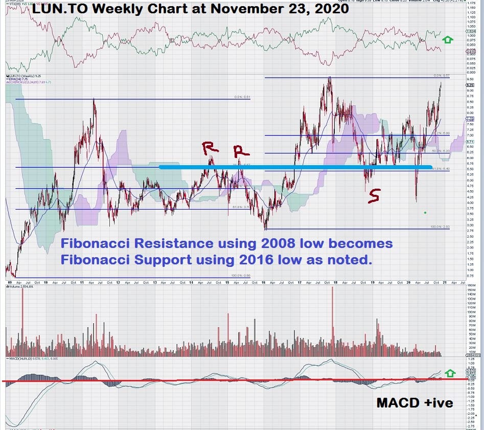
Notice how we continually look back to the lows of 2008 and use that as a starting point for how we see each of the companies’ share performance as reflected by these weekly charts.
Does this chart jog your memory?
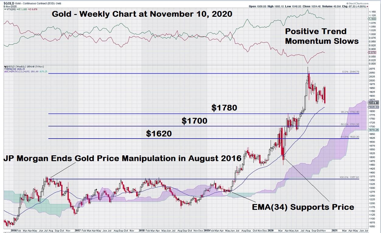
Remember, about a month ago, we took a close look at the weekly chart for gold. Our focus was the Fibonacci retracement levels derived by using 2008 as a starting point.
Here is the gold chart as a reminder….
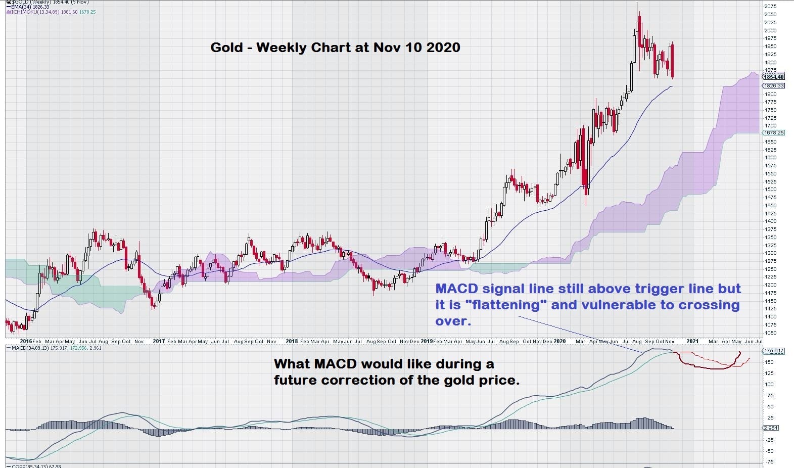
These two charts look very much the same in the sense that there was a low in 2008, then a high in 2011, and then a period of price consolidation more or less as expected within the bounds of the Fibonacci retracement levels. Gold stretched out its breakout level once the intermediate low in 2015 was reached. LUN.TO made a sharper breakout from the end of 2015 intermediate low.
LUN.TO is most interesting as it appears that a resistance level derived from one Fibonacci study (2008) becomes support for a second (2016) group of Fibonacci retracement levels. This is shown by the thick blue line on the LUN.TO weekly chart.
This chart clearly shows that LUN.TO is on the way to a re-test of its previous high of $9.50.
When making this statement, we must keep in mind that before these various copper stocks start to head higher and are in “blue sky territory” on their respective charts, copper must first establish that it has crossed the all-important technical level of $3.30. This event should give enough “fuel” for copper stocks to re-test and take-out their previous highs.
One more chart will round our outlook at the mid-cap base metal producers, with a copper focus. It is HBM.TO (Hudbay Minerals Inc.).
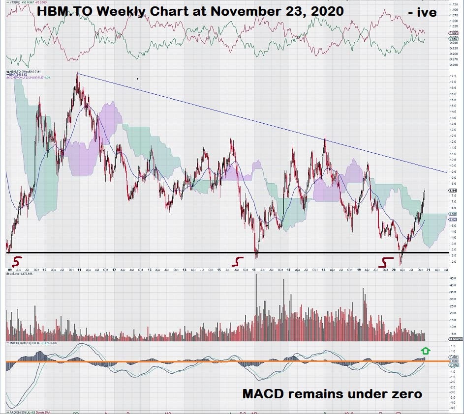
In sharp contrast to the other charts that we have been analyzing, something different is happening with HBM.TO.
We can see that the baseline low level of 2008 was once again tested earlier this year.
Some of the other charts show strength; this one tells us it is probably best to wait out the next few quarters to see if the price can at least get above its downtrend line. Note that in the indicator bar above the chart, reserved for Trend Momentum, we see that trend momentum has been negative for several years, and it remains negative today.
There is a bright spot with MACD: the signal line is above the trigger line, and both lines appear to be ready to cross the zero line. MACD must remain above the zero-line for there to be sustained chart strength to move price above the downtrend line.
Finally, we can check out some small-cap copper companies that have established trading profiles.
Let’s start by reviewing CS.TO (Capstone Mining Corp.) with operations in the southwestern USA and Mexico.
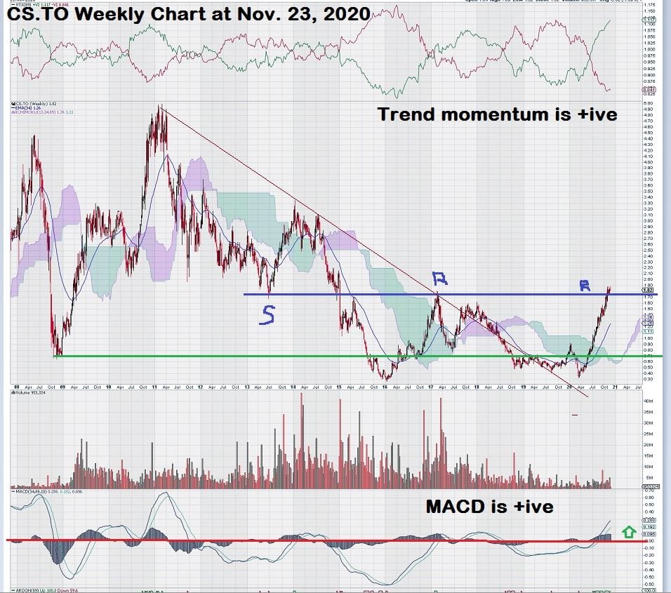
The CS.TO weekly chart shows that new lows were made post the 2008 period that defined the base level for most of the other copper companies we have examined so far.
Something immediately catches our eye. For the sake of clarity and lack of “clutter” on the chart, we have not drawn in a vertical line from the top indicator crossover, when Trend Momentum turns positive, down to the price chart for a signal. This occurs at the $0.80 level. Later, the signal is confirmed by a MACD crossover of the zero line move.
Let’s review the step in a sequence, starting with the way that the stock was consolidating through 2019, in a very tight box range, with little, if any, volatility. Then, a small break out at the start of 2020, only to be dashed by the “COVID correction” March/April. This is where the chart looks very good. Trend momentum begins to climb and become positive, followed by a break above the Ichimoku Cloud and finally confirmed by a MACD zero line crossover. All in all, a very instructive chart. One worth printing and saving for future reference when we see this pattern of trading in another company’s chart in the future.
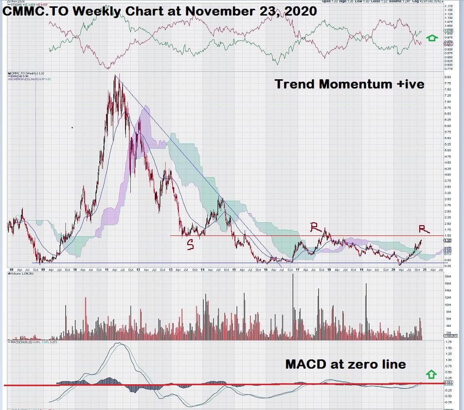
Let’s turn our attention to CMMC.TO (Copper Mountain Mining Corporation). This company has a mine in Canada and is looking to expand by advancing copper assets in Australia.
Did we save the best for last?
Perhaps so. Let’s get into it.
The chart for CMMC.TO has a lot going for it. Why do we say that?
Perhaps it is because of our very recent memory of what we have just seen in the previous char for CS.TO. These two chart set-ups are like “twins.”
The key level for CMMC.TO is easily identified. It is the internal support/resistance line that is defined by the $1.50 price level.
Notice that Trend Momentum has turned positive and that price is responding to it. Also, see that the signal line is above the trigger line for MACD, and both lines appear to be crossing at the zero-line. This is, in and of itself, a positive signal.
A good trade strategy would be to enter a 1/3 position now. Copper may bounce down off of its $3.30 level, but it has an equal chance of a break out over the next few quarters. Here again, we can see that another 1/3 position could be added on the sooner of a break above the $1.50 level or a copper price above $3.30.
Either way, the remaining 1/3 could then be purchased on the second of these two events materializing.
This chart has all the attributes of a winning trade.
The levels are clear and easy to read. The copper chart has a defined break out level. And, let’s not forget fundamentals. The consumers of the world are primed to buy as soon as their freedom to move about is restored.
We also took a quick look at two other small-cap stocks, TKO.TO and MIN.TO. TKO.TO has a chart similar to HBM.TO.
I must admit a small bias toward MIN.TO for two simple reasons.
The first is that I have extensive past experience in the field of gold leaching, where a family-owned company acted as a general contractor to design, build and install pilot heap leach plants in the southwestern USA during the period of the mid-1970’s to mid-1980’s. This experience draws me to MIN.TO, as they are attempting to become a successful copper producer using “in-situ leaching” of a large copper deposit that literally lies beneath a major US Interstate Highway near Tucson, Arizona.
This is an interesting project, and we will continue to monitor it closely.
A second reason why MIN.TO is on my radar screen is that I visited the property several years ago as part of a group of investors that attended an investment conference held in Scottsdale, Arizona. There is nothing like a field visit to help put a project into an investment perspective.
We may revisit MIN.TO in the very near future.
Summary & Wrap Up
We have looked at companies in the copper space, and there are lots to like. On the whole, many of these charts are expressing a true optimistic future outlook. Senior companies, FCX and SCC, have positive chart patterns. Mid-cap companies ERO and LUN also have a positive bias to their charts, as well. On the small-cap side, it sure looks like we may have found ourselves a very promising trade-set up in CS and CMMC.
-John Top
**************************************************************************
Brief comments on gold:
We see that gold has weakened somewhat over the past few days. Our sense is that, barring any surprises, gold can continue to drift lower and find a place where it wants to trade. Recall that we have already identified levels of support beneath the market in this chart:
And here is what we could expect to see in the months ahead:
Disclosure: CXB is an advertiser and Equedia and its director owns shares and options.