


Trend MACD Crossovers – Worth the Wait
(Chart Educational Segment 002)
You will recall in chart educational segment 001, we took an in depth look at the weekly chart for gold. Our expectation is for the MACD signal line to dip below the trigger line and then re-cross it later next year. This will be our buy signal based on trend settings. So let’s look at an example where this has just happened.
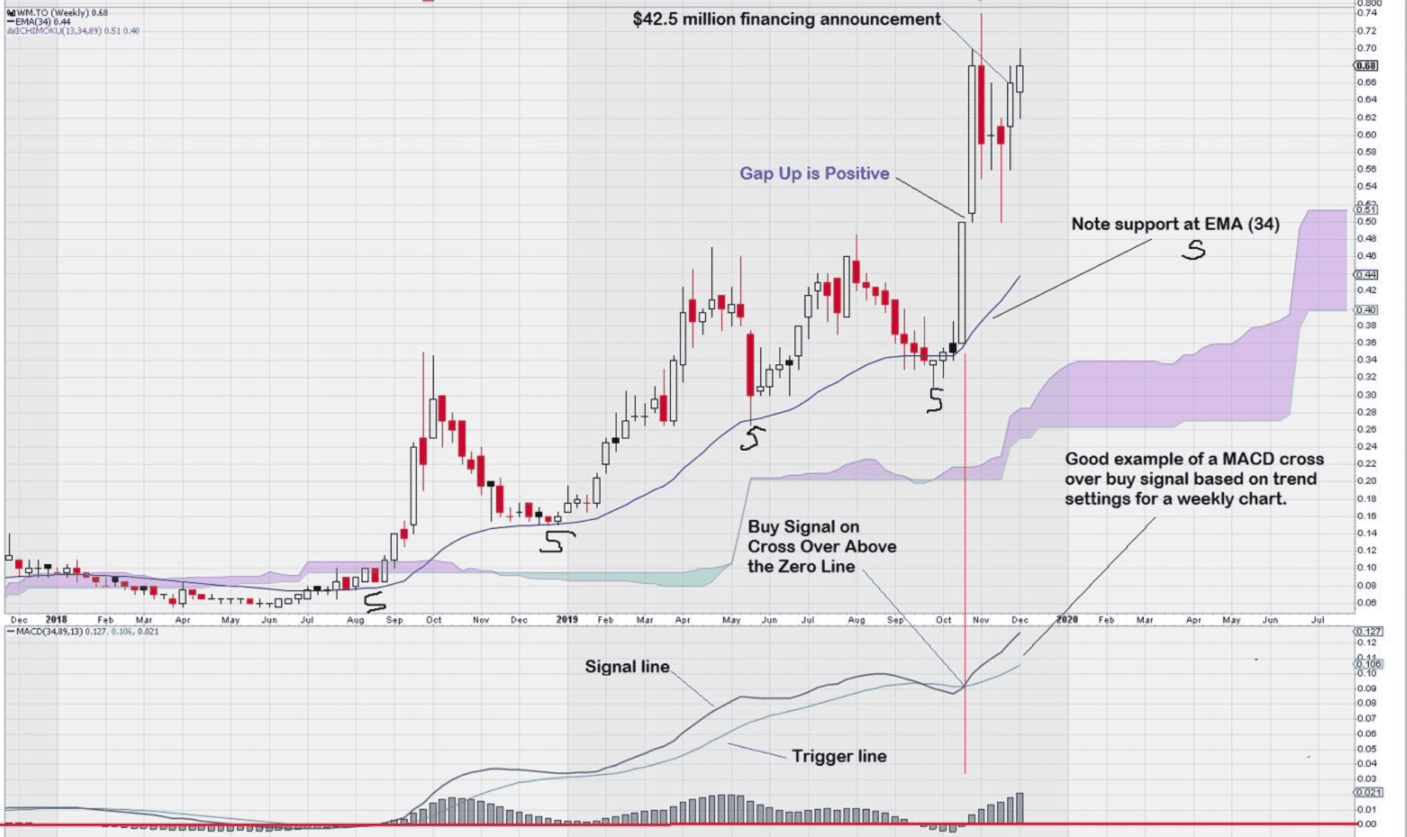
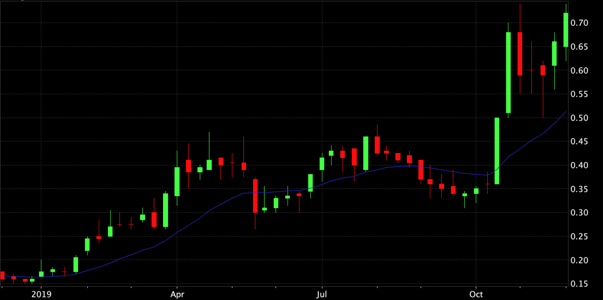
Here is an example of a very strong chart. The company is Wallbridge Mining (TSX: WM) and it just closed a $42.5 million financing – rumour has it that a large portion went to a big gold miner.
As with the weekly gold chart, we notice a consistent pattern of higher lows that underpins the advance of this chart. Note with interest that EMA (34) has been acting as support since July, 2018.
More importantly we can plainly see that the MACD cross over took place well above the zero line. This would have been a good entry point for this stock for traders who were watching (and waiting) for a spot to take a position. MACD had been steady for the past year – the signal line has remained above the trigger line for over a year, not allowing a trade signal to be generated. Then, finally the signal line crossed below the trigger line in mid-September, 2019. One month later, in mid-October, the MACD buy signal based on a cross over up of the signal line over the trigger line was noted.
The strength of the next two weeks of trading based on the tall white candles with short upper and lower shadows is impressive. Also, a small gap up is noted. Gaps up are positive signs in a stock chart.
One could easily surmise that a very positive fundamental change has taken place. Recognition of this change is confirmed with the completion of a large $42.5 million financing at a time when it still not an easy task to supply exploration funds to gold exploration companies.
We will continue to monitor this chart in the months ahead to see how well it performs in the future. A weekly close above the two prior closing price levels; both at $0.68 would be constructive for further price advance.
We remain very patient in our observation of the weekly gold chart which has a similar pattern to this chart – a consistent pattern of higher lows underpinning its advance. MACD appears to be rolling over and we await a cross over to the downside; followed by a reversal and a positive cross over to the upside. This is our expectation for the way in which we see gold trading in the first half of 2020.
One final comment, note that there was a small gap up on the weekly chart for gold at the $1400 level between two white candles. The gap was filled within two weeks and gold continued to advance.
*******************************************************************************
Note to readers: Various charts will be used in these educational segments, including individual equities. The intent of highlighting these charts is solely for educational purposes. It is not our objective to compile a list of “stock picks” based on chart patterns or observations made in connection with a particular chart.


Thank You.