What a Technical Analyst Sees in a Gold Chart
Chart Educational Segment 001
One of the keys to being able to correctly observe a stock chart is to create some distance between you and it. This is why I tend to leave about 4 – 6 weeks between looking at the weekly charts. Only one new data point is added each week.
So today, I took a “fresh look” at the weekly chart for gold. Several aspects of the chart caught my attention and this is what we will review today. The idea behind this chart is to invite you into my evaluation process so that you can see how the chart observations take form.
Lets get started.
First we will look at the weekly chart for gold that is not yet marked up.
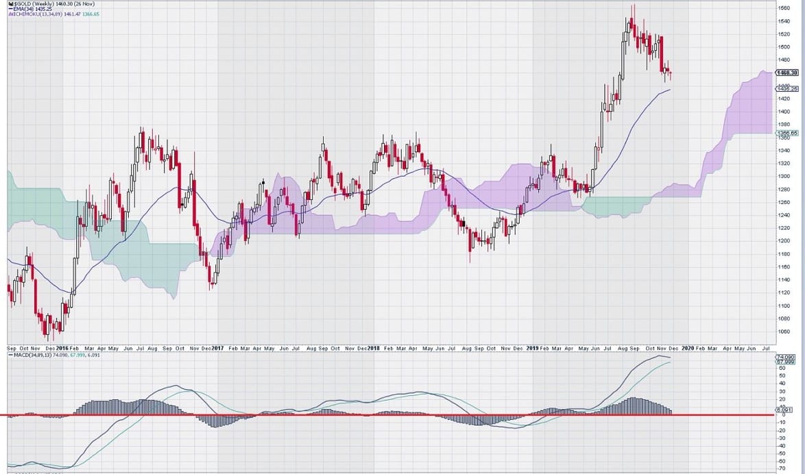
A very basic “first look” shows a positive pattern of price advance followed by retracement to a “higher low”.
So let’s look at this pattern a little more closely to see what else is going on.
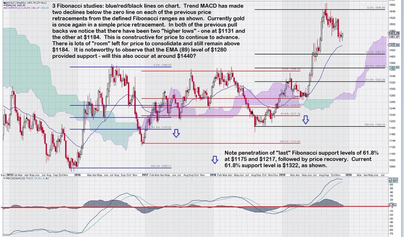
Further investigation of the price chart using Fibonacci studies to see where price recovers shows that in both cases this was at a level slightly below the “last” Fibonacci level of 61.8%. See blue arrows on chart. I find this interesting because it shows that despite “breaking down on the charts” gold actually had a 1 – 2 month “head fake”; twice! Remember we are looking at a weekly chart.
Lets take a very in-depth look at MACD on trend settings to see what to expect in the future.
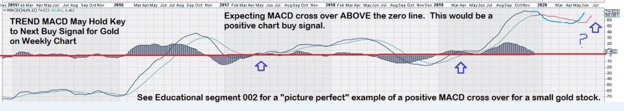
As shown, in both cases where the blue arrows are near the zero line, the signal line for MACD crosses over the trigger at the zero line or below it. Afterwards, both the signal lines and the trigger lines continue up over the zero line and continue to rise in lock-step. This is a positive chart condition. It remains intact until the signal line crosses below the trigger line, thus confirming that a retracement is underway.
In the case of the solid blue arrow, two outcomes are possible. One, the signal line, which is currently above the trigger line, dips lower but does not cross it. Two, the signal line continues downward and crosses below the trigger line.
Outcome No. 1
There is a possibility that the signal line for MACD will NOT cross over its trigger line, as we expect, but rather both the signal line and trigger line for MACD will turn back up and continue to rise. If this were to happen then our buy signal would be when the gold price rises above its previous interim high of $1545 on a weekly closing basis. Again, there is more waiting.
We like to see at least two weeks where the closing price is above $1545, with a “better candlestick” for the second week. (In the future we will have some examples of how to interpret candlestick charts. I suggest interested readers consider a book by Steve Nison – Japanese Candlestick Charting Techniques.)
Outcome No. 2
Alternatively, the second possibility is that the signal line (shown as the hand drawn green line at the right hand edge of the chart) continues its downward path and crosses over its trigger line (shown as the hand drawn red line).
Note that this has NOT occurred but is an expected outcome. There is no specific “time horizon” contemplated – we are content to monitor the slow progress of MACD, with each passing week. This is the one aspect of using charts effectively that investors have the most difficulty with; the expected outcomes for our analysis of the gold price are set. Who has the patience to sit and wait and “watch paint dry”? Not too many hands go up when that question is asked….but….this is exactly what is required.
Our patience may one day be rewarded with a strong, reliable trend based signal when MACD’s signal line crosses over its signal line from below. On our outcome 2 example this signal occurs when the green line re-crosses the red line from below it.
In summary, for our trend based buy signal to occur from this point in time we need to see two events. First, our MACD signal line must cross below its trigger line. Second, our MACD signal line must then re-cross its trigger line from below. We would prefer to see this occur at a price level above $1350 which was the previous interim high.
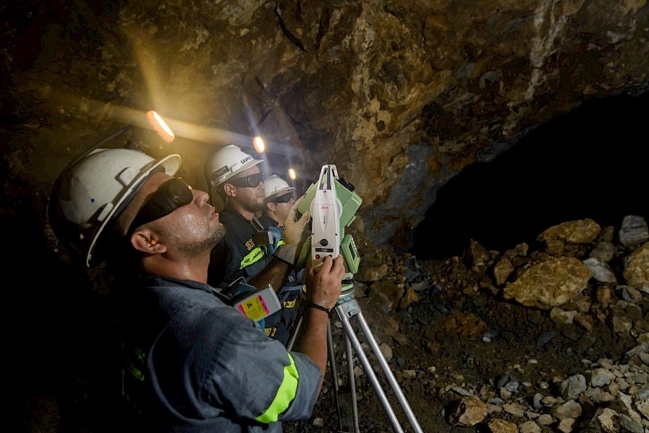
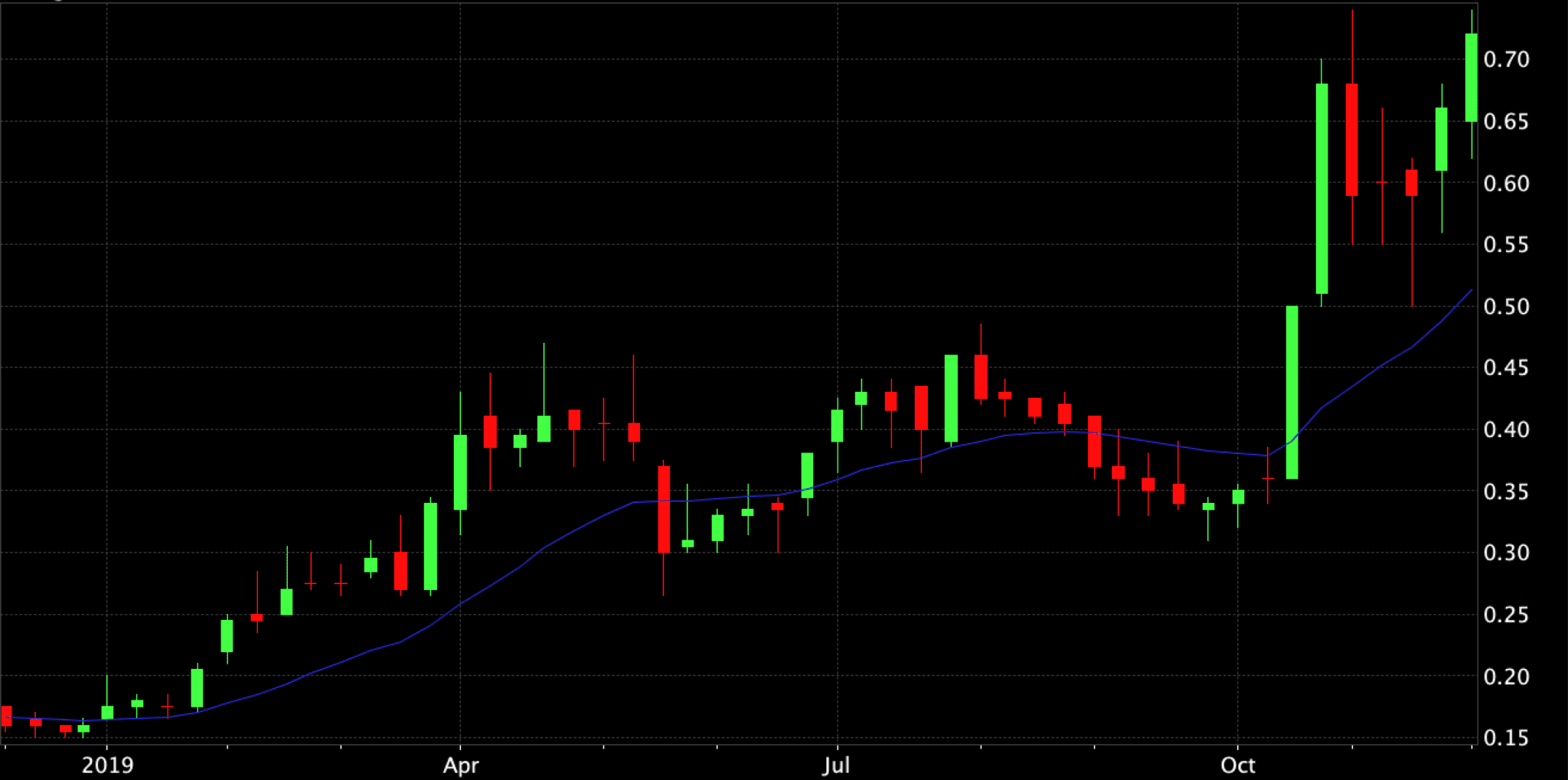
In Chart Educational Segment 002 we will see a recent example of a positive MACD crossover for a small gold exploration company that recently received a significant sponsorship boost via a $42.5 million private placement financing. This company has made a new gold discovery on what appears to be a splay off of a major fault structure that is a known conduit for gold bearing fluids. Obviously the discovery has garnered attention in the “right places”!
The next part of this series can be found here: https://www.equedia.com/how-to-read-stock-charts-trend-macd-crossovers/
– John Toporowski