

Sometimes Simple Really is Better – A Lesson in Charting
(Educational Segment 015)
Have you ever been at the race track, having just lost a bet, when the guy beside you says: “That was easy” – as he walks away to cash a winning ticket? Then you look at your losing ticket and wonder what happened.
It is an all too familiar scene played out over and over again.
So, let’s step back for a moment and try to analyze the situation.
How can two people with the same information (Daily Racing Form) come to vastly different conclusions about a future outcome?
Well, it’s a simple matter of interpretation.
Which brings us to the topic of today’s Educational Segment: A Lesson in Charting.
As most of the regular Equedia readers know, our primary focus is to identify trends correctly. That is why we like to use weekly charts, not daily ones. That is why we like to look at charts that show a long period of hibernation – we have the correct technical tools to let us know when there is a material change that starts to become reflected by the price.
That is also why we don’t get too excited by price breakouts when they do occur. We want to see other forms of confirmation: volume/position of various indicators relative to the zero line/and, of course, we must see positive trend momentum.
There it is.
We have the same information as everyone else, but we have our own way of interpreting it, just like the fellow at the racetrack.
Now that we have set the stage, so to speak, let’s take a look at a chart that caught our eye today.
It is the daily, not weekly, chart for Excelsior Mining (TSX: MIN) (OTC: EXMGF)
You remember that MIN.TO was reviewed in early January of 2020; we liked the way the weekly chart was behaving and wrote about how the share looked like they were on their way to test $1.45. Then COVID concerns hit the market, and the shares retreated significantly, trading down to around the $0.50 level.
Post the COVID market “shock,” MIN.TO has been rapidly recapturing lost ground.
Now it has once again reached a key resistance level at $1.10.
So – what happens next?
For a much closer look, we decided to check out the daily chart for MIN.TO to look for clues as to how the stock has been trading lately.
Here is what we found:
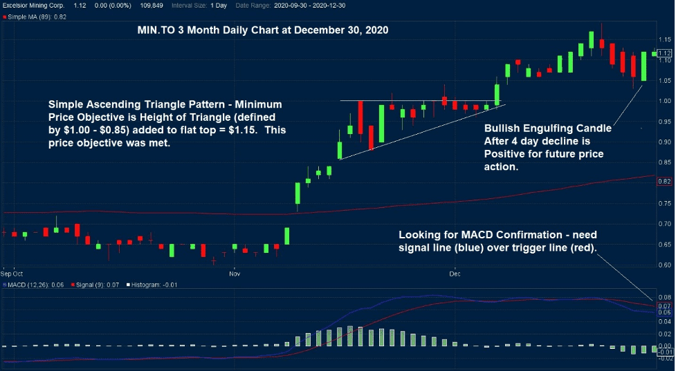
MIN.TO has formed a Bullish Engulfing Candlestick on December 29, 2020. This is positive. Although MACD is not yet properly aligned because the signal line still remains below the trigger line, both lines are well above the zero line, which is positive.
The daily chart for MIN.TO is a good example of how not to over complicate the interpretation of a stock chart. Simple is best. The small ascending triangle pattern formed on the daily chart – it defined a minimum price objective, and the minimum price objective ($1.15) was met.
MIN.TO is at an interesting spot on the chart. It is pushing up against a well-defined resistance level. Switching back to the discussion of the weekly chart, nothing has changed for us; we want to see at least two consecutive weekly closes above $1.10 and prefer to see a “better” second-week candlestick. Trend momentum is positive on the weekly chart, and it may help bring MACD up and over the zero line.
Summary & Wrap Up
We see positive indications on the daily chart for MIN.TO that will take time to be reflected in the weekly chart. The shares are at a key breakout level. We look for positive news from the company that will reassure investors that the vast copper resource that sits just below the surface can be profitably extracted using the in-situ leaching method.
Once this happens, a very positive re-rating will occur.
One gets the sense that institutional investors are just waiting in the wings for the green light to invest in size. The stock is ready, and the pump is primed – now management must deliver the goods.
-John Top.