Last December, we started to see increased daily volatility in a key market index: the Dow. We looked at a few daily charts and saw that 35,500 was emerging as a key level.
Now we shift our focus to the weekly chart and approach the recent trading in the Dow by a different measure. Instead of looking at horizontal support levels and noting how close MACD was to the zero line on the daily chart, we will focus on the EMA(34) and how it relates to the weekly candlesticks.
Here is the chart that we will be discussing:
Now let’s zero in on the weekly candlesticks in 2019/2020:
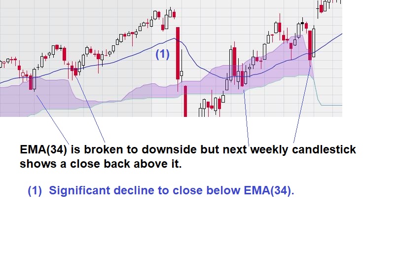
Here we can see that our choice of EMA(34) shows four instances when the Dow weekly chart “faltered” and then quickly recovered. Only once, when the close moved significantly away from the EMA(34), did a meaningful decline occur.
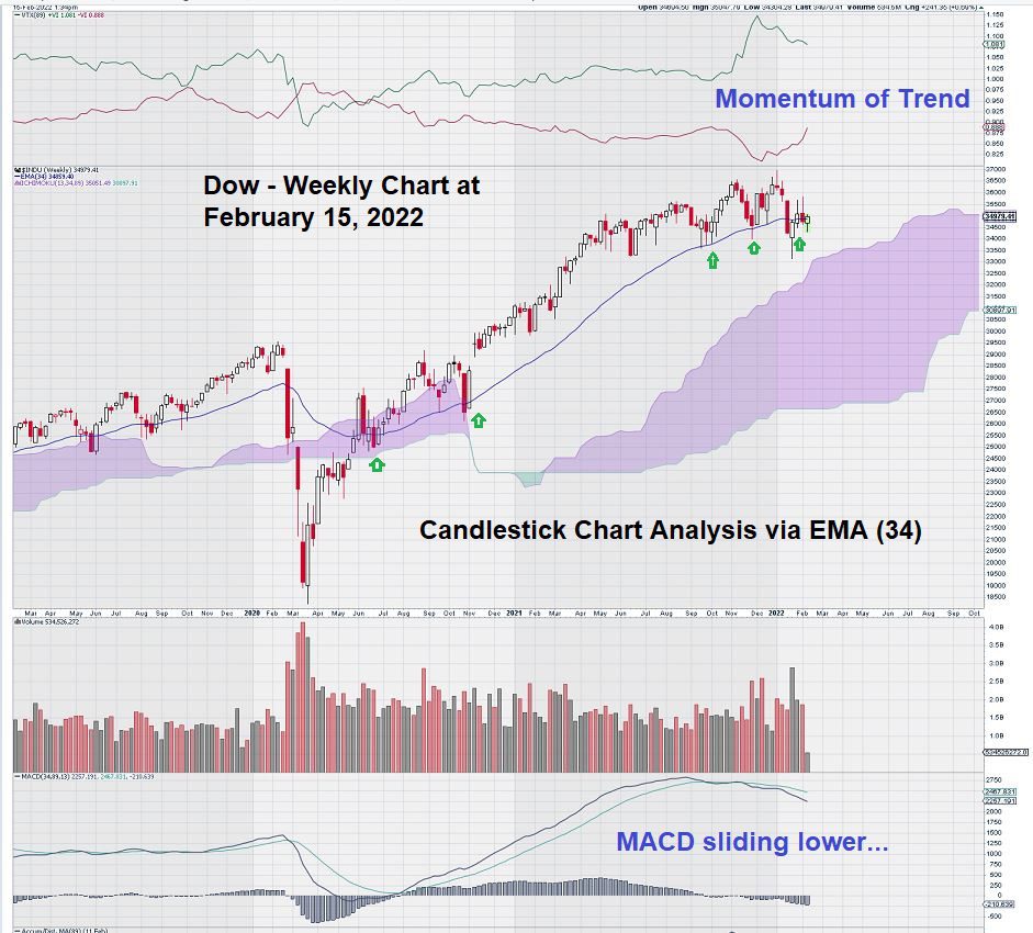
Here is a current weekly chart for Dow that shows that we should keep a close eye on the Friday close in the next several weeks:
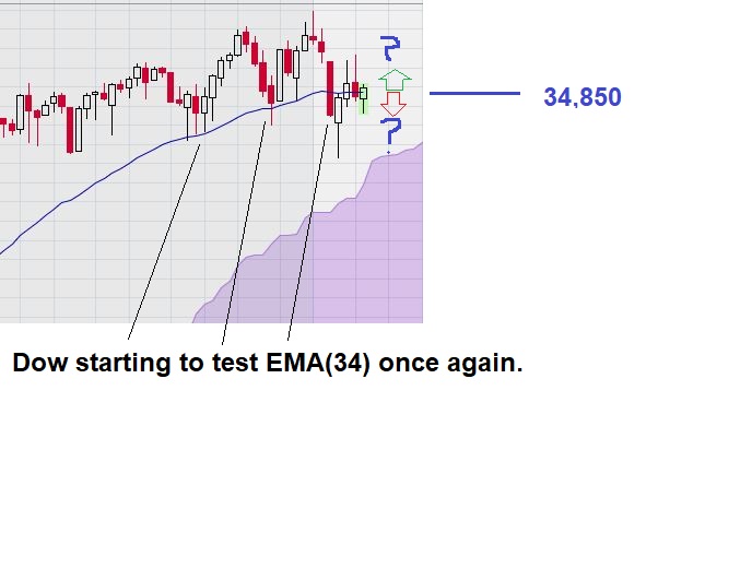
Last month, the Dow did close below its EMA(34), as noted on the chart. We saw this happen before in 2019/2020. In fact, 4 out 5 times, the Dow quickly recovered. Only once did it not.
Now we see that the DOW is basically “on the line,” and we are watching with great interest.
Summary & Wrap-Up
Active traders will not wait for the Dow to close below its EMA(34). They will decide, each to their own level of risk tolerance, what constitutes a “significant” decline below the EMA(34) and push the trade button.
One gets the impression that the steep one-week decline in FB maybe how the Dow will commence its next significant decline.
The up/down, up/down gyrations of the Dow in December as reflected on the daily charts may be a signal that investors have finally become a lot more “skittish.”
And finally, the small spinning top recorded six weeks ago has got us wondering if we are seeing an “evening star” that comes after a sustained upward rally – a rally that began in March 2020. MACD over the period would appear to give some further weight to this conclusion. MACD on the weekly chart is negative, with the signal line below the trigger line.
– John Top, the technical trader