


EQUEDIA readers have followed our continued interpretation of the daily DOW charts. This is a departure from our long-standing view that weekly charts are a much better guide for trend analysis.
Over the past month of trading, the daily candlestick charts for the DOW have clearly visualized the current market sentiment.
Uncertainty reigns supreme. We can see this on the various daily charts that show a collection of spinning tops. These candlesticks define indecision in a market.
Why are spinning tops important?
A spinning top has a small real body (in other words, the open and close for the day are nearly at the same level) that is coupled with a wide range of ups and downs for the day.
This means that, for a time, the bulls are pushing prices higher and yet are unable to sustain a price advance. Then, the bears take over, and inter-day selling takes prices lower.
However, like the bulls, they do not have the power to force a decline. At the end of the day, the market closes slightly above or below where it opened, despite having a wide range for the trading session.
Our most recent daily chart (December 12, 2021) highlights the spinning tops in the DOW for the past month.
Here is a weekly chart for the DOW that takes into account the uncertainty that we see on the daily charts:
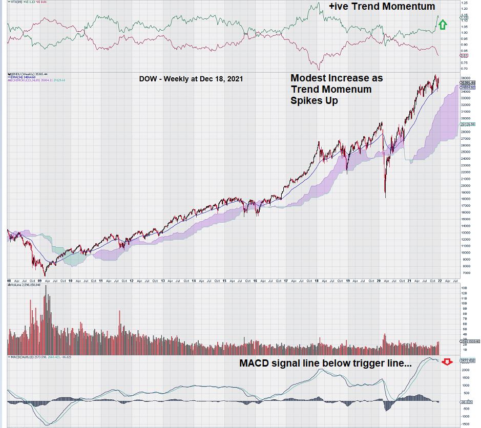
The weekly chart for the DOW now shows that MACD has flattened and that the signal line is below the trigger line. The level of the DOW still remains above its EMA (34), a level that has recently provided support at around 34,500.
It is noteworthy to see that despite a strong spike up in trend momentum, the DOW had a rather muted response. The new, all-time high in the DOW seemed to be a strongly fueled momentum push higher that had very little follow-up conviction.
This was illustrated by the weakness in the DOW on Friday, down 530 points to close at 35,365.
Recall that our most recent daily chart identified 35,500 as a key short-term level for the DOW.
Here is an updated daily chart for the DOW:

Since our last daily chart for the DOW, we now see another two spinning tops, two negative candles, and one positive one. Once again, the 35,500 level is prominent on the daily chart.
Virus Fears Spook Dow – Will COVID Ever End?
It does not matter if the fears for yet another COVID-19 virus mutation are real or imagined. There is enough uncertainty in the market to result in some very choppy trading that is, for the most part, “directionless.”
The weakness last Friday was not without conviction as it was accompanied by volume that was nearly twice the 10-day average volume.
The nature of these virus mutations really hits home on the financial market because informed decisions cannot be made until scientific data is available. This information may take several months to acquire*.
(*Ivan here. It is worth noting that the selling pressure may also stem from large insider sell orders from the likes of Musk, Bezos, and other billionaires. Their sell orders are out in the open, and hedge funds and pro traders know this. As such, these “pros” could be adding fuel to the fire, knowing that temporary selling pressures can be used as an opportunity to short stocks. It appears retail trading is still in full swing here trying to buy the dip, evidenced by the buying volume in the opening hours. As prices move higher from the “at-market” buys, a hallmark of retail traders, shorts pile in – knowing that these “at-market buys” will fizzle out.)
Daily candlestick charts are a great way to give visual proof that the degree of uncertainty remains very high. A “Minsky Moment” may occur when investors, in aggregate, decide that perhaps the best course of action is NOT to buy the dip but rather sell whatever brief rallies that materialize and which last only a day or two.
We know that if MACD, on trend settings, were to drop below the zero line on the daily chart, it would be another strong sign of caution. Also, as can be seen from the most recent daily chart for the DOW, the base of the Ichimoku Cloud has already been tested twice before and has held both times.
Another test of this key level is not beyond the reach of current trading.
– John Top, the technical trader