


Silver Chart Analysis
(Educational Segment 24)
Today we will look at silver through the lens of time, using monthly, weekly, and daily charts.
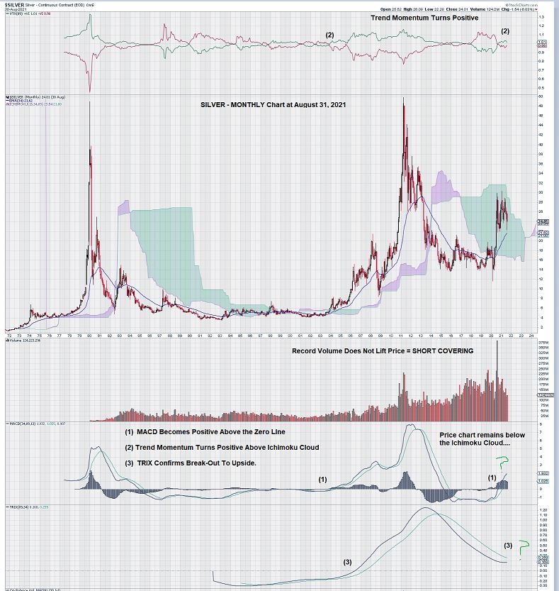
The monthly chart for silver shows the silver price within its Ichimoku Cloud. As can be seen by the two previous strong rallies to the $45 – $50 level, the price was ABOVE the Ichimoku Cloud when these strong upward movements in price occurred.
MACD (see (1) on the chart) is in a very favorable position with both the signal line and the trigger line above the zero line.
Also, the signal line remains well above the trigger line. The strong advances in the silver price have come when MACD is positive (as it is now) AND, simultaneously, when price is above the Ichimoku Cloud. We are closely monitoring the price chart relative to the level of the Ichimoku Cloud.
Finally, we see that TRIX, an oscillator that measures the rate of change of a triple exponentially smoothed moving average, remains above the zero line, but we also note that the signal line is under the trigger line. TRIX behaves in a similar fashion to MACD, so we await a signal line crossover.
Separately, we can not help but conclude that the massive volume spike which FAILED TO LIFT SILVER TO PREVIOUS HIGHS of $45 – $50 constitutes SHORT COVERING. How else can one explain the spike in volume without a corresponding price advance that tests the upper bounds of silver’s trading range?
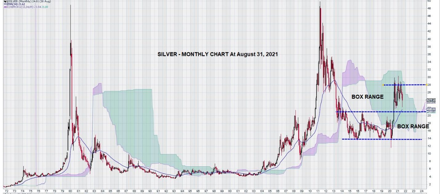
Silver has been trading up in step-like fashion.
Silver consolidated from $14 to $21, establishing a “box range.” Next, it broke out and up to test the minimum price objective of the height of the “box” added to its top. This gave a minimum price objective of $21 + $7 = $28. See chart below:
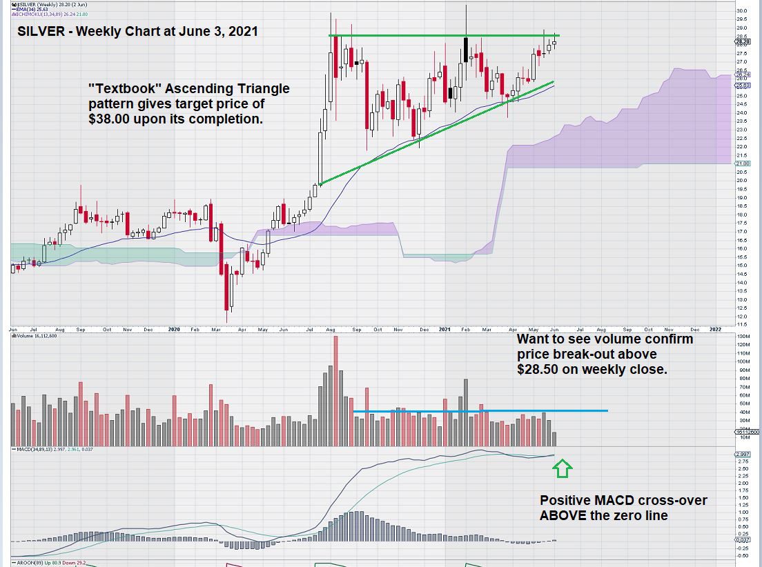
The last time we looked at a weekly chart, all indications were that a positive break out to the upside could result from the completion of a favorable Ascending Triangle Pattern. So let’s quickly review the weekly chart for silver on June 3, 2021.
And now, here is an updated chart, showing what happened:
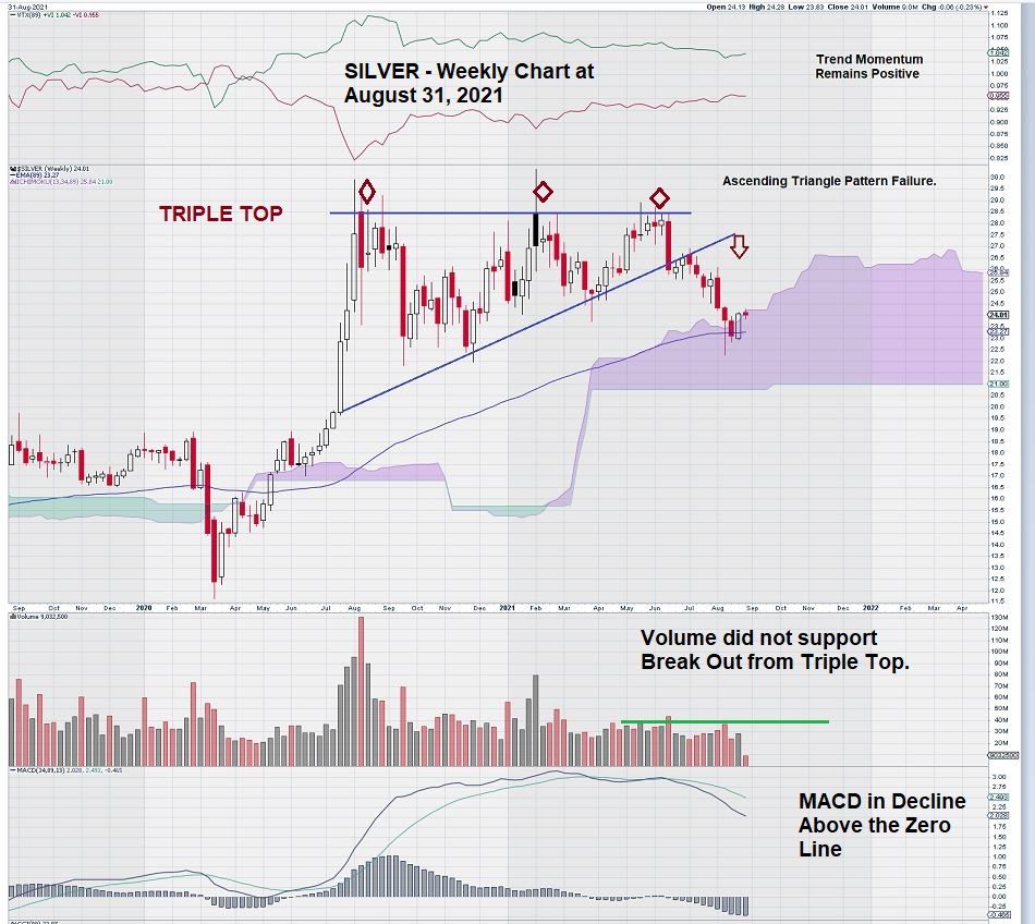
Although silver was poised to move higher, it failed to complete its Ascending Triangle Pattern, and there was not any additional volume to help Silver “punch through” the $28 level. MACD is weakening, although both the signal line and trigger line remain well above the zero line.
Silver is also just on the verge of continuing to go deeper within its Ichimoku Cloud. Note that the base of the Ichimoku Cloud is well defined at $21. It is interesting to note how this level on the weekly chart is also a key level on the monthly chart.
Trend momentum remains positive, despite the recent slippage of the silver price.
As many EQUEDIA readers already know, we do not usually compress our time frame to examine DAILY charts. Often, there are too many false signals generated. With that in mind, let’s still look at the DAILY chart for silver to see what we might uncover.
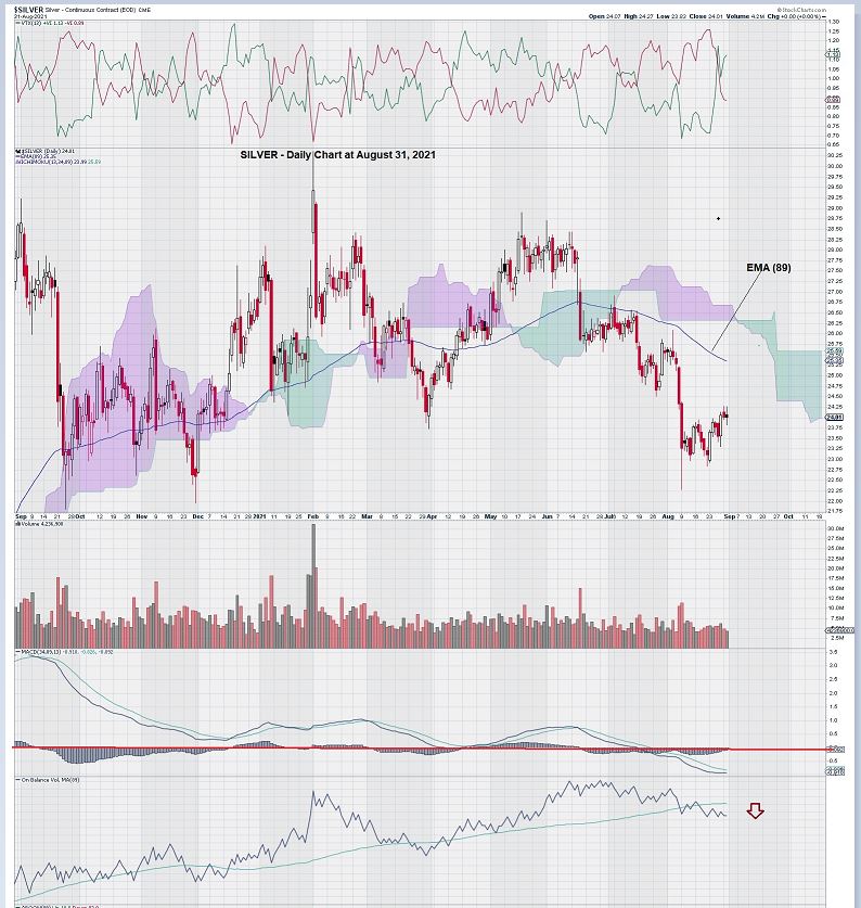
On a ONE YEAR DAILY chart for silver, we see that MACD has just crossed over the zero line and is now in negative territory. The signal line is below the trigger line, and both lines remain under the zero line.
We see little reason to become optimistic in the short term if this condition continues to exist.
Also, On Balance Volume, OBV (89), is once again below the trigger line.
The Ichimoku Clouds offer little in the way of analysis as the time periods are too short to give meaningful results.
Summary & Wrap-Up
Our MONTHLY chart for silver has defined a trading range of broad “chop” from $21 to $28, in which we expect to see future trading occur. Future trade direction looks to be controlled by these two levels.
Turning to the WEEKLY chart, silver shows weakness and seems likely to re-test the $21 level. There is plenty of “room” on the WEEKLY chart for MACD to re-adjust and show a positive condition where the signal line is once again above the trigger line. Another “compromise” of the WEEKLY chart is the emergence of a “triple top” and the failure of a positive ascending triangle pattern. Failed patterns can, in and of themselves, be useful as they demonstrate inflection points on the chart where sentiment changes.
Lastly, the DAILY chart for silver is the weakest of the three time frames that we have studied. This is because MACD is in a most negative condition, with the signal line below the trigger line and both lines having gone below the zero line around mid-July.
In summary, our charts show that silver is negative on the DAILY chart, just rolling over to a negative bias on the WEEKLY chart, and yet it remains in a positive place on the MONTHLY chart. We would be greatly encouraged by a positive crossover of the TRIX momentum oscillator. If this were to occur, it would be the confirmation needed to become bullish for a more positive outcome for the silver price.
– John Top, the technical trader