


Since gold has been on a wild ride lately, we’re doing another gold chart analysis.
It would be our normal practice to let a few months of data accumulate before taking another look at the weekly gold chart but the trading action in gold warrants that we stay current with the weekly chart.
Here are some new observations:
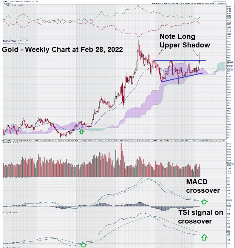
We can see that MACD has crossed over – a very good sign.
The last time MACD on trend settings crossed over it signaled the start of a multi-year rally in gold prices as they finally shook loose from the $1350/$1375 level that was strong resistance for about six years.
It is noteworthy that TSI (True Strength Indicator) confirmed the positive MACD signal. In the weeks ahead, we will keep an eye on TSI – a double-smoothed momentum oscillator that ignores “noise” and filters it out. Confirmation of the MACD signal would be very bullish.
Also, we see that for most of the past year, gold has been “grinding out” a positive pattern on its weekly chart. The Ascending Triangle Pattern is clearly evident.
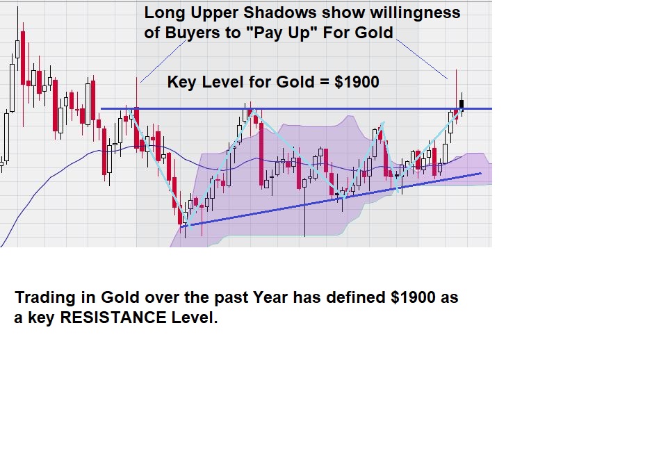
Gold briefly broke out and up from this pattern, but it quickly retreated, resulting in a long upper shadow, which is noted on the chart.
Regular readers of EQUEDIA will also recognize another technical trading setup we highlighted in past articles. This would be the “3 Taps & Out” setup that has given rise to some very strong trading action once it completes. As we write this today, the gold price must close and hold above the key $1900 level by having several successive weekly closes above it.
Here is another close-up of the weekly chart for gold that shows us a trade setup that we have seen before:
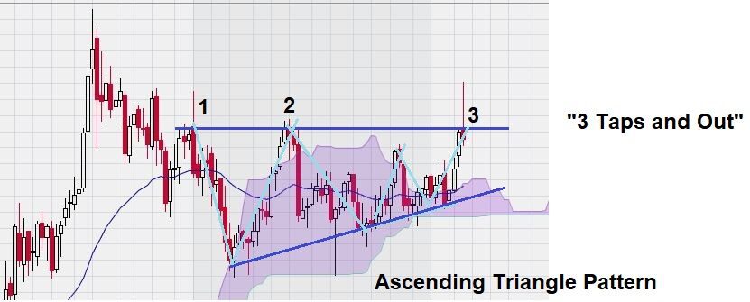
The “3 Taps and Out” trade setup is in place. In the weeks and months ahead, the $1,900 level for gold will dictate the direction of future trading.
And finally, we continue to see the weekly gold chart above its Ichimoku Cloud, yet another positive sign.
Summary & Wrap-Up For Weekly Chart
Despite the many positive signals and the recognition of a potentially positive chart pattern, there is a need to discuss how a negative could come out of so many positives. Chartists agree that a “broken pattern” can be just as useful as one that completes as expected. This is how we see the Ascending Triangle Pattern for gold. Either it completes, and the resistance level of $1,900 is broken to the upside as gold seeks to test its all-time highs or…the pattern breaks down, and a re-test of lower levels is the way of the future. We have mentioned that a key lower level for gold is at or slightly below $1,700.
Technical traders like to see a convergence of a number of trade signals emerge at a price level. This gives them more confidence. We see that this continues to be focused at the $1,900 level for gold on the weekly chart. There are lots of technical indications that gold can make a further move to the upside.
Our ‘favorite day of the week” is Friday – not because it signals the end of the workweek but rather that we get to see another weekly candlestick.
PS – When we see long line-ups at ATMs in countries involved in military conflict, it makes us appreciate the “store of value” that rests in a gold coin.
Daily Gold Chart – One Picture Says It All
Sometimes, price movements are so severe that they tell chartists a story unto themselves. This is what happened recently for the daily chart for gold.
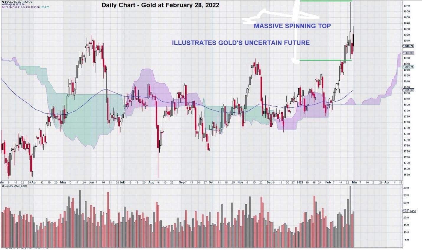
This chart shows a truly massive spinning top. Remember that spinning tops are so named because they denote uncertainty. Bears push prices lower and lower, then Bulls have their turn, pushing them higher and higher. Finally, at the end of the day, there is no clear winner for this game of financial tug-a-war. The battle will have to be fought another day.
The action of the daily chart tells us that the market does not know how to value gold. In time, gold will choose a direction, and the market will reflect it. Until then, the scrappy, rough-around-the-edges trading seems likely to continue.
– John Top, the technical trader
PS – The interpretation of the daily chart for gold is very different from that of the weekly chart, which can smooth out some of these erratic day-to-day gyrations. See the recently posted weekly chart for gold.