
It may not be good writing practice to entitle an article that highlights silver and then begin by talking about gold. But that is precisely how we will start with our look at silver. It should become clear after reading why we chose this method of analysis.
Let’s get started.
A month ago, we looked at a longer-term weekly chart for gold. It was a chart that had its own concerns. We are always uneasy when a chart enters the Ichimoku Cloud after trading above it for so long. Here is the chart:
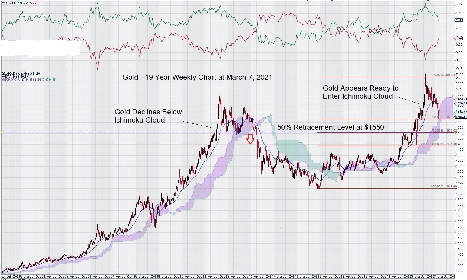
What caught our attention was a comparison to the period from the previous high in 2011. Gold subsequently entered the Ichimoku Cloud and then declined below it. The gold price then went lower and stayed low for a very long time. We don’t expect this to be repeated because, using those well-worn words that many later come to regret, “This time is different.”
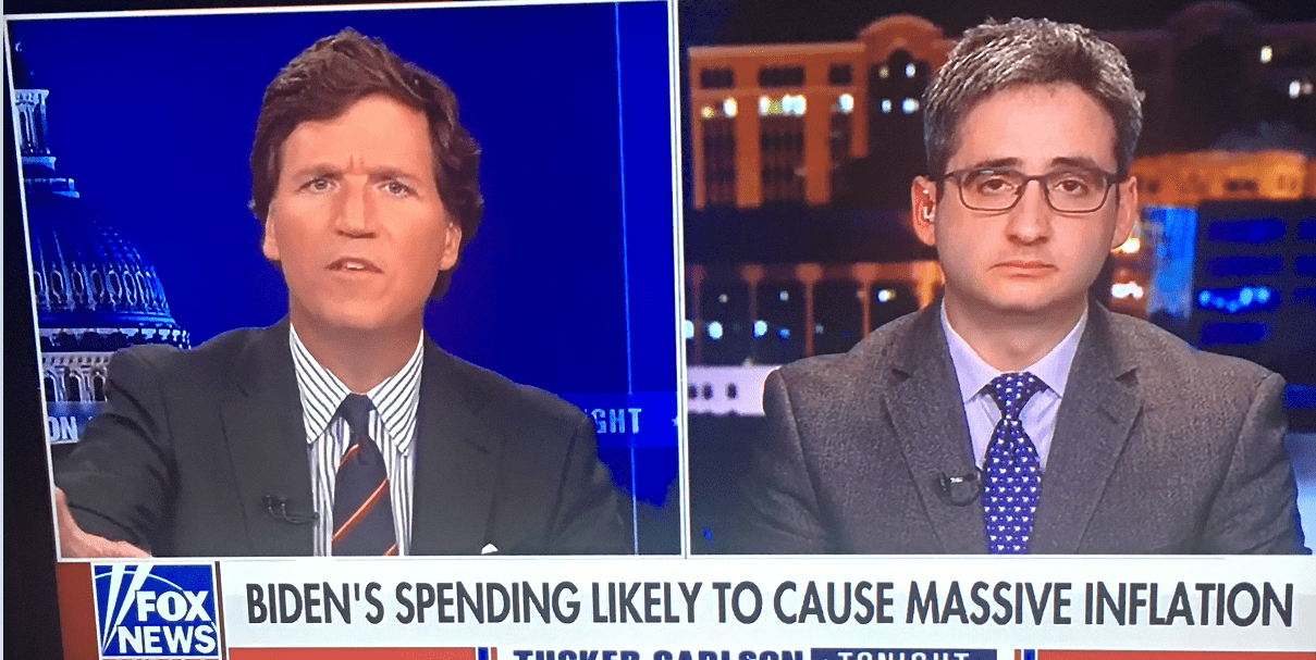
We pointed out that this time really was different because of the massive money printing that has taken place and our belief that “inflation is baked into the cake.” This observation is now being made by others who are not generally concerned with the economy or have any particular interest in inflation or its effect on the gold price. Here is an example:
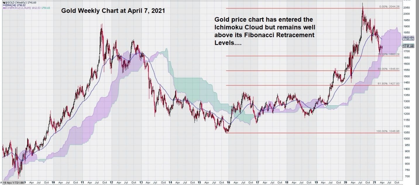
So, what has happened to the weekly gold chart over the past month? Did it improve, or is the gold price starting to push on the lower limit of the Ichimoku Cloud?
At this point, it worth taking a “technical time-out.”
Why are we so obsessed with Ichimoku Clouds? Remember what Ichimoku Clouds are – they are a graphic representation of exponential moving averages plotted forward in time. Our previous use and experience with Ichimoku Clouds that rely on longer-term trend settings is that they have a way of capturing when market sentiment changes. Often, when sentiment changes, trend changes follow. That is why we like to use Ichimoku Clouds as they can provide a visual “wake-up call” when prices move above or below certain levels that define key inflection points.
Here is an updated weekly chart for gold that shows it has entered the Ichimoku Cloud. Our expectation is that it will remain in the cloud and then, once again, rise above it. We shall see if this viewpoint remains valid as the year progresses.
Now, what about other charting clues that show where the gold price might be heading?
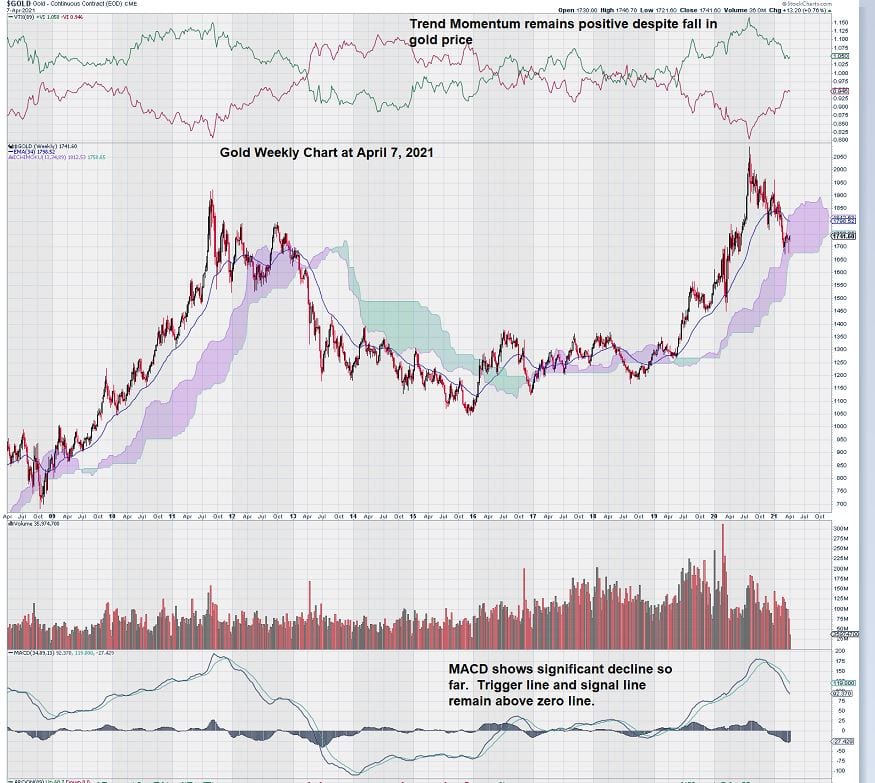
The chart below shows that despite the decline in the gold price, trend momentum has, so far, remained positive. Also, it is worth noting that MACD on trend settings is showing a decline. The signal line remains below the trigger line, and both lines so far have not yet shown any signs of “flattening.” This would be the first noticeable indication that the decline in the gold price is slowing.
Trading in gold these past few weeks have seen stronger support as the price dips below the $1700 level – something that we commented on in a previous article last month.
Now that we have seen how gold has behaved from a technical trading perspective, let’s turn our attention to silver.
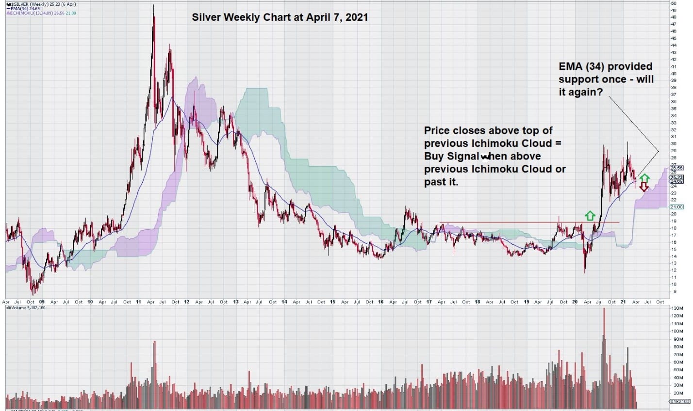
Here is a weekly chart for silver. It shows how $19.00 was a key level and how the EMA (34) provided some chart support when silver declined after a very strong advance.
Here is a look at that $19.00 level over a longer-term:
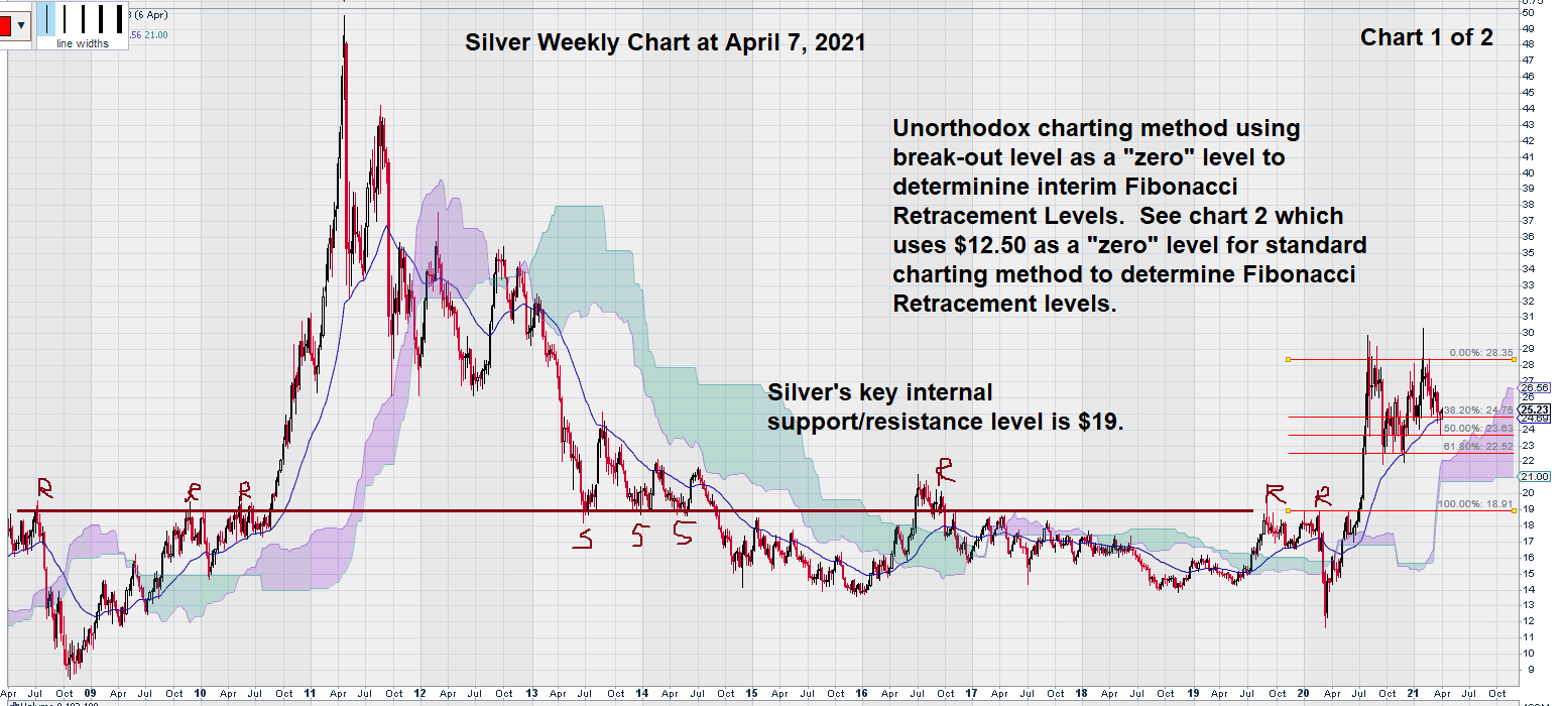
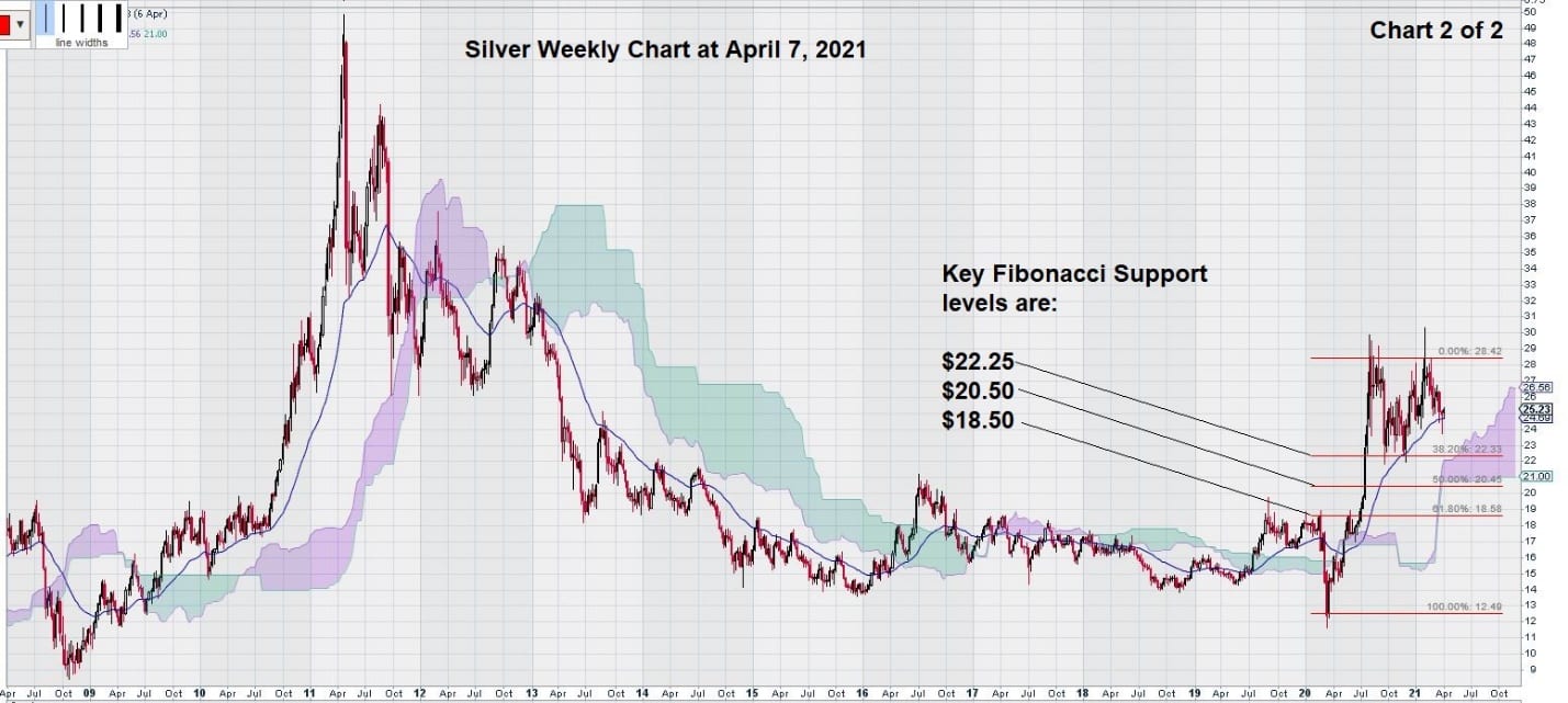
And here is another look at the chart showing a more conventional way to calculate the Fibonacci Retracement Levels:
Now, let’s compare the MACD for silver to gold:
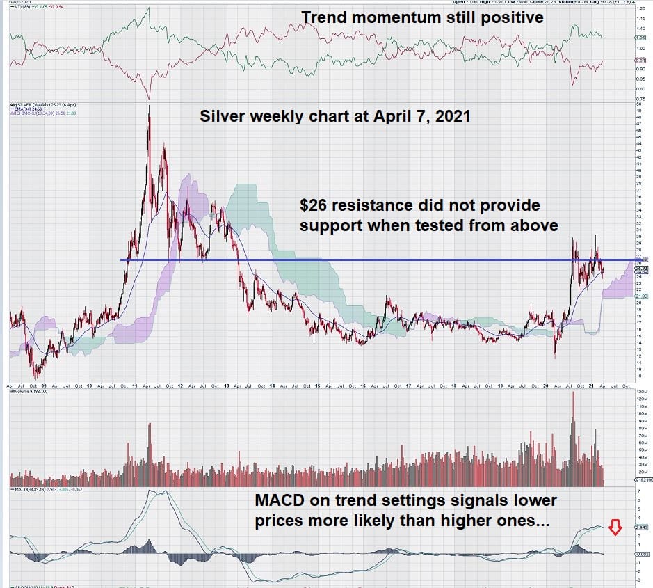
Here we see a noticeable difference. The MACD for gold is well advanced; it has been steadily declining for several months. Recently, it looks like the $1700 level, +/- may be starting to provide some initial support for the gold price, although it is too early to tell. In any case, the more “Friday closes” there are for gold around its current level, the more likely that we will see MACD start to flatten and then turn back up to be positive with the signal line over the trigger line.
Silver Versus Gold Comparison
Do you see how our title for this article is now starting to make sense?
Gold is well ahead of silver, on the way to whatever is going to happen next. We are expecting the price to stabilize and then work its way out of the Ichimoku Cloud. This is not a certainty, but, given the massive new money printing exercise currently underway, our view for gold is positive – especially towards the latter half of this year.
The silver chart is clearly “lagging” the gold chart.
Silver remained strong while gold weakened. Now, both charts need to see their respective MACD stabilize and then reverse to the upside.
Given that we don’t know which way gold will trade, and given that silver is tracking gold but many months behind, perhaps we should view our future trades in silver through a trading lens that is either long or short.
We recognize that gold has become our “silver trading guide.”
-John Top