
Namibian Government Deep-Sixes Deep-South
Shareholders of Deep-South Resources Inc. (TSX-V:DSM) woke up this morning to learn that the Company’s Exclusive Prospecting Licence was refused by the Namibian Ministry of Mines and Energy. In response, DSM terminated all work on-site and has proceeded with the retrenchment of its on-site employees.
Investing in small start-up companies is not without risk. In this case, shareholders were somewhat unprepared for the sudden negative reversal of fortune. Why?
Around a month ago, in an investor presentation dated May 2021, Deep South addressed jurisdictional risk. Here is what they wrote:
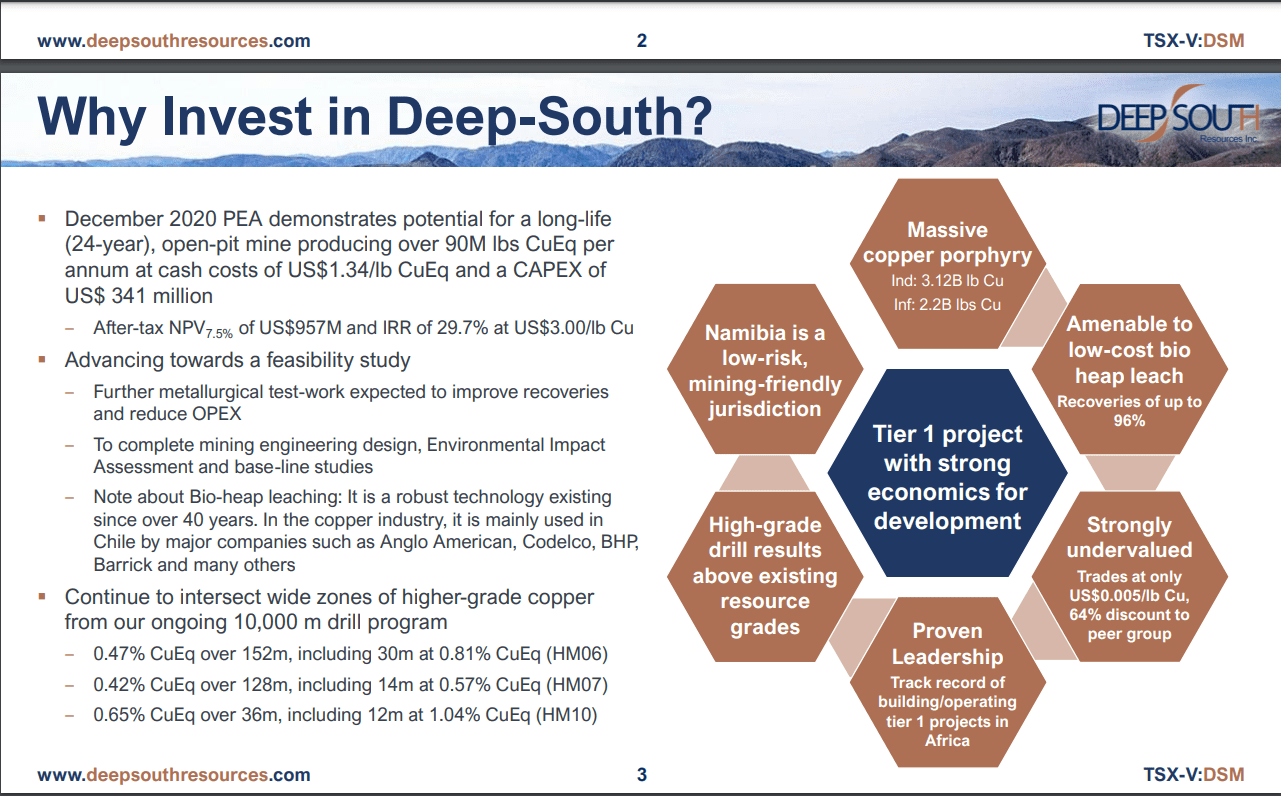
Note the section that states that “Namibia is a low-risk, mining-friendly jurisdiction.”
To be clear, our intention is not to “pile one” with respect to the misfortune that befell DSM. Rather, we want to use the stock chart as a “teaching tool” for our readership.
So. let’s take a “deep dive” into the stock chart and see if there may have been some “early warning signs.”
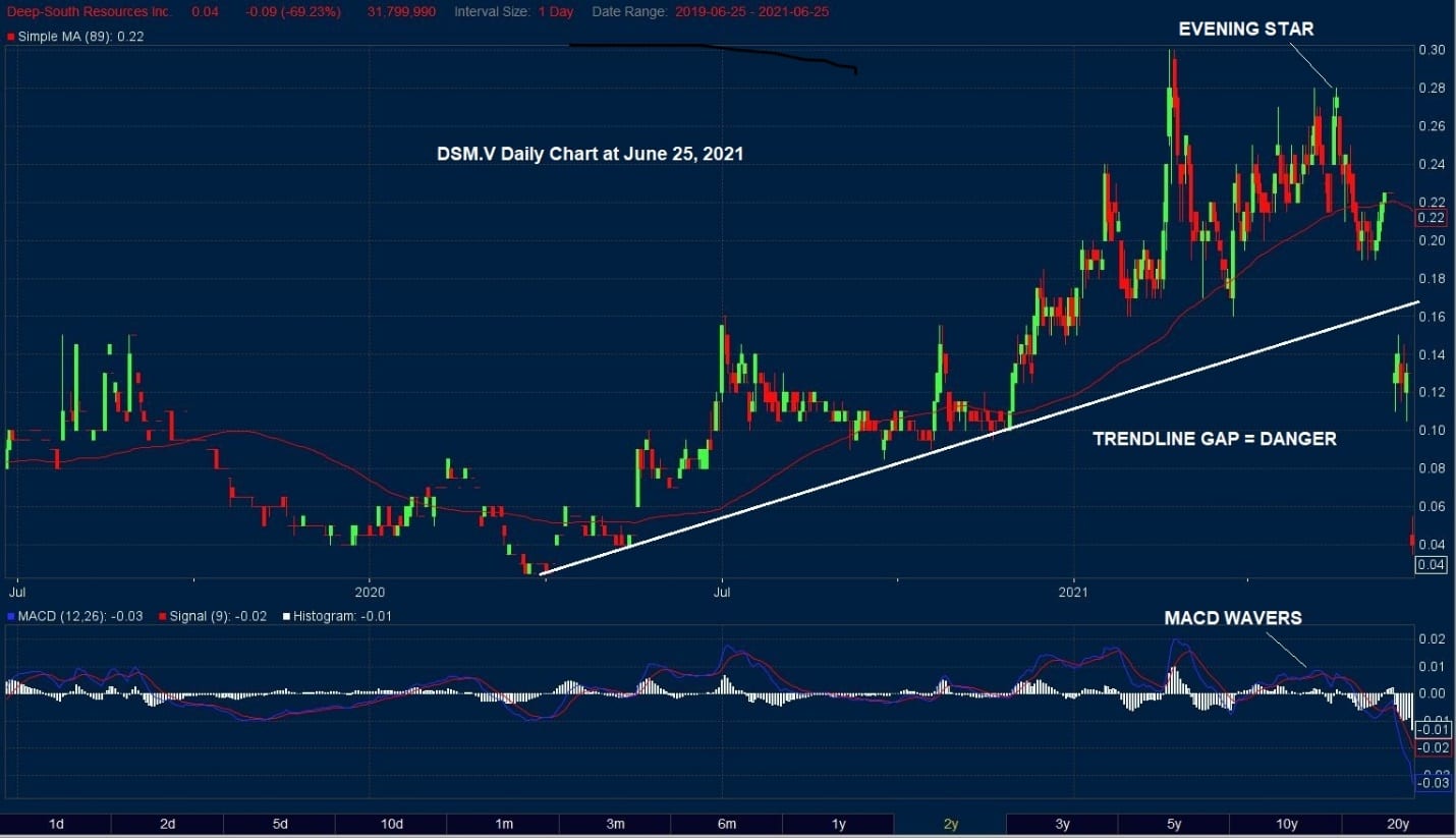
This daily chart for DSM shows that MACD is behaving in a rather odd fashion. Typically, MACD has some technical clarity. What do we mean by this statement?
We like to see MACD with technical definition. This occurs when the signal line is either above or below the trigger line.
Usually, MACD rises in concert with Price. However, once a new high is reached, Price retracts, and the signal line for MACD declines below the trigger line. We have seen this typical action for MACD in the many charts we have presented.
That is why this chart is interesting.
Price rises to a new high, then retraces, and then reaches a support level and starts to recover. At this point, we would typically see the price move confirmed by MACD by seeing the signal line rise above the trigger line, and stay above it as Price continues to strengthen.
This did not occur.
Instead, we see MACD start to “waver,” as shown on the chart. The MACD signal line oscillates above then below the trigger line.
In other words, MACD is NOT CONFIRMING PRICE. This initial observation should make us wary.
Our suspicions that something might be amiss were later confirmed, not by MACD but by a specific Japanese Candlestick Pattern known as the “Evening Star.”
The Evening Star Pattern defines a top. In the case of DSM.V, this pattern, along with the erratic behavior of MACD, was enough evidence that downside risks were starting to build.
Another “shot across the bow” was the decline below the EMA (89) – a level that we always keep in mind when examining daily charts.
And finally, MACD gives us another strong signal to be cautious about the future – it heads below the zero line.
To recap, we have several NEGATIVE technical indications for a company producing good drilling results in May/June. This situation would demand our full attention. It is another good example of how investors can use technical analysis as a valuable trading tool.
Fundamentals looked good – technical signals did not.
Reconciliation had to occur…and it did.
– John Top, the technical trader