
CRB Index Breaking Above Key Level
It is nearly impossible not to be reminded by both the financial media and the mainstream media that inflation has become the major topic of the day. Yet, it seems that inflation fears are not shared by everyone equally.
It is, for lack of a better way to put it – a “50/50” split.
Those of us over 50 remember with undeniable clarity the late 1970s and early to mid-1980s when inflation started to spiral upwards, out of control. And, speaking of control, there were wage and price controls mandated by President Nixon in 1975. Unlike today, unions wielded a lot of power, and this drastic action prompted unrest. It boiled over in 1981 when President Regan fired all of the air traffic controllers in the US using executive power.
Airport travel slowed considerably, not unlike what happened recently with COVID.
https://www.history.com/this-day-in-history/reagan-fires-11359-air-traffic-controllers
The “under 50” generation is largely unaware of the events of the 1970s and 1980s – this is not a criticism, just a sober observation. Like most things in life, lived experiences teach the greatest and most remembered lessons.
Ask someone under 50: “Who was “Paul Volker”? Don’t expect an answer.
Now that our stroll down memory land is complete, let’s turn our attention to the subject of today: the CRB Index.
The CRB Index is essentially a way for economists, politicians, and investors to take a “broad brush” approach to evaluate whether or not prices within a “basket of commodities” are rising or falling.
Here is the list of the 19 commodities that make up the CRB Index:
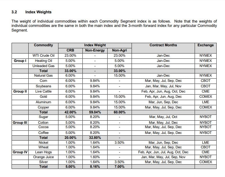
As you can see, the index overweights oil (23%) and underweights nickel, wheat, lean hogs, orange juice, and silver (1%).
“Silver bugs” may look at this lowly ranking with some disdain, but it accurately reflects silver’s minor role relative to the other commodities noted.
The CRB Index was established in 1957 and has had numerous revisions designed to maintain the index as the leading global commodities benchmark.
One commodity that is conspicuously absent from the CRB Index list has itself attracted considerable media attention.
Can you guess which one?
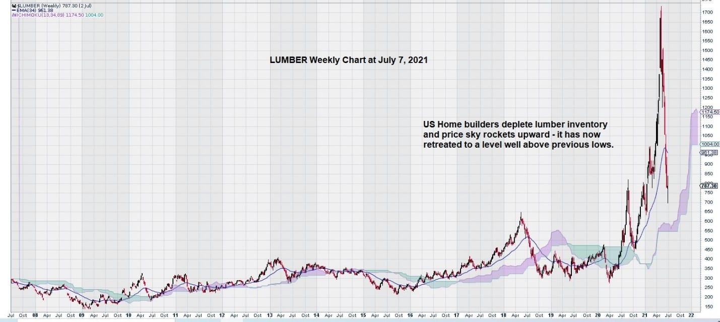
Lumber.
Lumber has been on a wild ride recently. The weekly chart shows what happens when there is a true supply shortage in the face of strong demand.
Now we will see what the CRB weekly chart looks like:
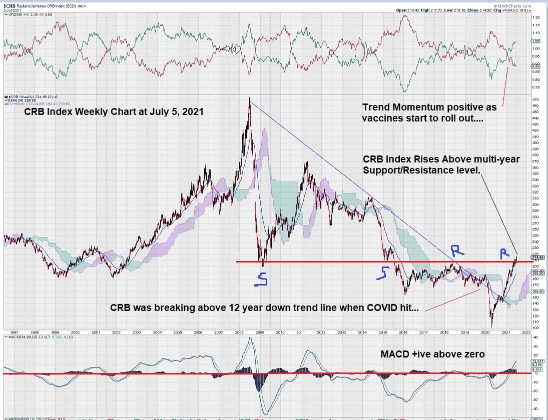
Regular EQUEDIA readers understand that we like to use long-time intervals when we look at charts. This one is no different.
Here we can see that the multi-year weekly chart for the CRB Index has some positive features.
First, we note that the long downtrend line, briefly broken to the upside before the COVID pandemic, has resumed its upward path.
Second, we can see that the move upwards is supported by MACD.
Currently, the MACD signal line remains above the trigger line, and both lines are above the zero line – a very positive condition.
MACD “tested” the zero line twice before but was unable to sustain itself above it. This time is different.
Third, we see that trend momentum is positive. This change looks to have occurred around the end of 2020 when there were positive indications that suitable vaccines to combat COVID had been developed, tested, and ready for widespread use.
Finally, the CRB is at a very key inflection point.
The 210 level is well defined as the primary support/resistance level. We sometimes refer to these key support/resistance levels as the “spine” of the chart. It is the key level that “holds the chart together” and separates negative and positive sentiment.
Summary and Wrap-Up
COVID left broken supply chains in its path. The weekly chart for lumber clearly illustrates this point.
Oil, the most heavily weighted component in the CRB, is currently trading at around $75, and it has a favorable weekly chart. The strength of the CRB weekly chart is buoyed by oil, but oil is the only driver. Other commodities are continuing to see improvement.
So far, many people have yet to return to work and re-establish their regular routines. These routines include consumption. Over the past 18 months, emphasis has been on simple existence, savings, and, perhaps for the bored millennials, online trading. This is all about to change.
As far as inflation is concerned, it should be treated with both respect and with fear. Just like the wildfires in California – easy to start, not so easy to put out.
Epilogue
Years ago, I got a call from an investor I used to talk with regularly. He moved around Europe a bit and ended up living in Cyprus. One day he called me to give a “man on the street” reconciliation of some events.
After a long weekend consisting of a 3-day bank holiday, residents of Cyprus woke up to a very different financial landscape. Food prices were an astounding 300 – 400% higher. Bank machines limited withdrawals to around 50 euros. As a result, bank line-ups were long, and those in line were far from happy.
So, could what happened in Cyprus also occur in the USA and Canada?
It depends on who you ask…
Let’s just say the chances are 50/50 and leave it at that.
-John Top, the technical trader