


An Analysis of the Gold Chart After the Manipulation of It Stopped
(Educational Segment 012)
In all its forms, gold investors were treated to an early Halloween “trick” and “treat” when it was revealed that a large U.S. investment bank had been manipulating the gold market to create artificial prices.
That was the “trick.”
What about the “treat”?
The company was fined U.S. $920 million for market manipulation that spanned eight years, from 2008 – 2016. Without this manipulation affecting prices, gold began trading in a way that better reflected its value.
Here is an excerpt from an article that appeared on October 4, 2020, in The Northern Miner, a resource industry trade publication:
“After a lengthy investigation, the Commodity Futures Trading Commission in the U.S. has fined JPMorgan Chase & Company and its subsidiaries, JPMorgan Chase Bank and J.P. Morgan Securities LLC, US$920 million for market manipulation that took place over nearly eight years. The fine is the largest in the CFTC’s history, and with any luck, will discourage rogue trading behavior in the future.
According to the CFTC, from at least 2008 through 2016, traders on JPMorgan’s treasuries desk placed orders on one side of the market that they had no intention of ever executing in order to create the illusion of buy and sell orders to affect prices. The practice — called “spoofing” — has been prohibited since 2010 after it was banned under the Dodd-Frank financial reform law.
“JPM, through numerous traders on its precious metals and Treasuries trading desks, including the heads of both desks, placed hundreds of thousands of orders to buy or sell certain gold, silver, platinum, palladium, Treasury note, and Treasury bond futures contracts with the intent to cancel those orders prior to execution,” the CFTC stated in a September 29 press release. “Through these spoof orders, the traders intentionally sent false signals of supply or demand designed to deceive market participants into executing against other orders they wanted filled.
According to the order, in many instances, JPM traders acted with the intent to manipulate market prices and ultimately did cause artificial prices.”
We have covered this topic for over a decade.
In fact, last year in September 2019, Ivan Lo wrote about this (Conspiracy Revealed: The Real Reason Why Gold is Going Higher) and strongly pointed out that after many years of not buying gold stocks, he was about to accumulate.
Via the Equedia Letter, September 2019:
“The Fed has once again lowered rates – just as predicted. And I suspect that in November, we could see them announce some sort of new Quantitative Easing (QE).
That, combined with the revelations of precious metals manipulations that US prosecutors are calling a “Criminal Enterprise,” there’s no doubt in my mind that the price of gold can finally climb higher.
This has me really excited.
Why?
First, when sentiment is low, prices are as well.
And that’s where gold has been over the last five years.
Low prices are always good for buyers.
Second, we have knocked it out of the ballpark with many of our past precious metals stock investment ideas – especially following the revelation of potential price manipulation.
Last year, I was on the fence about gold stocks; Today, I am looking to climb over.”
So, did gold trade any differently afterward? Let’s take a look at the gold chart from the period when the manipulation stopped in August 2020.
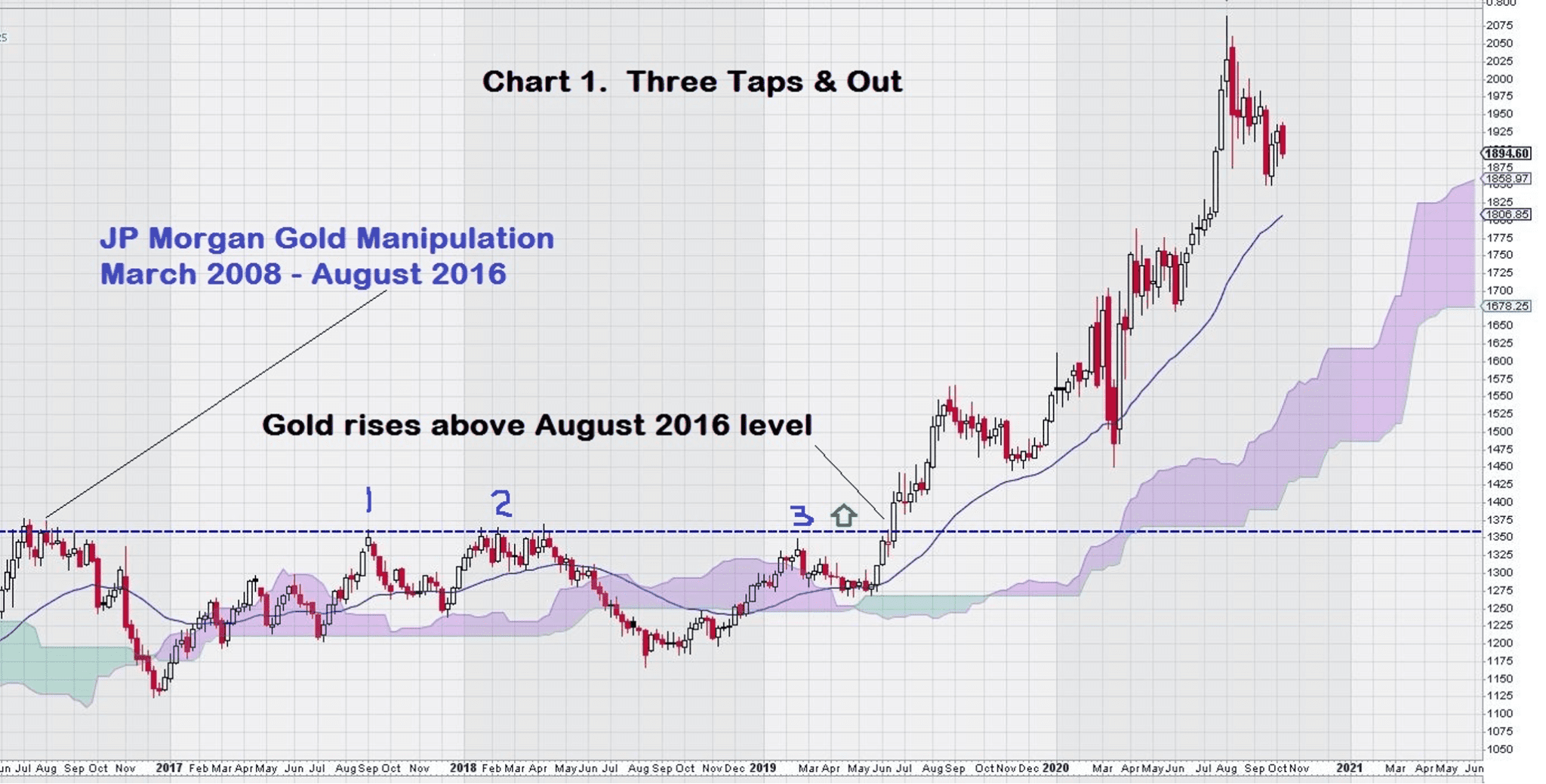
Regular readers of Equedia will immediately recognize an all too familiar stock chart pattern that seems uncanny in the way it tends to precede large gains. Our trusty old chart friend: “Three Taps & Out.” We have seen this pattern play out many times before.
Let’s take an even closer look at this weekly chart for gold to see what else catches our eye.
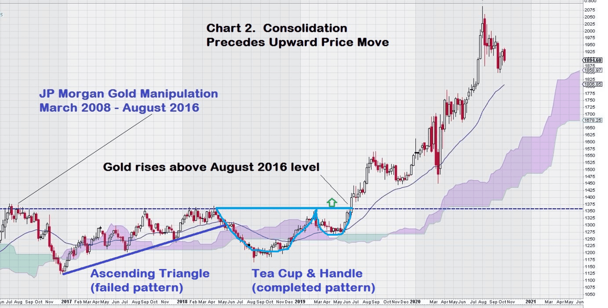
This second look at the same chart shows us that from the point the manipulation of the gold price stopped, “natural market forces” took over and gold began a 2 ½ year consolidation that was “capped” at the breakout level.
Even investors who do not look at charts or give them much weight will have to stubbornly agree that it is indeed curious that the “capped” level was the same as when the heavy-handed manipulation stopped back in August 2020.
Do you see how a horizontal line drawn on the chart from August 2020 forward in time defined the breakout level for gold?
Now, let’s look at the weekly gold chart another way.
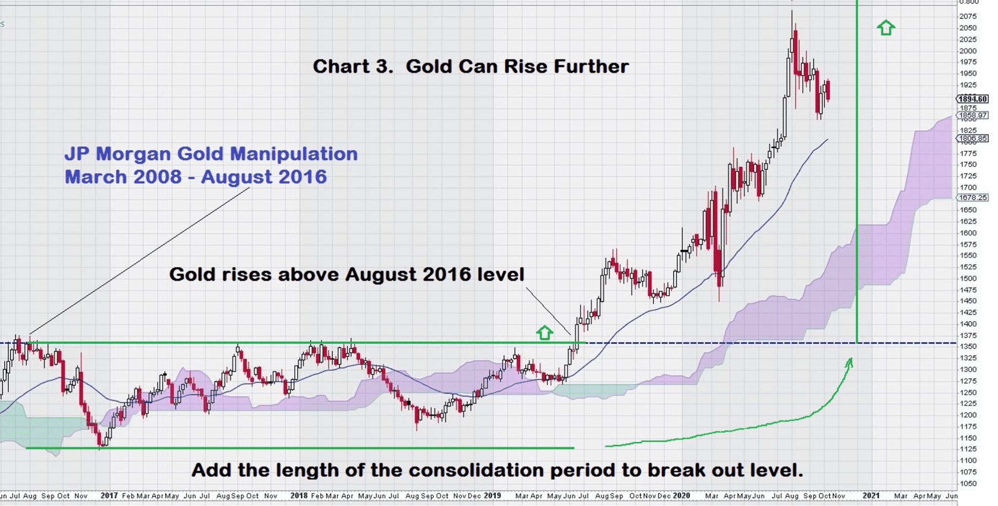
This look at the chart shows that gold has more upside potential. Some technical analysts simply add the length of the horizontal consolidation period to the breakout level to get a very bullish indication of where prices may go.
Others prefer a much more conservative approach and add the height of the “rectangular” box range to get an initial price target. Gold has obviously gone well beyond its initial chart expectations.
It is instructive to note that this chart is “marred” by the virus pandemic events that impacted all markets during the first half of 2020. This is visually evident by the two large red candlesticks in March.
Finally, let’s see how gold has traded after the breakout level was surpassed.
We will use Fibonacci Retracement levels (unconventionally using the breakout level as our zero-line) to see where risk exists on the downside, even though several indicators, such as MACD on trend settings, that show more room to the upside.
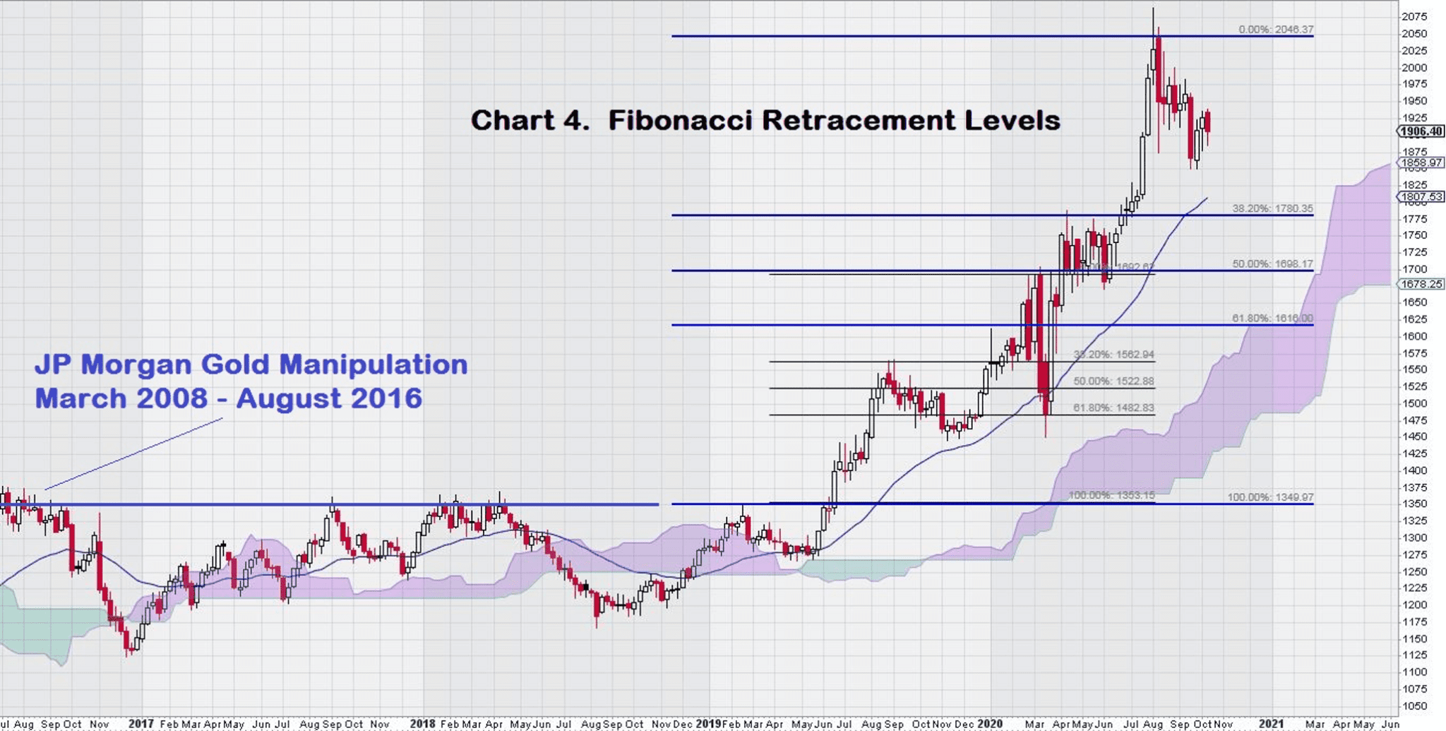
This chart shows that from the pre-pandemic high, post-breakout, gold declined to its last Fibonacci Retracement level of 61.8% during March when the pandemic was “announced” and the various economic restrictions were put in place. It staged an impressive recovery and then continued to rise to new highs, with brief consolidations along the way.
Currently, gold is once again consolidating its gains, well above its Fibonacci levels.
These levels are as follows: $1780/$1700/$1615.
The weekly gold chart indicates Fibonacci support below where it is currently trading. MACD on trend settings (not shown) is positive, with the signal line above the trigger line and both lines well above the zero line.
Summary and Wrap-Up
For those of us who “watch” the way gold trades on a day to day basis, it has been quite noticeable that gold has spent much more time “trading sideways” before breaking out.
This is how markets that are not manipulated trade.
Price consolidates volume at a level; then, once complete, future volume moves price in a direction.
Gold trading sideways in a range for 2 ½ years is a great example of this principle.
Sure, gold has its ups and downs, but this upward trend, as shown on these charts, is more how one would expect it to trade. Simple ebbs and flows. Rise, fall back, consolidate, then continue to rise.
The future for gold continues to look bright.
As far as the weekly chart for gold is concerned, there are good support levels built into the chart at lower levels, namely $1780 and $1700. It is encouraging to see the trading action in gold continue to be constructive.
It is also worth noting that the EMA (34) is an additional support level that was tested before, and the price subsequently made a nice bounce off of it.
My working chart knowledge is such that I am not too familiar with the use of “flag-pole and pennant” chart patterns, but we can easily see that one may be currently underway. In any case, $1950 looks like a level that will get attention from traders.
In the future, we will be paying closer attention to the weekly gold chart and intend to provide more frequent updates. Some of these updates may appear rather bland because a weekly chart is comprised of only three meaningful components: open/range/close. Of these, the close is most relevant. Our charting approach is to measure the close against previously identified key chart levels.
Lastly, it is worth noting that Ivan has been bang-on accurate with his timing in the move in gold. Where he uses macro and political research, I use charts. Together, these two different approaches to investing has served us, and our readers, extremely well. We hope you will use these writings to educate yourself to become more than just a “retail investor.”
-John Top
Disclosure: We own gold, gold stocks, and gold streams.