
CBOE 10 Year US Treasury Yield Index: Tide versus Waves
(Educational Segment 23)
There are lots of different ways to look at charts.
This is to be expected. Everyone has their special relationship with time.
Technical analysis provides the full rainbow of choice.
Time intervals can be in seconds to years – and every possible interval in between. This is why sometimes, in watching various business channels, you may see what at first appears to be an obvious conflict.
An example would be a headline that reads: “Gold drops…” followed immediately thereafter with “Gold rises…”.
How can both be “right” at the same time?
One way to look at it is this.
We have all watched Olympic sprinters on TV as they cross the finish line. They are still moving forward (in our chart example; “rising”), but it is obvious that the race is over and that they are slowing down (“dropping” or falling).
Which brings us to today’s education segment…
A closer look at the $TNX – CBOE 10 Year US Treasury Index
An acknowledged expert chartist (John Murphy) at StockCharts.Com provided the same chart with two different views over a 10-day period from July 9th to July 19th.
Who is John Murphy?
“John Murphy is the Chief Technical Analyst at StockCharts.com, a renowned author in the investment field and a former technical analyst for CNBC, and is considered to be the fater of inter-market technical analysis. With over 40 years of market experience, he is the author of numerous popular works including ‘Technical Analysis fo the Financial Markets’ and ‘Trading with Intermarket Analysis’. Before joining StockCharts.com, John was the technical analyst for CNBC-TV for seven years on the popular show Tech Talk, and has authored three best-selling books on the subject: Technical Analysis of the Financial Markets, Trading with Intermarket Analysis and The Visual Investor.”
Let’s take a look at these two charts.
The first chart shows the $TNX approaching its 200-day moving average – a widely followed level.
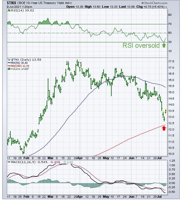
Most technical chart followers would agree with the comments John Murphy noted for this chart:
“Chart 1 shows the 10-Year Treasury yield starting to find support near its red 200-day moving average, which usually acts as a support line during downside corrections. In addition, its 14-day RSI line in the upper box is bouncing today from its oversold line at 30. Today’s gap higher may be another sign that the downside correction in yields may have run its course.”
The conclusion is a good one. We can see a “morning star” pattern just above the 200-day moving average, and we see RSI at an oversold level.
So, what happened in the next ten days?
The next chart shows a decline below the 200-day moving average.
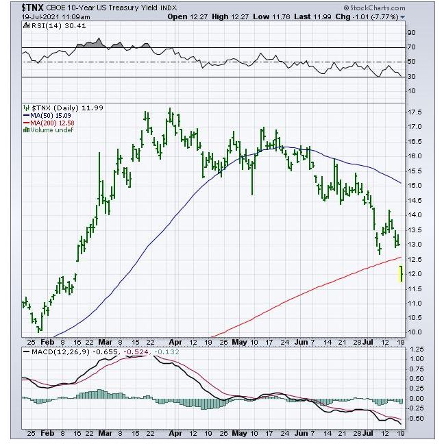
As noted by Murphy:
“10-YEAR TREASURY YIELD BREAKS 200-DAY AVERAGE…Bond yields are falling with stocks today in a flight to the relative safety of bonds. Chart 3 shows the 10-Year Treasury yield falling below its 200-day moving average to the lowest level since February.”
Despite the 200-day moving average, a low level of RSI, and a possible “bottoming chart pattern” in the Morning Star pattern, the $TNX continued to decline.
OK, that was interesting, but how did WE see the $TNX through our “trading lens?
Here is our chart:
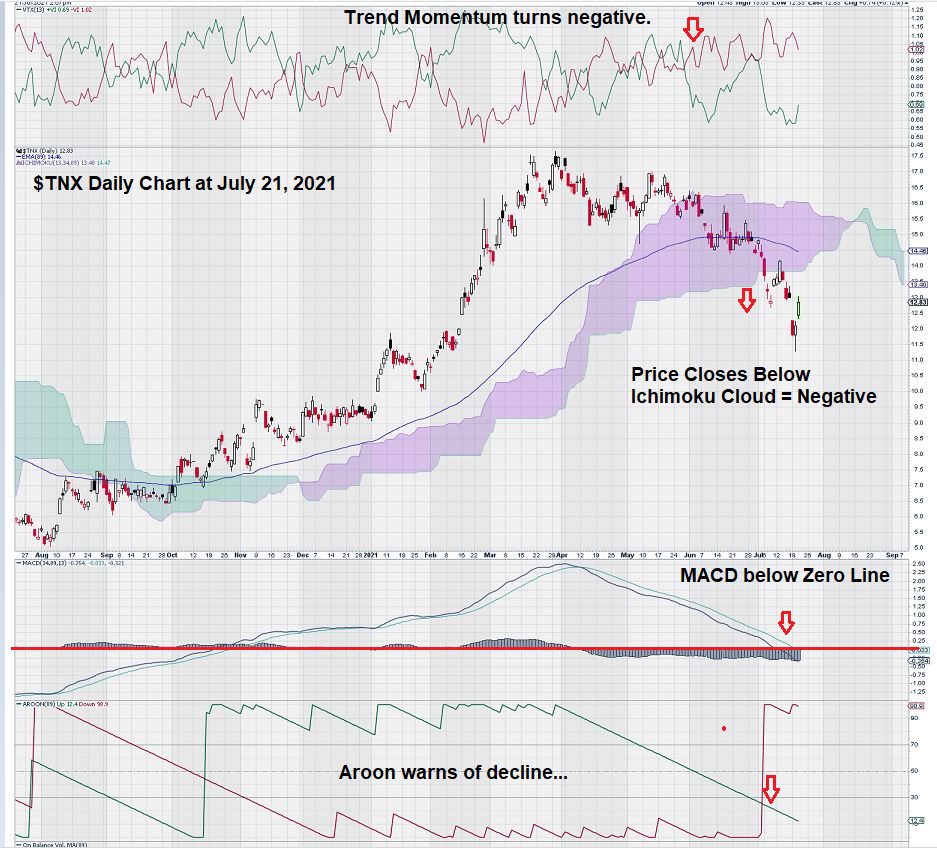
On our chart, we started to see some warning signs back at the end of May when Trend Momentum turned negative, just as price entered the Ichimoku Cloud. Prior to that, though, we saw our long-term and trusted MACD trend settings based on Fibonacci numbers show a cross-over of the signal line below the trigger line as far back as mid-April.
Then we start to see more and more technical evidence that weakening Trend Momentum was beginning to impact other parts of the chart.
We see a cross-over below the EMA (89).
Notably, and plainly obvious, is the shift in Aroon.
Aroon is an indicator that is not widely used. The word “Aroon” means “early dawn” in the ancient Sanskrit language. As in early dawning of a new trend; a trend down, in this case.
Summary and Wrap Up
Today’s charting lesson was meant as an illustration to show how charting can be used to help shape or form an opinion over time.
In our chart, $TNX was degrading over time.
There were numerous hints that price was starting to fail.
MACD, Trend Momentum, and EMA (89) were among the early signals that price was becoming more and more vulnerable to a decline. Later, the Ichimoku Cloud, Aroon, and breaking below the zero-line for MACD, were further evidence of weakness.
And yet, from Murphy’s first perspective, things were looking good. This is a great example and lesson that teaches us not to view charts from only one perspective.
There is a lot of noise in today’s markets.
The cause of this noise is the highly sensitive nature of markets and the way they instantly react to ever so slight changes. Conventional chart settings are based on short time intervals; ours are not.
As noted in one of our previous articles, we would rather be late and right than trying to “guess” each small change.
Thus, our trading philosophy and strategy is one that is based on the tide, not the waves.
Charts tell a story. Each story is different. Using a different lens – we like to use the “Lens of Fibonacci Numbers” – gives us all the information we need to make informed trading decisions.
-John Top, the technical trader