
Where’s the Volume?
About a month ago, we noted something strange on the Dow Jones weekly chart; the stock market fell in a “virtual vacuum.” All we did was compare 2008/2009 to 2020 using volume as a criterion.
The original chart appears in a previous post titled, “No Liquidity Could Spell Big Trouble for the Dow,” but an updated version is shown below.
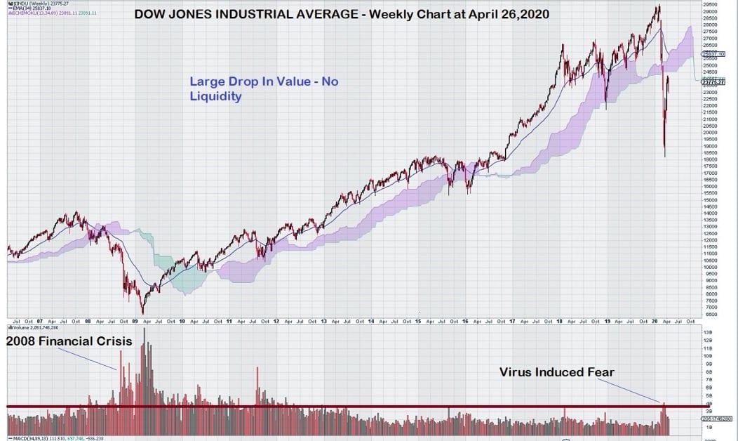
The weekly chart for Dow clearly shows a lack of selling that could be attributed to “Virus-Induced Fear.” The index has penetrated support at the base of the Ichimoku Cloud. Also, trend momentum has just turned negative in March.
So lets a take a look at a few other major stock market indices to see if their charts indicate a similar lack of participation by sellers.
First, the technology-laden NASDAQ.
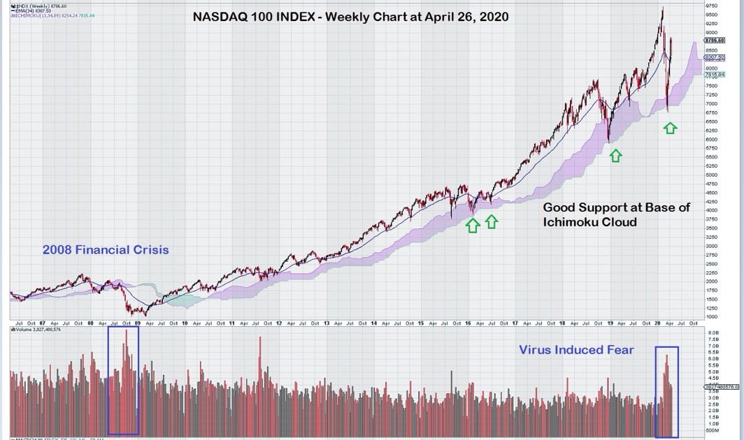
The weekly chart for NASDAQ shows a concentration of selling that retested the base of the long-standing, uninterrupted Ichimoku Cloud. At the end of 2018, the base of the Ichimoku Cloud was previously tested, and it provided good support, as expected. Prior to that, back in 2015/2016 the index entered the Cloud but did not penetrate it to the downside.
Another key note, although not shown on this chart because of size considerations, long term trend momentum for the NASDAQ has remained positive. Trend momentum has been positive since 2010.
The trading action on the NASDAQ is what one might reasonably expect to see for the DOW.
That is to say, a significant “jolt of selling” to reflect the uncertainty related to the shutdown of the economy, jaw-dropping unemployment numbers, and lack of valid financial analysis tools to deal with highly uncertain future earnings.
Let’s look at the broad market through the S & P 500 Large Cap Composite Index (SPX).
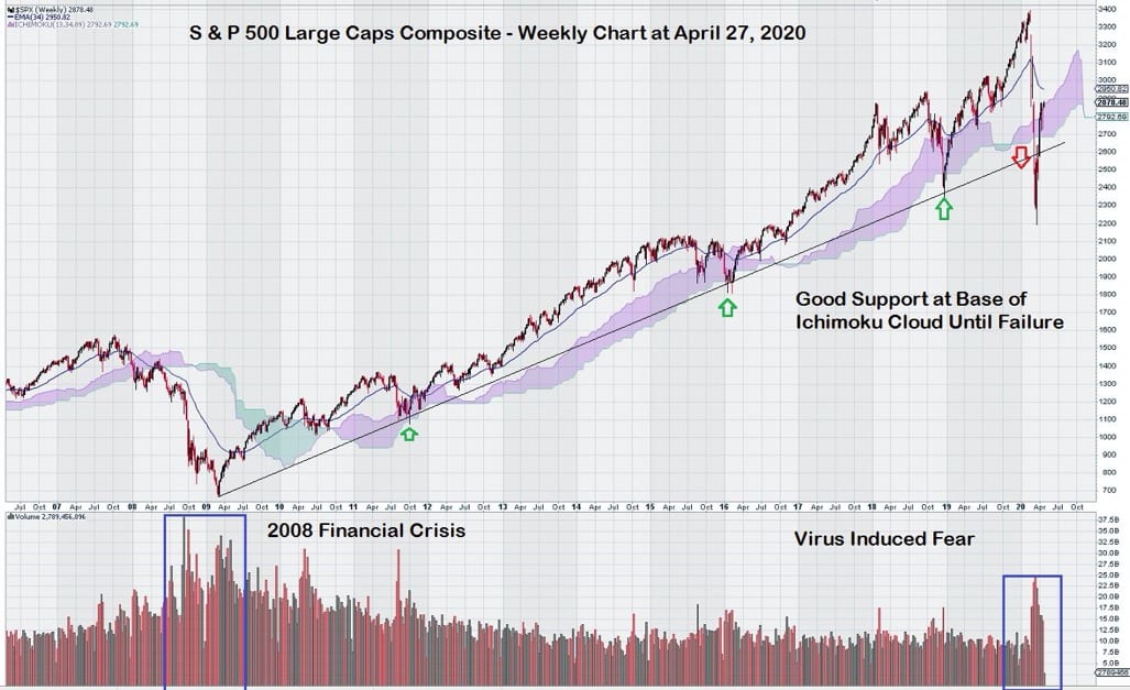
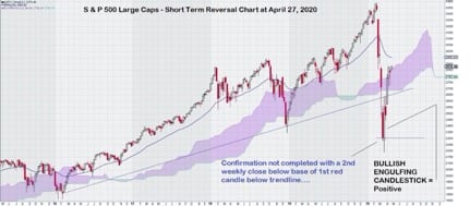
This chart shows good support along a multi-year trend line that has violated to the downside. Here again, we see a pick up in volume. This is where chart interpretation gets a bit tricky to read. As regular readers already know, we prefer to see a “second week” to help with confirmation of the signal. In this case (when we look at the chart on a shorter interval of 5 years), confirmation of further weakness did not occur. Instead, we see a bullish pattern emerge from the Bullish Engulfing Candlestick.
See close up view below:
Let’s take a quick look at our poor cousins to the North: Canada. They have a resource-based export economy that has been devastated by implosion in the oil markets. Copper and coal are also export products of Canada, and prices for both remain low.
Here is the TSX Composite Index:
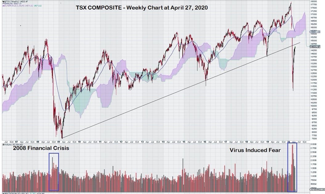
At a glance, one can see strong selling represented by the red volume bars.
Volume selling in 2020 has exceeded that of 2008. It is also worth noting that the up trend line has been violated with several weekly closes below it. Again, this trading action is what we expect to see, given the weak economic expectations for the near term future.
A weekly chart for the struggling TSX Venture Index shows a market that has waned to a very low level:
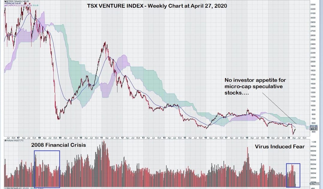
The TSX Venture Index sustained steady selling for one month that resulted in a new low below the 400 level. It has since staged a very modest recovery as investor and trader focus returns to large-cap US technology and pharmaceutical stocks.
What about the German Stock market?
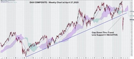
Volume information was not shown, but we see something else that is quite disconcerting.
Note that not only did the multi-year trend line fail to provide support – it failed badly. Gaps down through long-established multi-year uptrend lines are not commonplace. They are clear and unmistakable signs of weakness.
France repeated what happened in Germany – extreme weakness despite a long, multi-year positive up trend line.
Will Future Earnings Reports Rattle Investors?
In summary, what is strange indeed is that continued yoyo-ing of the Dow, both up and down on what seems to be inconsequential volume – given the uncertain economic landscape.
This is why investors should be very, very cautious because unlike in other major markets throughout the world, the Dow somehow has avoided the selling pressure that no doubt is lurking somewhere in the future.
Perhaps when the next two or three quarterly earnings reports are known, the selling volume will come then as investors realize how long the “recovery process” will take.
The full impact of the US economic shutdown has not yet been transmitted to those companies that comprise the iconic Dow Jones Industrial Index.