
Rising Rates or Hopes of Rising Rates?
Financial airwaves are now flooded with predictions for the future of the $USD 10-Year Bond Yield. A few weeks ago, we looked at several daily charts that gave “mixed messages.” Our own daily chart outlined a “weakening trend” based on price action over the past three months.
The past three weeks have seen plenty of up and down action on the daily chart. Since our last article, we have seen the rate rise, fall and now, rise again.
So that got us motivated to bring out the “long telescope” for a multi-decade look back. So, here is our weekly chart that goes all the way back to the inception of this widely followed $USD CBOE 10-Year Bond Yield Index:
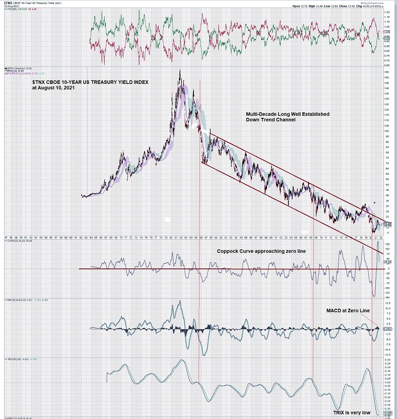
The chart presents very strong visual evidence that the $USD 10-Year Treasury Bond Index has established a well-defined multi-decade downward trend channel that goes all the way back to the mid-1980s.
As can be seen, the 10 Year Bond Index weekly chart rose above its upper trendline in 2018 but quickly retreated below it.
We note, with interest, that the Coppock Curve has seen increased volatility. Also, we see that the weekly 10-Year Bond Index chart shows further declines when the Coppock Curve goes below its zero line.
Currently, the Coppock Curve is steeply declining to what could be another test of the zero line.
MACD is at an important level, just below the zero line.
Although not shown on the multi-decade weekly chart above, a 1-year chart provides greater detail:
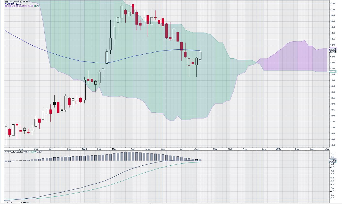
This expanded view of the weekly chart for the past year shows that MACD is flattening at the zero line. A cross-over of the signal line below the trigger line would be a “tradeable” signal and indicate a further decline in Bond Yields.
Note also that we will enter “red cloud territory” in December. We have found that the weekly gold price chart has been very responsive, directionally, when price moves above or below the red cloud. For the balance of this year and into 2022, we will continue to monitor the weekly chart for the 10-Year T-Bill Yield Index and keep our readership updated on any significant changes.
Finally, to “add to the confusion,” TRIX, a triple exponentially smoothed moving average indicator that is used to identify changes in trends, is at a very low level. This is positive for an increase in the 10-Year Bond Yield rate, despite the conflicting signals of the other indicators and the powerful evidence of a continuance of the downtrend trend (as shown by the trend channel).
Summary and Wrap-up
2021 is rapidly drawing to a close. The philosophical, political divide between the Left and the Right has prompted the party in power to use that power to speed up the passage of various funding proposals that are breathtakingly vast; billion-dollar budgets have been replaced by trillion-dollar ones.
COVID-19 is proving to be a much harder adversary than originally envisaged; its variants continue to contribute to the uncertainty of getting the US and global economy back on track.
These considerations and others are so far keeping the T-Bill market somewhat “in check.” Small moves up and down have been the order of the day. These moves can be seen very clearly on the daily chart, but they disappear on the weekly chart.
Our weekly chart shows that by mid-year 2022, it is likely that the Bond Market will have “sorted itself out.” At this time, we tend to side with the trend in place. We recall two familiar traders’ adages: “The Trend is Your Friend” and “Trends Remain in Place Until Clear Reversals Occur.”
-John Top, the technical trader