
A month ago, we sounded a clarion cry of caution concerning how gold stocks were trading:
Are Gold Stocks Leading Gold Lower?
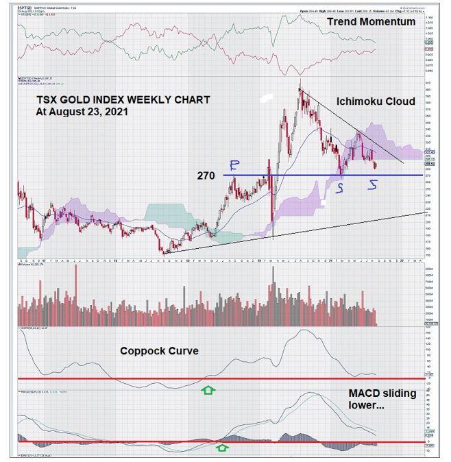
Here is the weekly chart for the S & P TSX Gold Index that showed gold stocks starting to break down below the Ichimoku Cloud.
Since then, a month has passed by. So let’s see what the weekly chart for gold stocks looks like today:
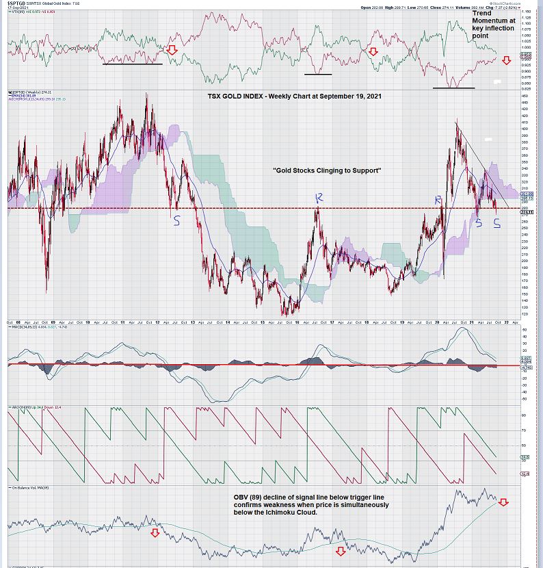
This chart tells us that the trend in place remains in place and offers additional areas of technical concern. Let’s review them one by one.
First, we note that trend momentum is approaching a key level of its own. See the top of the chart. Trend momentum becomes negative when the red line crosses over the green line. We show two previous times when this occurred.
However, this time trend momentum started at its lowest ever point – in July 2020, when the TSX Gold Index was trading back above the 400 level. Intuitively this makes sense – the bullish market sentiment for gold and gold stocks overpowered negative trend momentum and drove it to new lows.
Now we see that trend momentum is much more evenly matched. It looks as though the current round of negative sentiment impacting gold stocks can push trend momentum into negative territory.
Based on experience, this could mark another period of decline and consolidation.
Second, we have the 270/280 level for the S & P TSX Global Gold Index permanently etched onto our memory. Over the past decade, this key level keeps showing up when the weekly chart for gold stocks is about to change its trend direction. So here we are again – at another inflection point on the chart as defined by a number of technical indicators that tell us that things are about to change.
Since our weekly chart from one month ago, we see that our expectation that perhaps the dip below the Ichimoku Cloud would be “transitory” (to borrow a phrase from the FED) – but it was not.
Gold stocks are in a sort of “technical analysis no man’s land,” trading slightly below the Ichimoku Cloud to be sure, offering those who remain optimistic hope that a turn-around may be just around the corner.
However, our view is that the longer gold stocks remain trading at or below the current level, the more unlikely this is to occur.
Third, we turn our attention to MACD.
We use settings on MACD that are a bit unorthodox, but they have served us very well over the years. Specifically, they tend to zero in on important key measures when the trend is about to change.
As we can see with great clarity and consistency, MACD remains in a negative trajectory with the signal line firmly below the trigger line. On our chart from a month ago, our comment was “MACD sliding lower.” Today, this remains the case with one important difference; we are one month closer to the zero line.
The zero line for MACD, on trend settings for our weekly chart, is in and of itself a very key level. As you can see by the chart, MACD is “running out of room to manufacture a turn around above its zero line.
Finally, we look at OBV.
Again, with the benefit of history, we see what happens to the level of the TSX Gold Index when the level of OBV drops below its trigger line of (89).
And, to complete our technical review, we see that the Aroon Up (green) and Aroon Down (red) lines are parallel. This condition may precede a trend reversal. In this case, the expectation would be for a negative trend to emerge because, currently, Aroon Down is below Aroon Up, so a cross-over would signal a negative change, not a positive one.
Summary and Wrap-Up
Gold stocks are perched at a precarious point on the weekly chart.
Further sustained weakness can continue to damage those technical indicators that remain ever so slightly positive.
A sober reminder of the last time gold stocks retreated.
Now that we are not feeling so great about gold stocks in the near term, the obvious question is: “If gold stocks look ready to retrace their steps lower, then how will we know when will be a good time to step back in?”
The weekly chart for gold stocks answers this question for us.
We see that gold stocks made new highs in 2016 from lows in late 2015. Unfortunately, this short-lived rally was cut short, and we see how MACD declined below the zero line.
A new rally began in mid-2018 and was confirmed a year later in mid-2019 when the MACD signal line and trigger line crossed back over the zero line. Other than the brief interruption brought on by the uncertainty of COVID in early 2020, this rally continued until mid-2020, reaching the 400 level. This continuation move was quite impressive, considering the lows of 2015 were at the 120 level.
So, there you have it.
If gold stocks continue to decline, even below the Ichimoku Cloud (as they are today), and MACD becomes negative by crossing below the zero line, it doesn’t mean things are over for gold – it could be just a temporary adjustment.
For a point of reference, the second rally from the 150 level in late 2018 to the 400 level in mid-2020 easily eclipsed the previous move from 120 to 280, as noted on the chart.
We patiently await our “trading instructions” from a weekly chart that we know very well. We expect another continuation move to emerge in time, and we will be right there to take advantage of it when it happens.
The technical indicators we use have proven themselves in the past, and we can rely upon them in the future.
One more brief observation.
Gold, on a monthly chart that is adjusted for inflation and stretching all the way back to 1971, remains positive to continue to advance toward completing a multi-decade pattern known as the “cup and handle pattern.”
We would become concerned if gold were to decline below $1400, the base of the “handle.”
A short-term decline on weekly charts for gold and gold stocks is smoothed by their respective monthly charts. Successful interpretation of charts is very much time-sensitive. Gold and gold stocks reflect markets that are traded using a rainbow of time intervals, from seconds all the way up to years. A composite of trading interest based on time is what gives life to markets.
– John Top, the technical trader