


The spectacular rise of Gold’s perceived rival, Bitcoin, has left some gold bugs dazed and confused.
This is understandable.
The heightened political drama in the USA is most unsettling.
Policy has completely given way to politics. Make that totally partisan politics.
One would think that this would be a perfect storm for gold.
In the eyes of many, gold has underperformed its expectations. Is this because expectations were set too high? Or, is it something else?
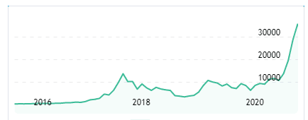
Instead, it has been Bitcoin that has seen its chart rise steeply over the past few months. Recently, though, it did correct with a strong move to the downside.
Via MarketsInsider.Com:
“Bitcoin plummets by the most since March as a stronger dollar and investor nerves strip off nearly $140 billion in cryptocurrency market cap
-
- Bitcoin slid as much as 21% over Sunday and Monday, its biggest two-day decline since March, under pressure from investor risk aversion that also undermined equities while the dollar rallied.
- The possibility of a second impeachment for President Donald Trump encouraged safe-haven flows into the dollar, which rose to two-week highs.
- Bitcoin is still up roughly 89% over the past month.”
Some perspective is necessary before getting sidetracked and starting to seriously compare Gold to Bitcoin.
Via blockcrypto.com:
“To be sure, the best-guess market cap of all mined gold — an estimated $10.6 trillion, per Gold.org (GoldHub) — dwarfs the market capitalization of bitcoin, which as of press time sits just below $708 billion.”
There you have it: gold has a much stronger footprint in the financial arena than does Bitcoin. Gold remains the “go-to” hard asset for portfolio managers, central banks, and the “1%” who want to have some form of “financial fire insurance.” Gold is well suited for this role. It has a long history of value retention when fiat current currencies start their inevitable downward spiral. Half a century ago, when the “gold standard” was in place, gold acted as a “brake” on money printing. That brake has long since been removed.
Using COVID as an excuse, governments around the world have literally flooded the word with new money. Yesterday I talked with a very successful international businessman who reminded me that cash is being shunned. He reiterated what we already know: much of the sovereign bond debt in Europe is currently at a negative yield.
A year ago, Manulife Investment Management had this say:
“Today, the vast majority of bonds in Europe and Japan—upward of 30% of all investment-grade debt in the world—carry negative yields to maturity. Nor is the phenomenon limited to short maturities: This past August, Germany sold 30-year sovereign debt at a negative yield for the first time.”
We have briefly set out some common views on Bitcoin, gold, and how the world is awash in debt. The wrong kind of debt. One of my favorite summaries of the situation, as it exists today, is: “Bonds represent a return-free risk.” This surely must go against all common-sense approaches to investment.
Yet, it is not a concept; it is real.
This brings us to how we see 2021 unfolding as it relates to gold.
Let’s begin by looking at our trusted weekly chart of gold over the past 12 years. That is a good place to start.
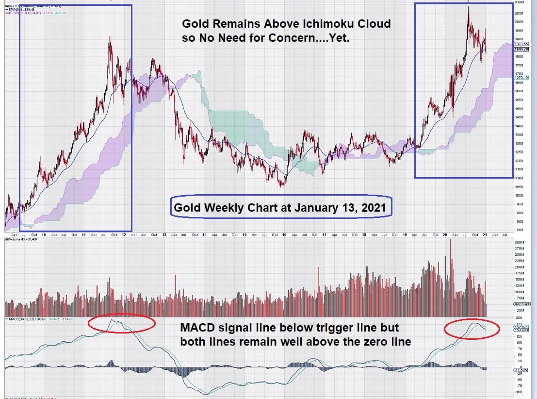
At first glance, this chart shows a mirror image of the period leading up to the decline of gold in 2013. Looking back, it is easy to see what happened. Price remained above the Ichimoku Cloud until it entered the cloud in early 2012 and remained above or within the cloud until 2013. Notice that MACD was giving a sell signal with the signal line below the trigger line at the start of 2012. We have a similar situation today with MACD.
The gold price continued to be under pressure and deteriorated further in 2013. As can be clearly shown by the chart, the price of gold declined more rapidly and for a more extended period, once the base of the Ichimoku Cloud was breached to the downside.
The obvious question is: “What is different about today than back in the 2012/2013 period?”
This is where technical analysis, on its own, does not provide a complete basis for making an informed decision.
Let’s go over just a few differences between 2012/2013 and today.
In 2012, the 10-year T-Bill yield was around 2%. Today it is over 1%, having risen from a historic low of just over 0.30% in March 2020.
Rising T-Bill yields work against the gold price unless the CPI is rising at a faster rater. Gold does best in a negative real rate environment.
Next, let’s look at the FED.
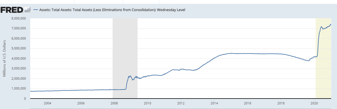
This picture tells a story unto itself. The large spike in the graph represents the additional monetary stimulus required by the US government to essentially bankroll the entire US economy through the COVID-induced economic shutdown.
What this graph does not show is the additional expansion to the FED balance sheet that will come when the newly elected Democrats disclose how much they intend to spend. It seems likely that another spike up in the graph will occur.
So, what does all this mean for gold?
All we can say for now is that the gold price appears to be correcting.
Sure, the two price charts side by side, from a technical point of view, show cause for concern. But technical analysis doesn’t forecast “cause and effect.”
The money printing that we will see today has somewhat of a “delayed fuse.” Some economists that I follow have picked up on this concept.
They note that the inflationary effects of money printing may take as much as 1 – 2 years to work their way through the economy. They all agree that this is a case of “when” not “if.”
There will be a moment in time in the future, a so-called “Minsky Moment,” when everything changes.
This will occur when the rate of inflation overtakes even a rising 10-Year T-Bill yield. When this happens, gold will finally “have its day.” Just like it did in the 1970s and 1980s.
A well-known and widely followed economist, David Rosenberg, recently discussed the idea of “cost-push” inflation or, as it is known by another name from the 1970’s/1980’s, “stagflation.”
He bases this idea on his expectation that, post-pandemic, there will be a lower labour pool on which to draw on.
This means an economy will have a restriction on supply growth. He goes on to say that the outcome of a very weak labour force growth will result in little, if any, productivity gains. This means that even a small increase in aggregate demand will see inflation re-appear.
Getting back to our weekly chart for gold, we are watching a few other indicators like trend momentum, on balance volume, and accumulation/distribution – just to name a few.
Trend momentum, for example, remains strongly bullish.
The day-to-day and week-to-week changes in the gold price are not enough evidence on which to make decisions.
Long-time readers of EQUEDIA, have seen us repeat over and over that we like to see at least 2 – 3 weeks of data to confirm any ideas that we might have. This remains the case today.
Summary and Wrap-up
The gold price is correcting from a new high reached in the middle of 2020. We have identified some key chart indicators that will tell us when more investors will turn their attention to the “ancient relic.” BitCoin remains a “modern mystery” to some.
So far, it has not been a meaningful threat as far as distracting gold-minded investors.
We will be taking a look at some senior gold companies and gold indices to identify some trade entry levels that look interesting to us.
Our Fibonacci studies, using $1350 as a low, based on strong, multi-year horizontal resistance at that level, results in a 50% retracement at $1700. Our general observation is that gold remains well supported, with recurring bouts of undisclosed support, manifested in any temporary price weakness.
-John Top


Really? Gold?
The charts for Tesla and Netflix make gold look weak!
Fundamentals are so strong here!