


When you have looked at enough charts over a very long time – sometimes you notice the obvious, and sometimes you do not.
Let me explain.
Like the rest of the global villagers, I too can not get away from the omnipresent doom, gloom, and worry that permeates the airwaves these days. It seems that the concept of “self-quarantine” is one that needs to be continually reinforced to be effective. Hence the constant message to “stay at home” by major TV broadcasters.
But how many high stakes poker re-runs or old Columbo detective shows is enough?
Today is the day I found out.
Scrolling through chart after chart after chart might be tedious for some, but for me, it was a timeless journey that took me far, far away from that which the rest of the world can not escape.
And that is when it happened….
Take a look at this weekly chart for the Dow. Notice anything interesting? Or have you already made the connection?
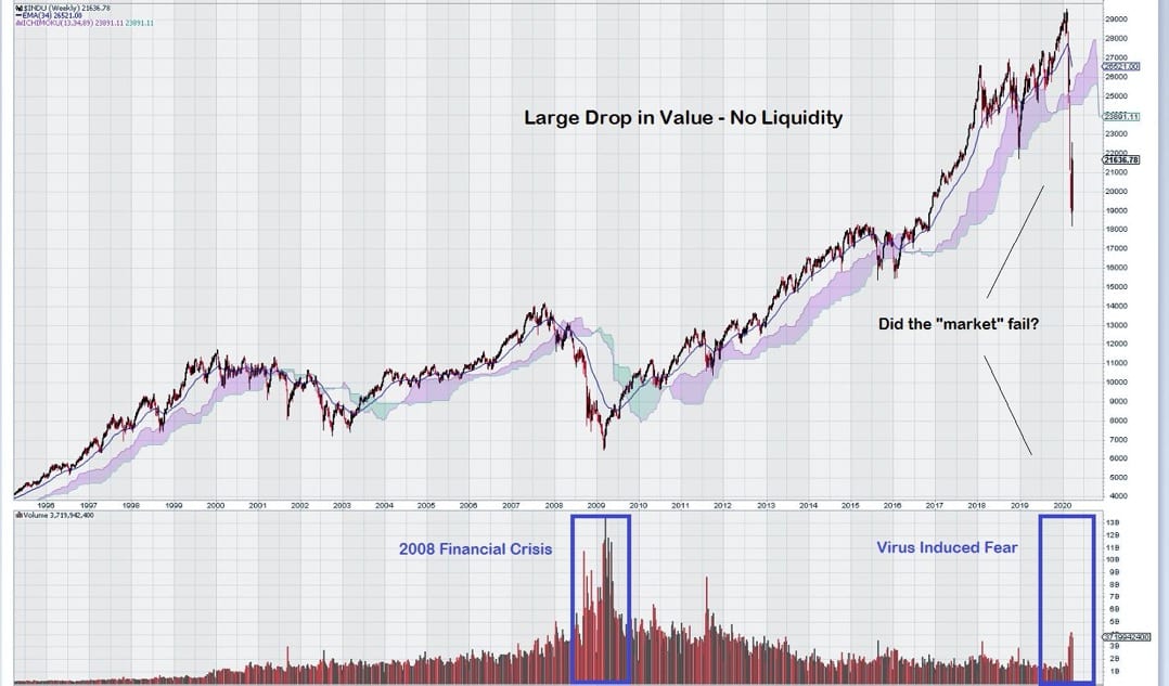
This is a most intriguing chart for several reasons.
Firstly, there is an old traders adage that goes along these lines: “Volume Precedes Price.” Look at the chart back in 2008/2009. Notice the strong uptick volume shown by the large black bars that PRECEDED the decade long rise in stocks that followed. Pretty obvious, isn’t it?
How does this compare to today? Words are unnecessary to explain the difference.
Secondly, notice the large “freefall” that occurred once the “virus fear” gripped markets.
Selling was “not an option” as there was a total lack of liquidity. See the relatively small red volume bars at the far right hand of the chart.
Did the market just now “fail”? Is this the “beginning of the end”? Investors across the globe are trying to figure out what just happened and what is going to happen next.
Finally, our most trusted ally in the world of technical analysis – Fibonacci Retracements – reminds us not to be too hasty to “follow the madness of crowds.”
Why? Simple – in our previous chart for the Dow, we took a close look at Fibonacci Retracement Levels. See “The Key Support Level for the Dow Jones” – March 12th.
We identified the 18,000 level as the 50% retracement level from the low in 2008 to the high in 2020. This level is a key support but not final support, which is a bit further down the chart at 15,500.
A Long Summary
The weekly chart for the Dow tells us that we are witnessing something truly unusual – a strong, broad-based decline across many different sectors of the market that lacks volume confirmation.
Bears can point to a decline below the Ichimoku Cloud, which previously provided support in 2011/2015-2016/2019. The potential to form an Orthodox Broadening Tops still remains.
Bulls see the lack of volume on the sell-side as a clear sign that the market can easily recover and continue to advance. So far, the 18,000 level has not been tested (although it came close.)
The volume chart for the Dow illustrates the impact of passive investment over time.
The chart pattern for 2018 – 2019 is very similar to 2015 – 2016; where there is multi-year consolidation, followed by a move higher.
This consolidation was completed through 27,000, and it appeared that the Dow was, once again, set to rise further.
The fact that the market had completed its consolidation and was moving higher and then was denied support at a previous two-year resistance level is both troubling and noteworthy.
Market sentiment continues to deteriorate, as shown by weakening trend momentum.
The quintessential question in regard to the stock market is: “Will investors start to sell or continue to hold when liquidity reappears?”
*Ivan here. It is clear that in times of non-financial panic, such as one caused by a virus, there is no support – just selling. This rush to cash is very normal but with the new limit down rules, there will be many that cannot liquidate in time – especially not compared to the speed in which algorithms operate. It is actually and literally impossible for a retail trader to keep up. Now, here is the biggest kicker: the Fed has now essentially become a commercial banker. What does this mean? Well, now you have a bank that can print limitless amounts of money in exchange for real assets as collateral – so as long as they can do that, the market will have support, even if it’s false. As this progresses, the Fed will essentially own anything that fails and have the ability to direct those assets to whomever it wants. And the new stimulus provisions allow them to do this until at least the end of the year 2020, or until the National Emergency Act terminates. For example, it just printed a bunch of money and is letting BlackRock manage it all. As I have always said: follow the Fed. Take a look at the chart for the Dow just prior to the Fed and US stimulus announcement. ‘Nuff Said.
-John Top