


Today we take a look at a 20-year weekly chart for the S&P TSX Venture Composite Index that measures how well (or poorly) micro-cap stocks are doing in the highly uncertain future that is being shaped by COVID-19 – Year 2.
We have seen the complete devastation of hotel, restaurant, airline, and travel industries as these sectors struggle to regain some form of economic balance. For some, the forced shut-downs and lock-downs have taken on an unwanted state of permanence. Famed investor, Warren Buffet, disposed of his airline stocks last year. He made these comment back in May 2020:
“I don’t know that three, four years from now people will fly as many passenger miles as they did last year,” he said. “You’ve got too many planes.” –
Warren Buffet
The internet has many voices – and it is an easy task to find one that supports a negative view of the economic future.
This is why it is something of a pleasant shock to see that the weekly stock chart for micro-cap stocks is telling us something completely different.
The chart has a very bullish look to it.
How can this be? Why is there such unbridled optimism in the smallest and easily the riskiest of all equity vehicles? What is it that investors see that makes them want to, as the Aussies say: “Take a punt”?
Here is the 20-year weekly chart that shows a key chart defining area of internal support/resistance has been broken to the upside:
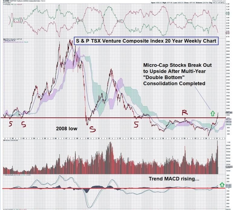
The strength of this move on the chart simply can not be understated.
Except for a brief decline in 2008, the 900 level of this chart is essentially what I like to call its “spine.”
This is the level that connects the chart to itself over time. Look at the chart and see how the 900 level provided a well-defined level of support that, once broken, predictably became resistance. This is how chart followers would have expected the chart to behave, and indeed it did exactly that.
That is why the current break-out is so “eye-catching.” Small stocks may have a long, long steady advance to some pretty lofty levels in the years ahead.
Let’s zero in on the last part of the chart – the past five years and take a better look:
Here we see that trend MACD looks exceptionally positive and moving up.
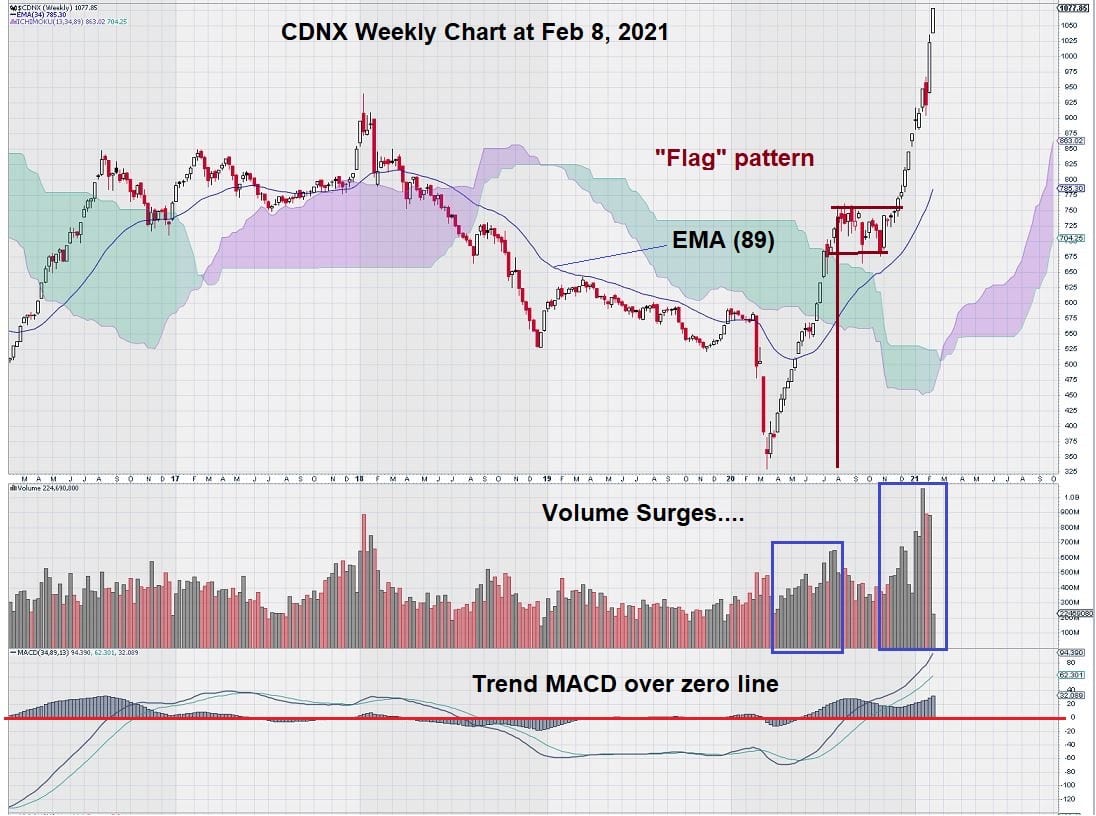
Also, we can identify two large “volume surges” that point to a much overdue revaluation. The level of the index responded to these two impressive increases in positive trading volume.
Summary and Wrap-Up
The performance of the micro-cap stocks is clearly reflecting a very positive investor undertone when it comes to risk. Despite a steady and persistent stream of negative views, small stocks have seen a pretty hefty surge of sustained buying interest. This has resulted in a rise to a meaningful technical level – one that is above previously established resistance.
We like to follow trader’s axioms. One that is clearly highlighted in these two charts is: “Volume Precedes Price.”
Small stocks are telling us to “buckle up and get ready.” The future is bright.
“Laissez les bons temps rouler.”
– John Top, the technical trader